
It’s late, you’re late, and your Sherwin Williams Paint Code book and your Pantone color book are both sitting on your desk, next to the folder you forgot to grab with all the code details, but you don’t have time to go back for it. As you pull into the parking lot to meet the owner of the new liquor store at the strip mall, the overcast skies seem to be robbing what little available light there was left in the afternoon sky, and you panic just a little because one of the key points that you needed to establish was the existing color of the stucco wall. Without your SW paint book, you’re stuck without any way to match the color by way of a paint code or color-referenced number.
Oh well, you decide to quickly snap a few shots of the stucco wall in hopes of figuring out the color later, back at your designer’s office. It’s overcast, it’s late in the afternoon, the horizon is a bright orange and gray, and you are taking photos of the stucco wall in hopes of matching the wall color for the raceway that the sign will need.
I think this is where the big lever is pulled, and the floor drops out from under you, and you fall into a tank of hungry sharks with laser beam guns mounted on their heads.
The next day you present your wonderful photo of the stucco wall to your designer. “I can’t use this,” your designer mumbles … “I can’t match this photo.” This puzzles you, as it wasn’t usually a problem in the past. Your designer then shows you an example of how the sun’s light is affected by the atmosphere, which bends the light and turns it orange — which is where our sunset and sunrise colors come from. That shift in the sun’s color is called the “Kelvin Shift,” which occurs every single day and is visible on days when the clouds don’t defuse the effect.
Here is the trick … and it’s foolproof in winning the color-of-the-wall or substrate-matching game (when the paint is faded or no paint code or stucco color mix number is available — which is most of the time).
The beautiful thing about using a color book with a color number or paint code number is that no matter what time of day it is, the color that matches the stucco in the photo at that time of day is the same color number that will match that color at any other time of the day. The reason is that when the color book sample color and the wall or substrate color are both photographed together, side by side, as a match or close match, then no matter what, the paint color number that matches that wall at the time of the photo is the color number, no matter how different it looks in the photo.
It’s not the color in the photo; it’s the real color of the paint number you are matching to.
Having just the photo, without the paint code number and sample color, only gives you the “visual color” of the wall at that time of day, which has nothing to do with the color of the stucco, and there would be no way to duplicate the evening sky color. It’s the color of the light that is reflecting off of the stucco color that is skewed by the Kelvin Shift.

Take a look at the photo arrangement I have shown here, which is also available via my Pre-Sale Sign Survey Guide and Training Course. In this example, the sun is making the color of the wall look much darker than it is in real life. Compare it to the other photo of that same sign band taken on a sunny day. The color of the wall is completely different in such a way that creating an illustration of the sign on the wall is nearly impossible and completely useless.

Here, we see the match of the stucco wall color in a photo that was taken in the shade of the building on a sunny day. Why is this image any more accurate than any other photo? The reason is simple – it’s the fact that the wall color was matched to the color book via how it looks at the wall site, as viewed by the survey person, with the color book laid against the wall to determine which color range it fits best.

And yes, there are limitations to this. You cannot expect to get the same color number match if you do this at night, in the dark. Nor will it work if you use a flashlight. This color match works during daylight hours and is even more accurate when the Kelvin Shift is in the 6,500 range, which is closer to the noon hour.
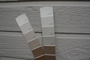
Paint colors vs. Pantone vs. anything with a color code…
Sherwin Williams seems to be the anchor brand when it comes to the colors that architects and interior/exterior designers use. Pantone colors are listed with a set of build numbers (commonly referred to as the PMS number) which is used by print houses to verify color builds of ink on paper or vinyl. Pantone reflects a color designed to either float on the top of the surface (called “coated” in the book) or to soak into the paper or surface (called “uncoated”). The coated numbers appear shiny, whereas the uncoated numbers have a flat or matte finish.
The differences between coated and uncoated colors have caused trillions and trillions of mistakes and confusion when a Pantone “uncoated” color book was used to document a glossy paint color. This has always created color match issues that most graphic artists are not familiar with.
Case in point: I was working with a graphic designer who was the creative director for a large rebrand of a company’s signage. The creative director was nearly obsessed with the color we specified to paint the monument structure. “It MUST match the corporate branding guide and that blue must be the right blue or it has to be repainted because it MUST MATCH EXACTLY.” Well, we’ve all run across this type of life-or-death job, and in this case, I picked up the phone and asked the CD if he had planned for the Kelvin Shift for that base color.
Naturally, the CD went silent … like I just asked him to name every Pantone color in order of hue. The crickets on the phone were deafening. I then kindly explained that painting the base in the color and sheen he had specified was all that we could do. I explained that “Every color darkens outdoors at a distance, which means our eyes perceive a darker shade of that color the farther away we stand from it, and depending upon the time of day, the color could shift as much as three places up or down the color spectrum due to the Kelvin Shift.” The CD thanked me hesitantly, as he was bewildered. I had enlightened him on something he had never considered — and as he hung up the phone, I knew he was wondering why the Kelvin factor had never been discussed nor mentioned while he was in design school l… ever.
Just remember that every color is subject to its surrounding colors (that’s a topic for another day) and that every paint color that is viewed outdoors versus indoors will be looked at with a much different eye and hue perception. Most viewers will take into consideration these factors and will provide a bit of wiggle room when it comes to color and sheen matching in an outside environment.
It’s much different when a color doesn’t match in a brochure or a business card. Print materials or screenshots can be compared side-by-side anywhere. However, comparing how a sign’s color looks by viewing it outside and realizing it is changing hue by the minute affects the way we should communicate color-matching limitations to our customers.
Maintain your accuracy at all times, but explain to those who question it that even when it’s correct, the big ball of light in the sky will determine how that color appears to the viewer’s eye, so making that color appear accurate throughout the entire Kelvin range is basically impossible.