Battling Being “Too Busy” in Design Work
Conditions and assets you may need to manipulate during sign design
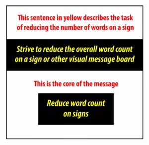
We have all heard the expression, “I wouldn’t add any more graphics; it’s already too busy.” But what does too busy really mean? Some signs need every square inch of space to tell their story, and yet other signs seem to leave too much empty space on the table. Is “too busy” a subjective term that depends upon the situation, or is it a hard and fast rule that needs to be adhered to? Well, it’s a little of both, and in some cases, it’s the only viable option.
Let’s review some conditions and assets you may need to manipulate while you are designing your clients’ signs:
Balance, white space, fonts, kerning, graphics, contrast, and color – these are the seven primary factors that we must be keenly in tune with as we design.
Balancing these in accordance with their importance for the sign’s job is key. Making one asset too visually dominant will absolutely take away the message that the sign is trying to convey.
Let’s look at these conditions and assets for what each of them represents, and how they can affect the visual clutter of the sign.
Balance (a condition) – How well does the information “puzzle-fit” onto the sign area? Does a graphic with heavy contrast make the image feel heavy or crowded on that side? Are the lines of copy hard to read at the intended reading distances? Balance is very important and must be recognized and adhered to.
White Space (a condition) – Referred to as negative space or blank areas where nothing is placed. It can be said that effective white space is what balance aims to achieve. White space helps the viewer’s eyes know where to go on the sign and makes everything more readable.
Fonts (an asset) – Some fonts are easy to read at a distance. Some fonts encourage emotions, and some fonts are simply too ridiculous to even consider using. Always remember that using the wrong font can change the mood and emotions of the sign’s message in the wrong direction.
Kerning (a condition) – Fine tuning the spaces between letters always improves readability. Most designers overlook this obvious feature (I have!). It’s easy to miss. Take time to look for kerning opportunities.
Graphics (an asset) – It could be the main subject of the sign’s message, or a supportive visual piece. It could be a watermark, or a full color, eye-attracting image that does the job in a three-second look, or an infographic that tells the entire story.
Contrast (a condition) – With proper contrast, the correct balance and relative visual importance of an asset are much easier to achieve. Contrast can also help visually adjust the layout and balance of the sign as a whole. Contrast makes letters stand out and become more readable. Use contrast as a tool for bringing the appropriate asset to the front and center of the sign.
Color (an asset and a condition) – A dark color can be used to create a stand-alone box or shape where lettering can be placed in a highly contrasting color (if it needs to be seen), or lettering can be placed on the dark area with a color that isn’t as contrasting. This allows the eyes to see it, yet not fight to read it if it’s a secondary asset that isn’t meant to dominate the sign.
Yeeesssiiirrreeee, bad layout and balance most definitely affect the sign and its ability to convey its message. Too busy means it’s not read, period. Detailed graphics and multi-shaded or colorful aspects in the background add to the visual confusion. Take a look at the example shown here:
This is a sign that was designed and mass produced for distribution among the manufacturer’s local paint stores. These were given out like candy at Halloween, and from my firsthand knowledge and personal experience in working with commercial painters, I can say that these light cardstock signs were rarely used. Why not, you may ask? They were/are free, so why not use them?
HERE IS WHY THEY DON’T WORK:
A: The background is too busy for the value of the message! Black is not the best choice.
B: The top of the sign is missing critical white space – making the text harder to read quickly.
C: The primary message is not centered, and the two words are placed on the sign incorrectly.
D: The company’s name and logo would stand out better if they were smaller and therefore less crowded.
To start off, my intention is not to pick on anyone or to bring attention to their work in a less than positive light. We all start somewhere. It takes time to learn this complex science of sign design, and learning from the examples around us is one of the best, most practical ways there is for understanding how it works. I have no doubt that some of my early work was used as an example of “what not to do,” like this example of one of my very first hand lettering jobs… before I realized that projectors existed.
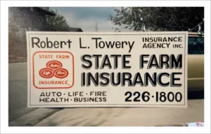
1986, one year into being a self-taught sign painter. Yep, pretty scary. I was so proud of this State Farm Sign. I painted it by hand well before my abilities, experience and skillsets had a chance to grow into what they are today. We all have had our moments when our work didn’t shine like it should have. My only intention here is to research and analyze the effectiveness of proper sign design to create learning opportunities for everyone to benefit from. By the way, last I heard there is no crying in sign design.
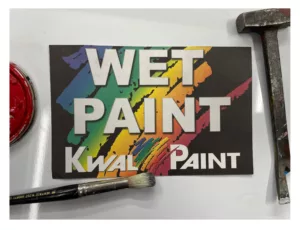
Let’s look at some of the things that could be improved upon for this wet paint sign:
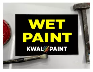
WET PAINT – this message should stand out in the same way that STOP and DANGER do on traffic signs, but in this example it’s hampered by crowded text, improper spacing, a too colorfully-busy background, and a lack of contrast between the multi-colored background and the white font – of which the spacing and placement are way off. I have provided an alternate “armchair quarterback” design here that would be much more effective.
In all fairness to the designer who created this WET PAINT sign design, it’s likely that they did not want this layout to be used for the final design. The designer may have been overruled by management, marketing, legal departments or branding. I would say it’s a safe bet that this design was never officially field tested for effectiveness.
This is a great example of a sign that is too busy to be readable, and where the primary message is lost in a sea of busy logo paint swatch elements.
Is there a way to keep this from affecting your future sign designs? Why yes, and I am so glad you asked!
CONSIDERATIONS FOR AVOIDING A BUSY SIGN DESIGN:
Step 1: Knowledge of the need
Always remember – signs perform a function. They have a job to do, which is to communicate details, ideas, or warnings. Here are some steps to follow:
- First, find out why the need exists, and what message or sign had been tried in the past. What has or hasn’t worked in the past, if anything. Why do they feel the past signs did not do their job? How well do the signs work that are on the property now? Have signs been stolen? Vandalized? What outside factors do you need to plan for?
- Identify the type of need and the sign type it will require, as well as potential code restrictions that may limit the size of the sign and where it’s installed.
- Is this need legitimate, timely and warranted? Who is saying the need exists, and is it a permanent or temporary need? Will the need evolve? How long will the need be present? Seasonal, parking, directional and most temporary signs usually fall into this category.
- The list goes on, but most importantly, you need to understand what end result is expected by the viewers who are reading the sign.
Step 2: The sign’s job
After you have identified the need, identify how the sign could address the need. How will it perform the job? If it’s safety or regulatory in nature, your design services may be severely limited in scope as these are typically regulated by code.
In reality, the only sign types that get the luxury of creative design are informational, directional and identification … and ego-driven signs. We’ll address that category later.
Remember, it’s important to know what the customer expects the sign to say, even if their idea isn’t the best.
Step 3: It’s more than just a job
How about designing an informational sign that has a lot of details on what to do, how to do it, and when? It’s easy to see how an informational sign, such as a Pool Rules sign, might be considered busy looking when compared to a sign designed for a three-second read. Not every sign is a three-second read, and not every sign carries the luxury of a 20-second read opportunity. Knowing the role of the sign and how long the viewer has to read it is critical to a proper design.
Step 4: Minimize, minimize, minimize
Yes, less says more and less usually wins in the three-second read category. So, ask yourself which details are not necessary for the sign to be effective. What can be eliminated or shortened without losing the meaning or the message?
Step 5: Pay closer attention to what your eyes are doing and how they are feeling
How comfortable or uncomfortable do your eyeballs feel when reading signs that are not properly designed?
Your eye should flow from the upper left corner of the sign to the lower right corner, like a half-grown pup looking at everything and stopping just long enough at each new graphic or image to get a good idea of what it is before wandering over to the next cluster of text. Of course, this all needs to happen within three seconds, or within the allotted viewing time for each sign type. But for an informational sign, it’s even more critical to create a well-paved path for the eyes to follow. Even with a 20-second read time, eye flow is important in order for the information to be conveyed – sometimes details must be conveyed in a specific order for instructions to be understood properly. Self-serve car washes have examples of this type of informational sign. Step 1: Insert credit or debit card. Step 2: Remove wand and hold tightly. Step 3: Select wash type. As you can see from the example image, step-by-step signs are informational and require a longer read and an un-busy layout.
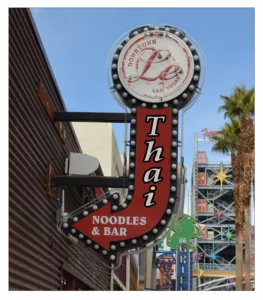
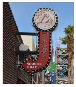
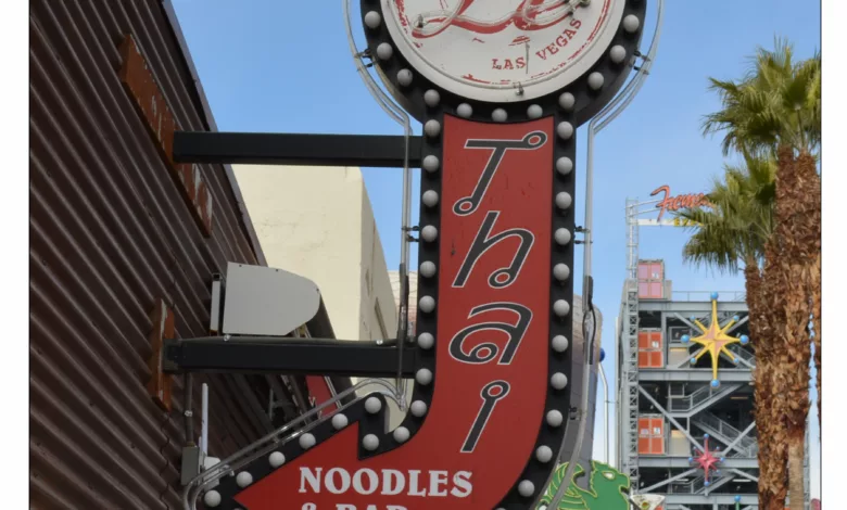
“Dang, what did that sign say — noodles or something — I could really go for some great Thai food.” Why did the day view of this sign neglect the important detail of the type of noodles they sell? Remember, not all finished sign designs are 100% the final choice of the designer. Clients have ideas too, and sometimes a stubborn client has to have the sign their way. I have no idea if that is what happened here — all I know is that I can’t really read it during the day to learn what type of noodles they sell.
In closing, pay attention to how the sign flows, and how the assets you have chosen work to help or hurt the message that is trying to be conveyed.