How to Combine Line Art and Posterization to Create Dramatic Images
Stephen Romaniello discusses how to create spectacular images void of color
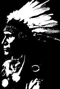
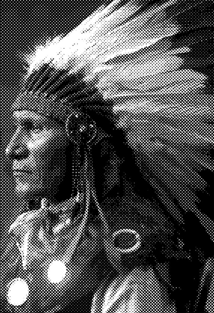
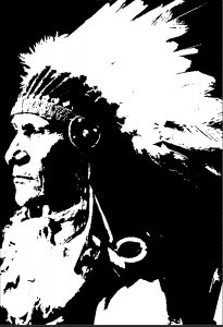
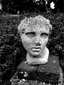
Line art—it’s used to spike a picture with high contrast impact. It’s void of color and midtones and contains only the extremes of tonality: black and white.
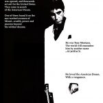
Back before computers, high-contrast black and white images were made by shooting a photograph using a film called Kodak TriX pan ASA400 and a dense red filter. For even more contras the images were traced by hand using India ink or “bumped” by quickly exposing the image to light with a process camera to burn out the light grays and blacken the dark grays. High contrast images were quite fashionable for promotional materials in the 1970s and ’80s, especially in the movie industry. Of course, back then, these techniques were very labor-intensive.
Enter computer graphics. By replacing the old film or hand-inked line art techniques with easy-to-use software, any photograph can be altered to produce a dramatic black and white effect. There are several methods for converting images to black and white line art, and the outcome depends on how the image will ultimately be used. These techniques are pretty straightforward, but it helps to understand how the tonal characteristics are being altered. Furthermore, combining line art techniques with posterization and color overlays can produce really dramatic graphics.
Black or White?
Since a grayscale image contains only one channel, it has the potential of containing 256 desaturated colors (shades of gray). The secret to converting a grayscale image to line art is to control which pixels are black and which pixels are white.
Consider a grayscale where black is assigned the number zero and white is assigned the number 255. The midtone gray is assigned the number 127 (about half of 255). When creating line art, all pixels in the grayscale that have values from zero to 127 become black, all pixels with numerical values from 128 to 255 become white.
Bit depth
In Photoshop, this process can be accomplished a couple of different ways. One method is to reduce the bit depth of the image to one bit per pixel. A grayscale consists of pixels that have eight bits of information. Each bit functions as a light switch. It’s either on or off. The combination of eight “light switches” produces the potential of 256 combinations that appear as shades of gray (28=256). By converting the image’s bit depth to one bit per pixel, its potential is reduced to two options: the one switch is either on (white) or off (black).
Bitmaps
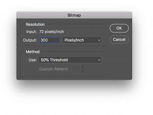
To change the bit depth of an RGB image you first need to convert it to grayscale. (Image Menu > Mode > Grayscale) and then convert it to a bitmap in the same menu. A bitmap is simply an image with one bit of information per pixel-one on-off switch that produces either black or white pixels.
The Bitmap dialog box that appears offers a number of choices. Choosing the default, 50 percent Threshold, creates a straight across-the-board black and white image that converts pixels with values less than 128 to black and values more than 127 to white.
There are interesting menu options too in the Bitmap dialog box that screen the image and create black and white dots of variable sizes such as Halftone. or densities such as Diffusion Dither based on the tonal range of the image.

Limitations
Unfortunately, because bitmap file sizes are so small, they are very limited in the features that they support. If you want to add special effects, you’ll need to convert them back to grayscale or RGB (Image > Mode). Then you can experiment with them and apply cool effects like layers, color, or even filters while maintaining the image’s line art or screened effects.
Threshold
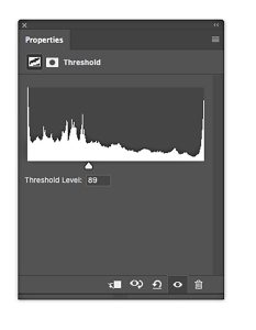
There is an alternative solution to creating line art images that is a little more direct and offers more control over how light and dark pixels are converted. The Threshold command can be applied directly to the image from the Adjustments menu or as an adjustment layer. The dialog box initially converts the image to black and white with the midpoint set at 127. The slider controls the midpoint. If you want more black pixels to darken the image drag the slider to the right, increasing the numerical value of the midpoint. Drag the slider to the left to lighten the picture and convert more pixels to white. It’s unnecessary to convert the image to grayscale or bitmap to apply the Threshold adjustment. The Threshold feature doesn’t offer the same screening options as the Bitmap method.
Posterization
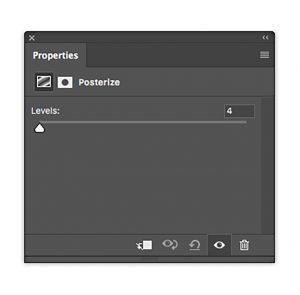
As Threshold divides an image into black and white pixels, Posterizing determines the number of colors that compose the image. Choose Image > Adjustments > Posterize or better yet, choose the Posterize icon in the Adjustments panel to display the Posterize dialog box. Type a Levels value from two to 255. Posterize applies the value to each channel of the image, so if you enter two to an RGB image with three channels, for example, you actually produce eight colors (23). This technique can be interesting, depending on how many colors you enter into the Levels field or it can be pretty disappointing. The results are somewhat unpredictable.
Grayscale technique
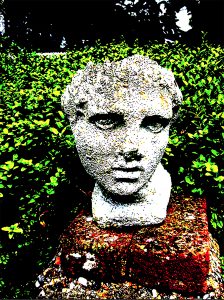
Fortunately, the Posterize feature can be used to determine the number and choice of colors and how they are distributed in the image. The following workaround creates flat areas of gray that can be tinted with your choice of color.
With this method, you can achieve an effect that resembles a screen print with bright, vibrant colors, or tone down an image with pastel colors. Because there are eight sequential steps, I’ve numbered them to make it easier to follow.
- Open the RGB image.
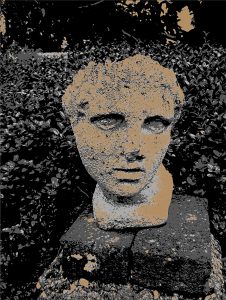
- From the Adjustments panel, click on the Black and White icon to produce what looks like a black and white photographic image. Adjust the color sliders to enhance contrast.
- From the Adjustments panel, click on the Posterize icon. Make sure the Posterize layer is above the black and white layer in the stack. Enter a Levels value of four. You can enter any amount from two to 255, but an amount of four produces a nice simple posterized effect. Notice that the image is now divided into four shades of gray: white, light gray, dark gray, and black that correspond to the picture’s original tonality.
- From the Tools panel, choose the Magic Wand tool. Set the Tolerance to one, and clear the Anti-Aliased and Contiguous options in the options bar. Click on a white region to select all of the white pixels in the image.
- At the bottom of the Layers panel click the New Fill or Adjustment Layer icon and choose Solid Color from the menu. When the Color Picker appears, choose a light color and click OK. A new Fill Layer is created with a layer mask that fills the white areas with the color.
- Once again click on the Posterize layer to activate it. Choose the Magic Wand tool. Click on a region of light gray. Create a new solid color fill layer and choose a slightly darker color.
- Repeat Step 4 and Step 5 on the remaining shades of gray choosing a darker color for each corresponding shade of gray.
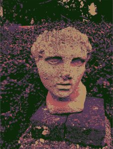
The advantage of using Fill Layers is that you can always return to the Color Picker and modify the color at any time during the process.
Gradient maps
While not exactly line art or posterization, gradient maps provide a technique for applying a colored gradient to an image based on its tonal range. It’s a simple process that can produce stunning effects that have a similar quality to posterization except that the colors blend into each other. A gradient map applies color to an image depending on two factors: the position of the color on the chosen gradient and the tonality of the image. To apply this effect, choose the Gradient Map icon from the Adjustments panel. Click on the Gradient Ramp to display the Gradient Editor.
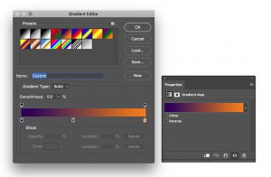
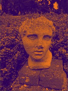
Here you can choose a gradient from the swatches list or make your own. The colors on the left of the ramp affect the dark areas of the image. The colors on the right of the ramp affect the light areas and the middle colors of the gradient affect the midtones. As you modify the gradient, the changes are displayed in real-time on the image.
Line art, posterization, and gradient maps all push the color envelope and provide interesting ways of modifying photographs. The camera sees in a very particular way that usually resembles boring old everyday reality. The Threshold, Posterize, and Gradient Map features hit the reality ball out of the park into new realms of color that can be beautiful and compelling. As usual, I encourage you to experiment with these techniques to produce extraordinary images that excite and inspire.