A reliable axiom in design is that “everything old becomes new again.” Styles in architecture, fashion, music, and art—indeed, in most aspects of culture—go through a cycle of loss and rediscovery. And it is forever fascinating to notice the ways in which each generation brings its own interpretation of preceding trends to bear.
Often, the kernel of an earlier tradition can be detected, and sometimes those influences are intentionally overt, pressed into service for the purpose of creating a particular mood or effect. Today we’ll explore the graphic style generally known as Victorian, a design aesthetic that is now enjoying its latest revival.
Early Influence
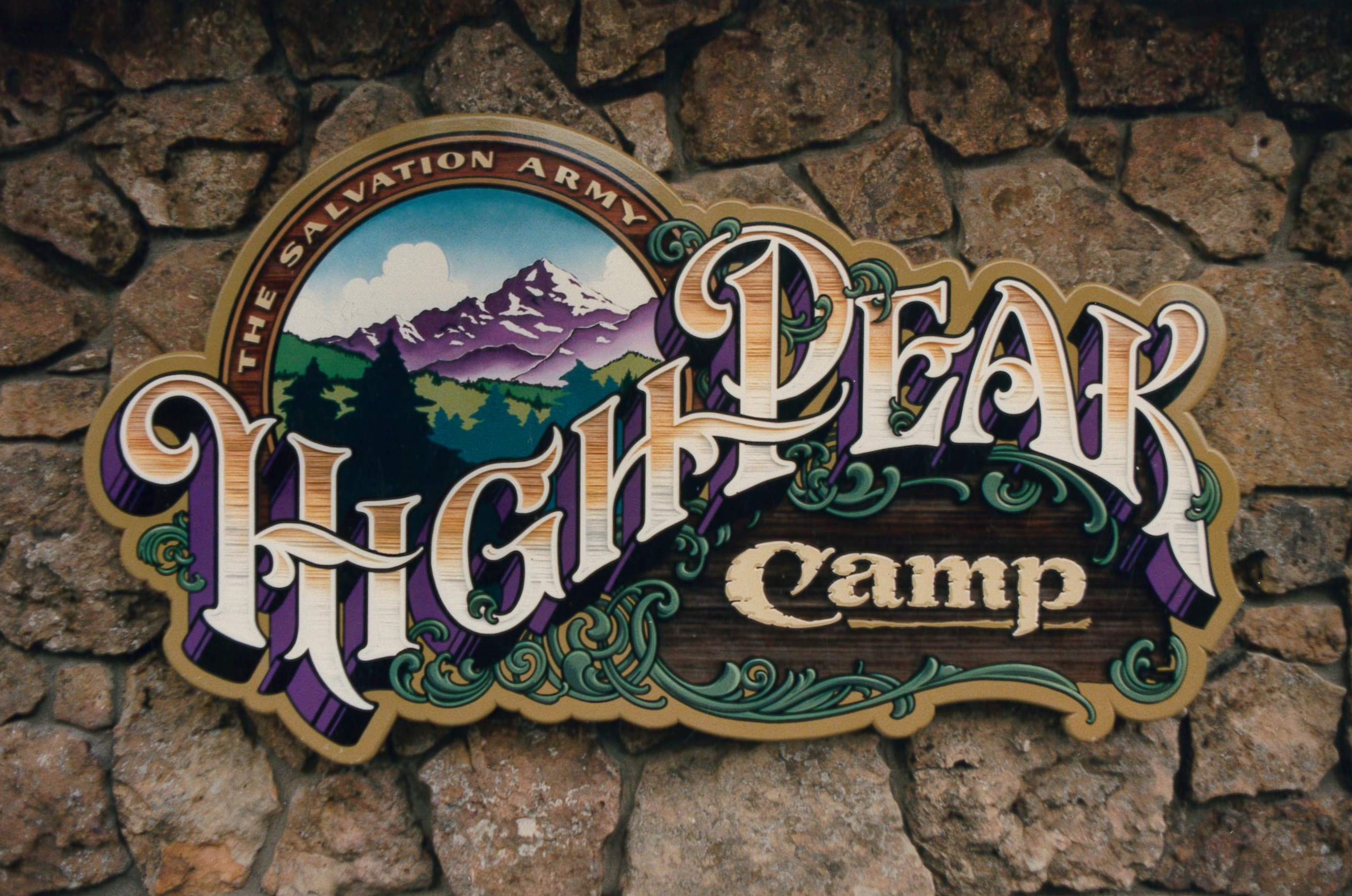
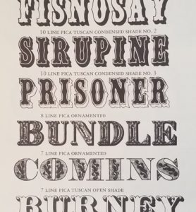
Victorian style is marked by an exuberant and unabashed celebration of ornament that began in England in the early 1800s in the period after the Industrial Revolution.
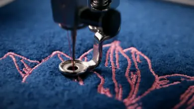
In the field of printing, remarkable and attention-getting typefaces proliferated. Letterforms were condensed and extended to outrageous extremes and festooned with all manner of spurs and serifs, replete with exotic dimensional effects. As typesetters used these tools to deliver dramatic “broadside” posters and advertisements to the marketplace, engravers and lettering artists (also called engrossers) devised opulent currency, letterheads, receipts, and official documents, all hand-drawn and imaginatively flourished with consummate artistry.
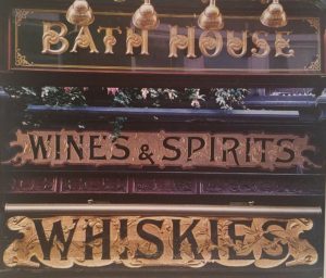
With such a riot of decoration loose at every turn, sign makers were not to be outdone. The skill with which 19th-century sign craftsmen applied themselves to the glorification of every available public space and surface (with no small assistance from the general absence of restrictive sign codes) was astounding. The trade hasn’t been the same since.
Broadened interests
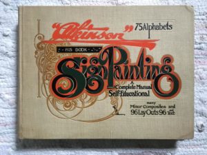
My introduction into the world of sign making and to the origins of Victorian design occurred simultaneously. In 1970, I was given a book called “Atkinson’s Sign Painting” by my then future mother-in-law. She retrieved the item from the sign studio of her recently deceased father. I believe I had gotten the gift because of my declared interest in art, but I’d certainly never seen anything like it in my 19 years.
I was utterly captivated. There were dozens of full-page illustrations. The unusual compositions, lettering, and cartouches fascinated me, as did the subject of the designs; these appeared to be antique advertisements for products long forgotten. But then I began to read the text and realized that this rare 1906 manual provided information about a craft with which I was completely unfamiliar.
The descriptions of products, methods, and theory were imparted in an esoteric shorthand, clues written in a mysterious jargon intended for the use of persons already familiar with the vernacular. The deeper I delved, the harder I was hooked. The whole thing seemed wondrously exotic. Was there still such a thing as a sign painter? If so, was it possible to learn how to become one? I applied myself then and there to discover the answer to those questions. After five decades, I am still trying to do so.
Within a few months of my exposure to Mr. Atkinson’s tome, I learned that sign painters did indeed still exist, and that many of them belonged to an organization with the remarkable name of the International Brotherhood of Sign and Pictorial Painters. The trade union offered a training program, to which I promptly applied and was accepted. After a five-year apprenticeship, I earned my Journeyman card, and the lifelong discipline of making a living, practicing my trade, and extending my learning began in earnest.
Among the things I learned was that my treasured Atkinson book had already been an obscure, late-Victorian artifact by the time I’d received it.
I then learned to respectfully accept instruction from these masters, but to ignore their prejudices. I resolved to broaden my interests in the world, and especially the world of design. I began to diligently research its history, to understand its progression, and to appreciate its infinite variation and style.
En vogue
I happened to notice in the mid-1970s that the austere, corporate look in graphics that was then popular (Helvetica, Helvetica, and more Helvetica) was giving way to a deliberately elaborate and flourished trend. The psychedelic ’60s had made their mark on Madison Avenue, and a reworked, ersatz version of “Victorian” was suddenly in vogue.
Every denim label and granola bar seemed ripe for the treatment, which had somehow gained the inexplicable cache of “organic.” Three-quarters of a century after its supposed demise, the hand-lettered charm of that earlier style seemed to be just the thing needed: wholesome, solid, and traditional. An ad-man’s pitch. Atkinson was back.
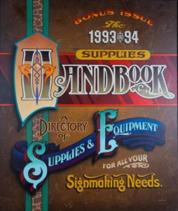
Examples of my own explorations in the form include a cover I designed for a historic National Business Media (NBM) publication called Sign Business. I’m certain my fondness for the style will be apparent; I cut my professional teeth in its pursuit. To be sure, a Victorian send-up isn’t appropriate for every situation; plainer solutions are often required.
But since you are design-savvy, you have noticed its influence in the branding of your favorite craft brew, on the latest concert poster, and in the gilt logo of the local tattoo parlor, haven’t you?
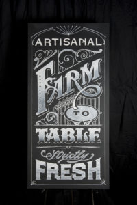
Look closely. It seems that a new crew of designers and artisans have picked up the spin, and they are making Victorian their own.