What is Pantone?
Think of it as a trip to your local Benjamin Moore paint store. Upon arrival, you will see an endless wall of color swatches from which to choose. Once a color is selected, an employee can look up the primary colors used to make the color and mix it with the proper base. All Benjamin Moore locations have the same primary colors. With a name and number, you can call any other Benjamin Moore and order the exact color with confidence.
Color schemes are an important part of branding for any business. Imagine you have a successful business in New Jersey and decide to open a second location in California. Instead of being there in person to look at and approve a color, you can simply supply a name or number of the chosen color to your contractor — resting assured that the proper branding will be painted without the need to be on site.
Similar in theory to Benjamin Moore, the Pantone Matching System (PMS) is a standard that was specifically created for the print industry. There are multiple books available depending on your print capabilities. Some of the more popular books for graphic arts printing include Solid Coated, Solid Uncoated, Color Bridge Coated, Pastels / Neons, and Metallics. True PMS colors can not be produced in most shops with a digital printer.
Only certain print shops with the right equipment can print a true PMS color. They can print their photographic process work (CMYK) and then add another plate or screen for running additional PMS colors. Pantones can also be run as a stand-alone spot color. If you have a mailer that is a one-color red, why produce it in four color process? It would be more cost-effective and look better as a PMS or “spot” color.
What is the problem?
A lot of designers do not have realistic expectations of Pantone color output from a digital press running a CMYK ink set. Some of the Pantone colors can be simulated with CMYK. Other Pantone colors are impossible to be reproduced with process (CMYK) colors. True Pantone colors can only be reproduced by mixing primary colors such as reflex blue, gold, green, and red (not CMYK) to achieve an accurate PMS “spot” color. This is typically executed in a screen printing or offset house.
If you have the chance to go into one of these shops, you will notice an endless offering of primary colors, powders, reducers, and catalysts to be mixed together to make a true Pantone “spot” color like Pantone 021 Orange, Pantone 877 Metallic Silver, or Pantone 802 Fluorescent Green. “Process colors” Cyan, Magenta, Yellow, and Black do their best work printing photographs. Spot colors can be used alone or as an additional color when printing process colors (CMYK).
Pantones are typically solid colors in the design that provide more vibrancy and consistency. While they still run CMYK for photographs and sometimes process spot colors depending on the client’s budget, they do not use the same four cans of ink (CMYK) to mix any true spot color in the Pantone book. It would be ideal, but it’s impossible to achieve.
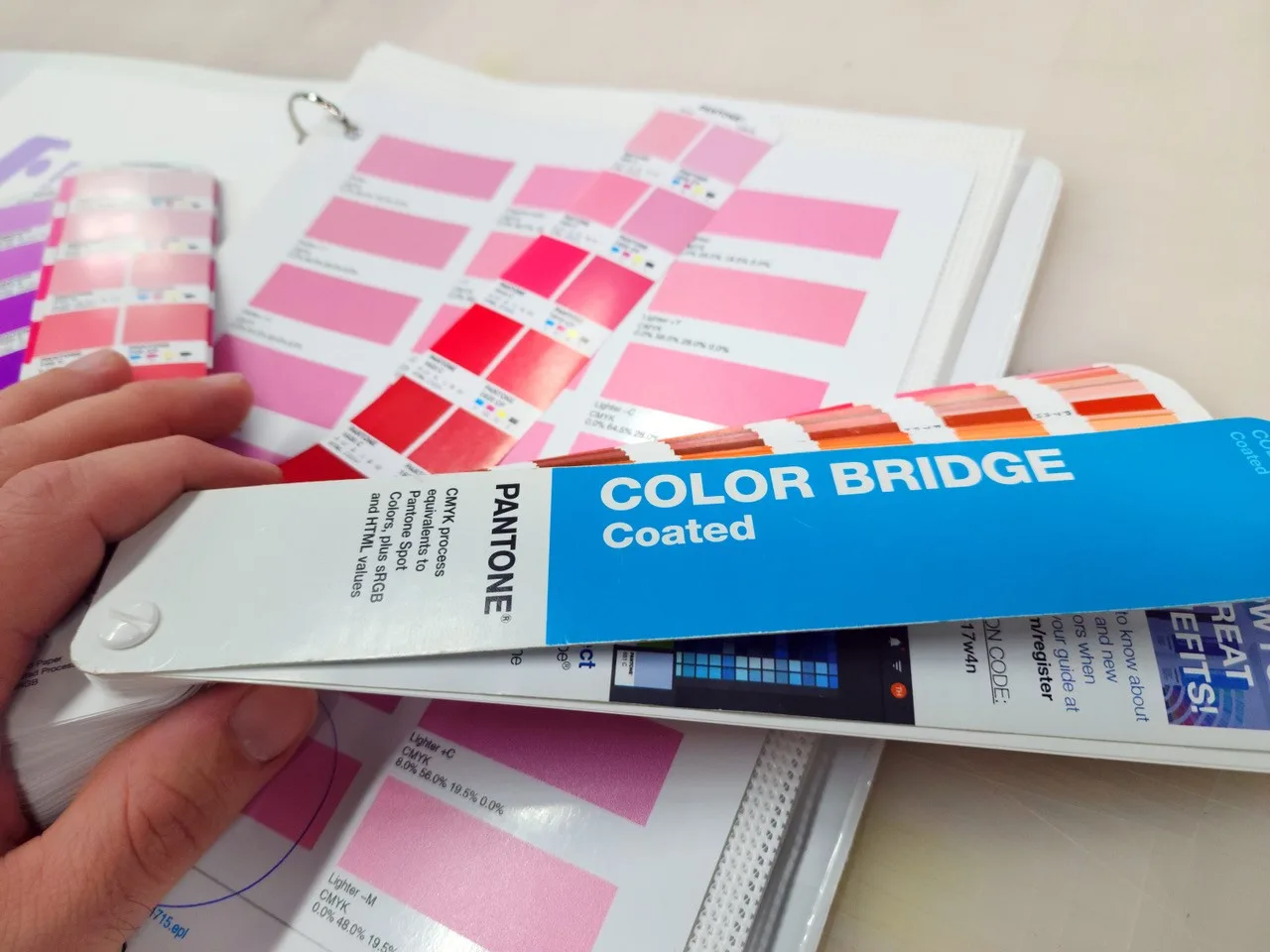
Why are digital printers expected to match Pantones with “process colors” Cyan, Magenta, Yellow, and Black? This is where the Pantone Color Bridge comes in. It’s a process that needs to be reinforced and explained to customers upfront.
How the Pantone Bridge book works
If you take a look in the Pantone Color Bridge swatch book, it clearly shows the true Pantone C (coated) color on the left. Next to it is the Pantone CP (coated process color) printed with CMYK ink. If we are printing with a CMYK inkjet, the “CP” is achievable, and the “C” is not. Explaining this upfront keeps us in good grace with our customers. It gives customers a sense of comfort that there are not going to be any unexpected surprises while working with us on this or future projects.
What about other colors?
At Vinylbomb, we do a lot of exhibition work where we are expected to match both Pantone and Benjamin Moore colors. Benjamin Moore does not have a color bridge book to see the closest equivalent in CMYK, but the same principle has to be explained.
Next time you go to any paint store, take a look at how many primary colors they have to mix colors for their line of paint. I’m sure Benjamin Moore would love to have four cans of (CMYK) paint as well to mix all the colors offered, but it is impossible.
Communication
While most of the colors are achievable with a CMYK ink set, not all of them are. A failure of your PSP (print service provider) to communicate expectations will cause frustration for all parties involved. Countless times we have been sent creative that included colors that are unachievable on our CMYK digital printers. Recognizing the Pantone names or looking them up before accepting the job will make the project a lot smoother.
Being upfront with customers and managing expectations is appreciated by them and builds trust. This is why the Pantone Color Bridge is so important.
Considerations with your printer/material
Different “white points” of material have a big effect on your color gamut. If your paper has a blueish tint, how are you supposed to print a bright yellow? Another consideration is your color ink set (CMYK, CMYKCMYK, CMYKcmyk, or Hexachrome CMYKOG).
The CMYK ink set on each printer is not always created equal. Some printers have a wider color gamut depending on how your manufacturer makes the pigments used in each ink. Other printers offer specialty colors like orange, white, or metallic. All of these factors allow you to achieve a wider color gamut that can achieve more Pantone colors. However, the compromise is the print speed would need to be cut in half as opposed to running a CMYKCMYK or CMYKx2 ink set.
Creative ways to create an unachievable color
One of my past clients was Nickelodeon. Their corporate color is Pantone Orange 021. It was a custom short-run job. Printing Pantone 021 on a CMYK device is not realistic to achieve, but it was required. We were able to create a hybrid print. We ran the banners and boards on a digital CMYK device but did not print the Pantone 021. We left that area blank so we could mix a custom color and silkscreen it on the digital print. After the digital prints were complete, we cut guides for the silkscreening process and printed the Pantone 021 orange separately.
The same effect could also be achieved with cad cut vinyl or partnering with other vendors. There are creative ways to execute tough corporate colors for clients even when you do not have the right equipment in-house.
A proactive process
Asking which Pantones are expected and taking a quick look at the Color Bridge will let us know if we can meet our clients’ expectations. When we get a Pantone color, our goal is always to try simulating the solid-coated (C) version of the color. While a lot of them can be simulated accurately, we have to accept sometimes we can only achieve the (CP) version of the color adjacent to the coated swatch. If the CP version of the color can not be matched, there is an issue with your printer’s color profile, and that would be a whole separate article.
Color rings are used to match colors in-house or to be sent out for client approval. There are variables to be considered after the ink is on paper or vinyl. If the color looks good after being printed, we then have to laminate it and view it in lighting conditions that are acceptable to the client. These could be a museum setting, lightbox, outside in the daylight, or under D50 lighting in a retail environment.
The color ring prints your Pantone color with slight adjustments to the saturation or brightness. You will typically have a group of swatch variations with shifts of the CMYK colors making up that particular Pantone build. This will allow your client to approve the proper shade that resembles the Pantone color the best with the lamination and lighting considerations.
At Vinylbomb, we print two color rings. One is sent to the client, and the other is kept in a three-ring binder for future reference. The ring includes material, lamination, resolution, printer, and uni- or bi-directional print modes so we can replicate the color and match in the future. What ends up getting approved is not always what you expect, but that is why we have this process in place.