Let’s face it, if you are reading this you most likely are not sitting in an NYC design studio creative room as part of an eight-member design team who works on $50,000 corporate branding logo packages for multibillion-dollar corporations. Then again, perhaps you are.
This article is for the design warriors out there who are disciplined to turn on their creativity at 8 a.m. and off again at 5 p.m. The folks who are leaned upon to spit out award-winning designs like they are a graphic design Pez dispenser in the hands of a 5-year-old.
This is the design market where clients don’t have an extra $50,000 in the budget for their donut shop logo, but they do have an extra $200, $300, $500, or $1,000 for a simple, easy-to-recognize design that is clever, unique and works well in the space for their sign.
The customers you are working with are typically hands-on owners who most likely mortgaged their homes to finance their dream of owning a donut shop. They are invested, they care, and they are involved in every step of the process, and you have won their trust for a logo design.
If this sounds like the customers you work with, then sit down in that chair right there and let me show you how it’s done. Well, at least how I do it.
A little groundwork…
Chances are, you are a designer with three to 10 years of experience. Perhaps you are formally trained in graphic design, perhaps not.
You are most likely someone who creates marketing pieces, visual products, labels, pen designs, brewery coasters, T-shirt concepts, coffee mug graphics, key chains, trophies, book covers, tire covers, truck wraps, window decals, banners, signs, labels and of course, logos at either a small to medium size design firm, sign company or other marketing agency.
How do you approach logo design? Which steps do you take first and why?
So here you go, you are now facing a challenging opportunity that may push your creative brain right out of your own skull.
You may have lived through this hell a few times in your past, or perhaps this is the first logo project where the perfect graphic solution isn’t just popping into your head. I’m talking about the brain squeezer logo design challenges that force you to re-evaluate why you are sitting in that designer’s chair and not living the good life as a manager at Taco Bell.
Fun, simple, quick logos are easy, and we all have those gifts of enlightenment where a literal logo vision pops into our head, you create it, show it, and the client loves it. You are then “the logo design hero” for at least a week or so until the next impossible design project is plopped onto your desk, and you must prove your worthiness as a creative designer all over again.
An outline of the process
I have used these steps since the dawn of my career nearly 40 years ago. It works very well for me, and perhaps some of the ideas may help you navigate the forks in the road and avoid the speed bumps that can upset the apple cart of your creative process.
1. Get your client to talk to you
Building trust with your client is key to any successful logo design project. I’m not talking about the initial meeting where the overall project was discussed. Set up a time to talk to your client in a “logo interview” where you either provide questions or interview them to find out what they want, what they expect, and what their history or experience is on purchasing logos in the past, for other companies they may have had or worked at.
Here are a few questions to work into your conversation with your client.
Do not interrogate them. This is not an FBI interview; it’s a relationship-building meeting to hopefully allow your client to be comfortable enough to open up to you and explain what they really want the new logo to look like.
2. Discover your client’s likes and dislikes upfront
The spin on this option has only been around since Google and Bing images came into existence. In the olden days, we used magazine clippings to do the same thing. I ask the client to search online for certain keywords that will bring up images related to their industry.
I ask them to look at the images and pick out three they like, and three they don’t like and send them to me. This process is amazing at narrowing down the size of the design forest you are navigating through. It allows you to look into the client’s head to discover their likes and dislikes without drawing up examples to illustrate the same thing.
3. Identifying the end-viewer expectations
Who is the customer that will be viewing the logo and what design, image or graphic will they respond most favorably to? Is your product unique, rare, or not something used every day? It’s critical to be clear and concise in both readability and visual clues to help all of the first-time viewers of the logo (the potential new patrons of the business).
4. Outline the uses of the logo
How will your client be using the logo? If it’s for their website, where else will they be using it? What will they use the logo for regarding their products and services they offer? Will they need stickers, labels, pens, hats, uniforms? How about a sign? How about social media uses?
The ways that your client will be using the logo controls how the logo needs to be designed. There is a rule of thumb in logo design that I came up with forever ago that I have yet to find an exception to, and that rule of thumb is this: Design your logo to be readable on a sign at 100 feet away, and it will remain readable at any size, no matter how small you make it. Design the logo for viewing at arm’s length, such as on a smartphone, then it most likely will not be readable at a long viewing distance.
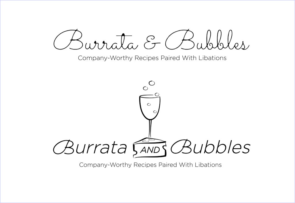
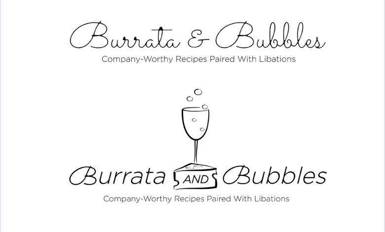
Case study 1: Burrata & Bubbles
Illustrating point No. 3 is a logo I helped fine-tune to present a “more visually informative graphic” that tells the eye precisely what “Burrata” is in one quick look.
Amanda McGrory-Dixon, the owner of Burrata and Bubbles, had an original logo that was very lively looking — bubbly would be the most appropriate phrase and one of its features was actually hindering its function, and that was the readability of the font.
From a glancing distance, not only was Burrata a fairly uncommon term in most circles, the loops and hoops of the letter style, combined with the unstable italicizing that some fonts have, and it was a less-readable-than-desired approach that simply needed some clarification for the viewer. I didn’t want to completely abandon the branding efforts she has successfully attained, so I left the original B font in place and combined it with a cleaner font. The icing on the cake was the graphic that may not directly describe what Burrata is, but the graphic indicates that it must be cheese, since the “bubbles” aspect is represented by the champagne glass. I played with the cheese and glass a few times before Amanda chose the logo assembly shown here. It was tough because burrata cheese is the shape of a lump of something in cheesecloth. It has very little iconic impact and there was nothing available that even came close to representing it so that anyone seeing it might say: “Oh hey, hot burrata, let’s eat!”
“As a foodie, I’m obsessed with burrata and mistakenly thought everyone knew it was a cheese, but over the years, I found that’s not quite the case, Amanda says. “To me, this (revised logo) gives the reader an instant idea of what kind of recipes they can expect.”
She goes on to say, “I’ve seen some logos, especially in the food industry, that try to cram in too many elements, and your eyes don’t know where to focus. It’s also important to keep in mind how it will appear online, particularly on mobile devices.”
Pictured is her original logo, and her new one. The graphic elements are all hand-drawn originals I created for Amanda’s new logo to capture the quintessential graphic image that says it all about her food blog.
Case study 2: Hamblen Hats
The client approached me with the need for a mark for his new custom hat shop in Ault, Colorado. It had to be bold, unique, recognizable, easy to reproduce on any and all surfaces and mediums, and it had to tie in the name with the product into one, clean, iconic logo mark. Yeah, sure.
If I were to say that this creative process forced me to remove my brain from my head and stomp on it a few times that would be an understatement. Holy smokes, what a brain-strainer.
I encouraged my client to go online and find ideas he liked, but there were none that were going in the right direction. He knew it, and I knew it. I was in a pickle and already had blown through three other concepts and burned up a full week on ideas that were going nowhere.
I knew deep inside I had to organically create the mark as it had to pass the attorney’s trademark process. Also, it had to say what the product was without words, in one quick glance.
On top of that, his customer demographic was all over the place. It went from 6-year-old mutton-busters to 90-year-old wranglers. It’s also the other custom hat passions that have nothing to do with cowboy hats. Yeah, this was not an easy assignment.
My secret design tool
It was about 9 a.m. on that very exciting morning when I called upon my secret design tool, and it came through like it typically does. It was evident that I was not coming up with anything earth-shattering, so I took a minute to step back, prayed about it, and with that I was able to relax my thought process and back off from the direction I had been going. I was overthinking the whole thing, and it’s easy for a designer to do.
I grabbed my other pocket-sized go-to design tool and that is my trusty Flair Felt Tip marker and started with what I figured was the core of the logo, and that was a circle.
As my hand drew the circle, I knew it had to be a circle because hats are round, like heads, and so I drew the circle and placed an H inside of it… hmm.
“Now what” I said to myself, looking at this very nondescript boring start. I wasn’t impressed yet. I had seen this heavy bold initial in a circle done hundreds of times on corporate marks, but this mark had to scream HATS, but how?
Suddenly it appeared in my mind’s eye, like a fog clearing from the valley. I saw it, and I knew it was right, and with one fluid, smooth curved line I created the brim of the hat across the H and the Hamblen Hats logo mark magically appeared.
I nailed it, and I knew it beyond a shadow of a doubt. Additionally, my research had assured me that this approach, this look, for this custom hat company was completely original and most likely markable.
I had to show it to my client immediately, so I took a screenshot and sent it to him on his phone. Yes, those of you who know me realize I do not recommend doing this, ever. I always say, “Take the time to present the logo properly, giving it its proper introduction” and this is something I have stood by firmly with the designers I train in my classes.
This logo was hot, it worked and when my client saw it, he started crying. He too, being of strong faith knew this logo was a blending of my talents and God’s will for his business.
This is the emotional paycheck that defines why I have stuck with this industry since 1985. It’s most likely why you are in it also — to capture that same type of “thank you” gratitude from a client is priceless, and it’s what we all live for. Providing a logo to a happy client doesn’t get any better than this. Period.
Creative inner-spiration source
What is your creative inner source? Have you identified it yet? Take time to stop, think, listen, and follow your own inner creative inspirational resources (it’s the mojo that separates you from the accountants).
This is the voice in your head that provides you the drive, focus, passion, and desire that helps propel your creative brain into the direction the design needs to go.
The simple fact you are reading this means you are aware of this creative source, but you may not have recognized nor realized you can tap into it, like a tool whenever you need it, and you can absolutely lean on it at any time for the inspiration needed to get through a tough design project.
Every creative designer or artist who sets out on a creative process with a result in mind depends on tapping into their own private, inspirational source for the “WOW-NESS” factor. This is needed to provide the creative drive, passion, and abilities that help them avoid pursuing the accounting degree they never ever wanted.
I hope this outline has helped you define the logo design process or at least helped you realize there really is a creative drive you can tap into and use to make the creative process easier and faster, and ultimately more fun for you and your customer.