Getting all the right information about an order is useful in setting up the personalization. When in doubt, ask before you begin the design. Spending precious time designing and then finding you are way off base is frustrating and wastes time.
Here are some questions to ask customers to help you get all the information you need:
- Should it be centered or left justified?
- What font do they want?
- What is the overall style desired?
- Is a script font appropriate, or were all caps requested?
Once you have these details hashed out, you can start to do the design within these parameters.
Design considerations
When choosing a font: Make sure the lines in the letters are thick enough to be readable when personalized. Its readability depends on the personalization method, material type, and contrast between the material color and actual personalization text/graphics.
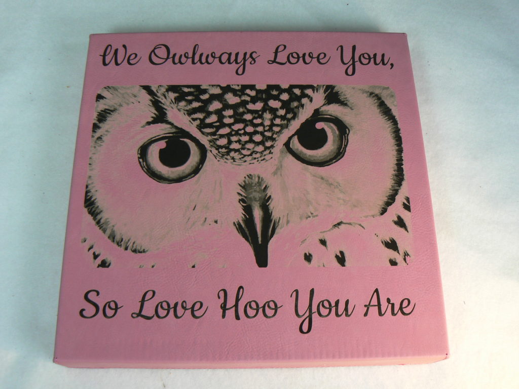
When the client requests all caps: As mentioned above, I typically choose or ask for permission to use large and small caps. It is easier to read and looks nicer.
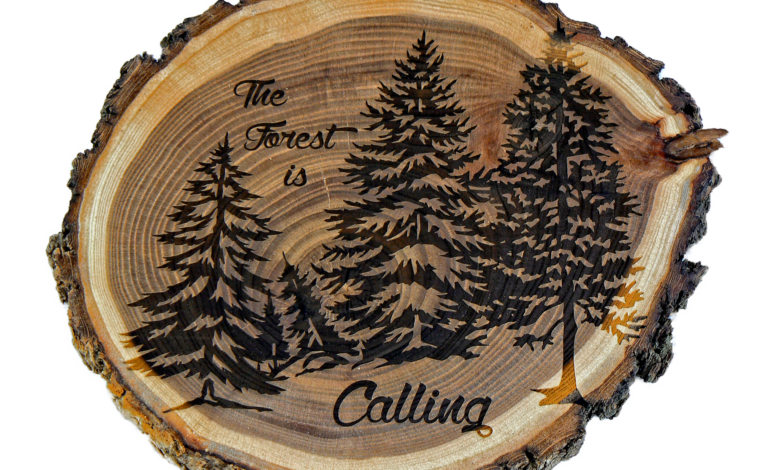
If you are laser engraving the personalization: A thin outline around the text or any other objects in vector art may be read by your laser as a cut line. If you do not intend for the laser to cut, turn the text or graphic into a grayscale bitmap. I select 600 DPI as the resolution to make sure I get just the added thickness I want.
Graphics can be a challenge: Especially if supplied by the customer. Very few people understand the difference between a bitmap and vector graphic or even what resolution is. If a small bitmap must be sized up to print, etch, or engrave, the quality may not be high enough to get satisfactory results. I tend to vectorize most every graphic I use. There are exceptions; however, there are several quality tools available that will aid you in turning a bitmap into vector objects that can have each object be turned to a selected color or grayscale. You will also be able to enlarge the graphic as much as you need to without losing resolution.
If you are not getting the best vectorization results, try erasing some of the small grit around the lines in the bitmap using your bitmap editor. You don’t have to make it perfect. Getting rid of the thickest groups of dots or grit should improve your results.
Are you looking for more tips and tricks on creating custom gifts? Check out the Custom Gift Annual.

