Sometimes, the customer won’t have a grayscale image or logo that is ideal for laser engraving. It’s not the end of the world, but it does require a few extra steps on your end prior to engraving. More often than not, the greater the number of colors or shades of a color, the more likely a simple conversion to grayscale can be done on your laser’s software. But if you find that it doesn’t look quite right, perhaps consider the manual method. It gives you the most control, allowing for best contrast between colors. Use the following guidelines to learn how to adjust your own graphic…
Materials Needed:
- Vector image
- Graphics software
- Wood (See Step One for further clarification)
- Laser system
Step One: Choose the right wood type for your specific graphic
Wood is the ideal material to laser engrave with grayscale. Results vary widely by the color, so choosing a type of wood that complements the graphic is an important step.
Lighter woods display the shades and depth differences much better than the darker-toned woods. However, the more oil that is left in the wood, the darker and deeper it lasers given each shade of gray. Sanded and finished woods are best. Well-sanded wood shows the grayscales better, and finished wood cleans easily.
Step Two: Convert colors to appropriate shades of gray
In your graphics software, select each shade of the graphic individually.
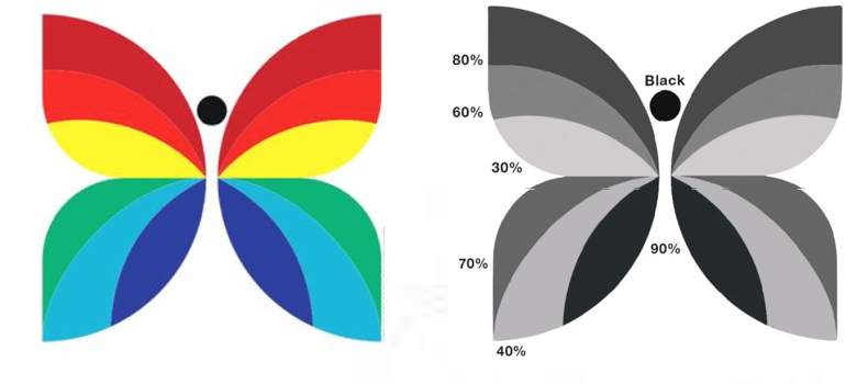
Converting color to grayscale looks most authentic when light tones become light shades of gray, and darker tones, darker shades of gray. White and black with three shades of gray is the maximum range that works well for most projects. Darker tones such as navy blue would become dark shades of gray, such as 70 percent. Yellow would become 10 percent, and red, a fairly neutral tone, would become 50 percent black.
The larger number of color tones you need to represent, the less distinction between gray tones is necessary. If the client is looking for finer or more subtle levels of differentiation, perhaps five gray shades will give good results. When selecting shades, leave a minimum of 20 percent between shades; 30 percent is better. If you only need two shades (along with black and white), for example, 30 percent and 70 percent work well.
In this example, the butterfly has a pure black circle as the head. The wings are split into two sections: the top has three shades of gray from 30 percent as the lightest, 60, and 80 percent as the darkest. The bottom section also has three shades, each differing by the same amount as the top section; however, they start at 40 percent, then 70 percent, and the darkest is 90 percent.
Step Three: Engrave
Send the new graphic to your laser. If you used an unfinished wood, it will likely need a light sanding to remove all of the soot from lasering.