


Lately, television and movie-going audiences are seeing a resurgence of intelligent, creepy horror shows. From “American Horror Story” to “Castle Rock,” to “Get Out,” the things that go bump in the night seem to be making a big comeback in the fantasy world of film and video.
To celebrate the resurgence, the Digital Eye will demonstrate some of the cool techniques commonly used to create artwork for the promotion of the horror genre. You’ll see how to compose a compelling picture that draws the eye, generates eerie background and texture effects and seamlessly combines visual elements that are both spooky and believable-and “over the top.”
Thumbnails
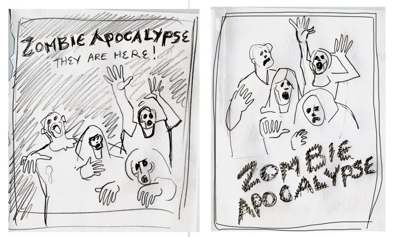
I like to start the design process by roughing out a few thumbnails on paper to get the creative juices flowing. With a marker, pencil or tablet, envision what the composition will be. These drawings don’t have to be great works of art as they are done quickly. You can knock out ten or so of these thumbnails in a few minutes. As quick and dirty as they are, thumbnails are essential to generating ideas and loosening up the eye and the brain. Combine the elements of two or more sketches until a general idea emerges. If there is going to be type, rough it in for placement in the sketch (see Figure 1).
Decisions, Decisions
At this point, you’ll want to make a few critical decisions about what “look” you’re going for, and of course that depends on what movie you’re promoting. In this case, we’ll be promoting the ever-popular zombie genre. The movie’s title is “Zombie Apocalypse.” The poster needs a few undead-looking fiends, a lot of blood and gore and don’t forget the grungy background.
Source Materials
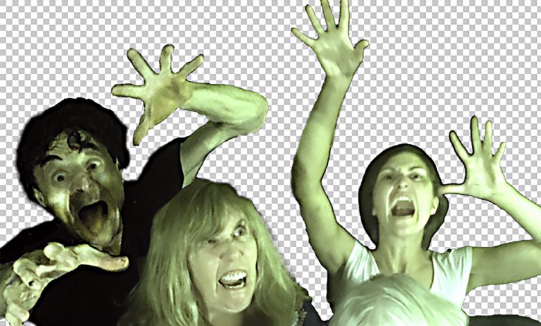
As with any project you’ll need to start out with the good source materials. Bear in mind that the original photo(s) are going to be heavily altered. Nonetheless, composition, lighting, facial expressions and dramatic elements all need to be at their best and appropriate for the TV show or movie the poster is promoting.
You’ll no doubt be using multiple images so compile a group of pictures that lend themselves to your design. Accumulate more images than you need use so that you can choose the best possible configuration of elements (see Figure 2).
Alterations
Make any alterations to the image including color correction and replacement, sharpening, adding or replacing elements, smoothing out backgrounds and resizing to the final dimension (see Figure 3). At this point, although my models have the proper grimaces and contortions on their faces and hands, they are hardly zombies. They need to be zombified-and that’s where the fun begins.
Separation Anxiety
It’s best to separate the zombies from their background enabling focused control over these two important elements. If I separate the content, I can apply effects and adjustments to the zombies without affecting the background. First, create a Hue Saturation adjustment layer to slightly desaturate their flesh tones and add a slight greenish pallor to their skin. They are undead after all. A Levels adjustment layer and a bit of sharpening enhances the contrast (see Figure 4 A, B).
Minor Details
As I work, I see details that I want to change, like the dress (I changed it from purple to dark gray) and the tongue of the scary guy on the left was asking to be painted red (see Figure 5). Although it’s probably better to add or modify details in the original file, there is no particular order to changing minor details. It’s okay to make changes at any time. As you experiment with different effects, you’ll have insights and ideas that will require editing as you proceed. To make this process more efficient, make a separate “details” layer to tone or modify specific areas. You can paint directly on the layer superimposed over the layers below and then apply blending modes or opacity adjustments to produce the perfect balance of color and content.
Textures
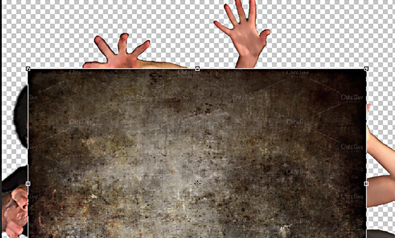
Grungy textures lend themselves to the dystrophic feeling of the Zombie Apocalypse. I found two textures online that I used in this image but believe me, if you Google “grungy background textures” you’ll find hundreds of them. They are frequently smaller than the image and will have to be scaled to fit (see Figure 6), but don’t worry about pixel degradation when scaling. The textures don’t need to appear crisp and sharp especially if you are planning to apply blending modes and opacity adjustments.
Duplicating Layers
In this particular image, the original Zombies layer was duplicated two additional times. Experimenting with blending modes and opacity adjustments produced the grainy gray-green colors. The result is that the textured backgrounds and the figures blend nicely and the whole picture takes on a textured surface. The stacked, duplicated layers in combination with layer masks, blending modes and opacity enable the precise interplay of texture, color and content (see Figure 7).
Bloody Brushes
I found some blood brushes for free online (see Figure 8). The secret to using them is to paint directly on a new separate layer and to use a different brush for each stroke. Adjusting the layer’s opacity and applying a blending mode blends the blood into the skin, and a bevel and emboss layer style gives the blood a subtle three-dimensional surface.
Horror Type
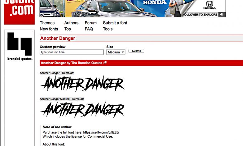
Just like brushes, there are dozens of horror fonts available online (see Figure 9). This particular font is called “Another Danger Slanted” and I got it from Dafont.com. The text has a stroke, color overlay and drop shadow layer style applied to it. The lines of type are on two separate layers so that they could be rotated independently.
Vignette
A vignette, when correctly applied, focuses the attention of the viewer to the center of the picture plane. It works particularly well on this horror poster because it makes the figures appear as though they are emerging from darkness. To make a vignette, first, make a new layer. With the Elliptical Marquee tool, draw a large elliptical selection that almost touches the edges of the picture (see Figure 10). Inverse the selection (Select > Inverse) and fill the selection with black. Deselect and apply the Gaussian Blur filter to the layer. Finally, adjust the opacity of the layer until the effect is achieved.
Tweaks
After all the content is in place, it pays to go back in and readjust the Levels and Hue/Saturation adjustment layers and play with the various blending modes and opacity adjustments you’ve attached to the layers. Now is also the time to tweak the content if necessary. Try clicking the visibility icon of each layer on and off in the layers panel (Figure 11) to see how it adds to the entire image. With experimentation, you may discover a few different looks that significantly change the feel of the poster. You’ll have to decide which set of configurations best suits the content. In the case of the Zombie Apocalypse poster, will it be bloody or Really Bloody? These final steps can provide choices, two of which can be seen in Figure 12A and 12B that really push the poster over the edge. For the horror movie genre, over the edge is an extremely desirable goal to strive for.