I refer to the most frequently used color correction techniques as the Big Four. Brightness and Contrast, Levels, Curves, and Hue/Saturation are the nuts and bolts of color and contrast adjustments that refine an image and make it pop.
It’s important to know how to use these features because they are crucial to producing quality images that are void of color casts, have superb contrast, and are rich in tonality. You’ll find versions of the Big Four in many software packages, and even on some scanners and digital cameras.
There are, however, lesser-known features in Photoshop that I’d like to pull out of the dusty old color closet. These tools aren’t used as often as the Big Four, but because they approach color manipulation a little differently, they are well worth exploring with the expectation that they will extend your capabilities even further.
Calibrate and measure
Before you begin applying any color modification features, determine what the colors on your monitor represent. Calibrate your system using built-in software or, better yet, hardware devices such as a colorimeter and a spectrophotometer to create an ICC profile that displays accurate color and contrast qualities of your monitor and printer before performing color adjustments.
With a reliable image displayed on screen, view the image’s histogram to determine the range of colors in each image and measure a specific white point or black point with the Color Sampler tool and the Info panel. Adjustments are more accurate and better controlled when applied in a calibrated workspace.
Adjustments Panel
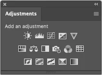
The 16 different icons in the Adjustment panel enable the manipulation of the color and tonal properties of an image (see Figure 1). When you click on an adjustment icon, an Adjustment layer is automatically generated, and the Properties panel displays specific controls.
A layer mask is also generated so that the opacity and position of the adjustment can be designated. The obvious advantage of using Adjustment layers is that they can be accessed and edited at any time to maintain the all-important non-linear workflow throughout the image editing process.
Exposure Control
Had enough preliminaries? Let’s get started with the actual techniques! One of the most common miscalculations when an image is captured with a digital camera is the exposure. Usually, photographers guard against under- or over-exposure by bracketing.
Bracketing consists of shooting a series of pictures with a variation of exposure of one half to one full stop. This works well when a picture is planned, but it isn’t possible for one-of-a-kind candid shots. Indeed, it can be quite frustrating if the picture is taken exactly at the right moment with perfect composition and the exposure is too light or too dark.
The Exposure adjustment is designed to lighten under-exposed images and darken over-exposed images. It was originally developed to correct a bracketed series of images being converted to 32-bit HDR images using the automated Merge to HDR Pro command, but it works equally well with 16- and 8-bit images.
The panel consists of three tonal sliders:
Exposure adjusts the highlight end of the tonal scale with minimal effect in the extreme shadows.
Offset darkens the shadows and midtones with minimal effect on the highlights.
Gamma Correction: Gamma is the relative bright and dark value of the image. It defines how the numerical value of a pixel relates to its actual brightness. It affects how a digital image looks on a computer screen. If an Image appears flat and lacks punch, drag the slider to the right to enhance the overall gamma.
Eyedroppers: These little icons adjust the luminance (brightness) values.
•Black Point eyedropper sets the Offset, shifting the pixel you click to black – zero (0).
•White Point eyedropper sets the Exposure, shifting the point you click to white – (255).
•Midtone eyedropper sets the Exposure, making the value you click middle gray-(128).
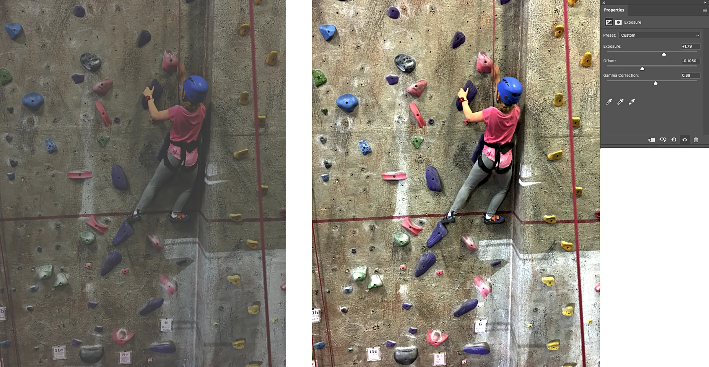
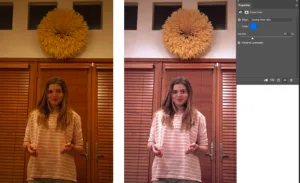
You can see the results of an exposure adjustment in Figure 2. This underexposed image was completely transformed with a robust Exposure and Offset adjustment and a modest Gamma tweak. The results are dramatic but quite different than applying a simple Levels adjustment. Specific areas of brightness in the overlapping ranges of highlight, midtone, and shadow have been targeted and modified.
Photo Filter
Warming or cooling an image might just be what is required to smooth its overall tonality. The Photo Filter lets you apply the effects of traditional photographic filters by producing results that are commonly used by photographers to warm or cool the colors of an image, reduce glare, or simulate a specific atmospheric environment (see Figure 3). In the panel, choose a specific filter from the menu or a specific color by clicking the swatch. Control the amount of the color by moving the density slider between 1 and 100 percent.
Within the menu are specific color filters. For example, Warming Filter (85 and LBA) and Cooling Filter (80 and LBB) are color conversion filters that target the white balance. If an image was photographed at a lower color temperature of light, it will appear yellow.
The Cooling Filter (80) moves the colors toward the higher temperature range so that they appear bluer to compensate for the lower color temperature of the ambient light. Conversely, if the photo was taken at a higher color temperature of light, it will appear blue. The Warming Filter (85) will reduce the blue by adding yellow.
If specific filters aren’t what you want, any color can be specified by clicking the swatch and choosing it. Individual Colors apply a hue adjustment to the image depending on the color preset you choose. Your choice of color depends on how you’re using the Photo Filter adjustment.
If your photo has a color cast, you can choose a complementary color to neutralize it. You can also apply colors for special color effects or enhancements. For example, the Underwater filter simulates the greenish blue color cast in underwater photos. Check the Preserve Luminosity option to apply the filter without affecting the tonality.
Good Vibrance
Click the triangular-shaped Vibrance icon to adjust color intensity with minimal clipping as colors approach full saturation. Vibrance increases the saturation of less-saturated colors proportionally more than the existing intense colors. It also guards against oversaturation in skin tones.
Note: Clipping occurs when the color values of a pixel are higher than the highest value or lower than the lowest value that can be represented in the image. For example, the Saturation control in the Hue/Saturation panel uses clipping to hyper-saturate colors at the extreme of the adjustment. Overly bright RGB values are clipped to output white, and overly dark values are clipped to output black. The result is a spiking of color intensity and a loss of image detail.
Vibrance enhances color without clipping. Drag the Vibrance slider to the left to increase or to the right to decrease color saturation. To apply the same amount of saturation adjustment to all colors regardless of their current saturation, move the Saturation slider. In some situations, this may produce less banding than the Saturation slider in the Hue/Saturation Adjustments panel.
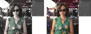
To decrease saturation, move either the Vibrance or the Saturation slider to the left. You can see the different results in Figure 4. Diminished vibrance produces soft pastel-like colors. Increased vibrance intensifies colors without the harsh intensity of hyper-saturation.
Balancing Act
The Shadow/Highlight command quickly corrects over- and under-exposed areas of an image. Unfortunately, because of its complexity, this adjustment is not represented by an icon in the Adjustments panel and therefore does not produce an adjustment layer.
Access the dialog box from the Image > Adjustments >Shadow/Highlight menu. Shadow/Highlights is a tonal balancing act. It uses an adaptive algorithm that controls luminance by assessing the RGB values of neighboring pixels. This enables the image contrast to be increased in the shadows or highlights without significantly sacrificing contrast in the other tonal regions. It’s especially good for restoring detail in over-exposed or backlit images.
The sliders represent several aspects of the adjustment. It’s best to check the Show More Options box to access all the controls.
Amount
This slider controls the strength of the adjustment to each pixel. Larger values provide greater lightening of shadows or greater darkening of highlights.
Tonal Width
The Tonal Width slider sets how much modification will be applied to the different tonal regions. For example, you may want to darken only the lightest highlights, or lighten only the deepest shadows. When correcting shadows, small values of tonal width emphasize the darker regions and larger values include more of the midtones and highlights.
Radius
The size of the neighborhood over which the luminance is averaged depends upon the Radius setting. Every pixel is modified depending upon how dark or light its neighbors are. The larger the radius, the larger the extent over which the neighborhood luminance is averaged.
Color Adjustment
After you’ve applied the Shadow/Highlight command, you may find that the image has acquired an undesirable color cast or has significantly reduced saturation. Drag the Color Adjustment slider to the left to diminish the over-adjustment. Moving the slider to the left decreases the saturation of the image. Moving it to the right increases the saturation.
Midtone Contrast
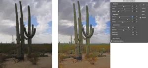
Increasing or decreasing the midtone contrast produces an overall contrast adjustment that may be just what you need to really pop the image as in Figure 5.
The Black and White clip percentage fields enable you to enter a value for the amount that absolute black and specular white will modify. By entering a value of 5%, for example, the value of 95% black will be increased to 100%, and all other colors will be remapped accordingly so the image will appear darker.
Out of the Closet
The four under-used techniques I’ve pulled out of the color closet in this article are powerful, direct, and easy to perform, and they usually produce great results! They are typically employed under very specific conditions. The challenge is to assess the image and find the best solutions for color correction.
Often, it’s a matter of combining multiple techniques. Knowing about these special features will expand your abilities so that when confronted with a problem image that doesn’t directly respond to the mechanisms of the Big Four, you can experiment and find the perfect solution.