Selecting embroidered fonts for workwear is similar to selecting fonts for any project, at least at first. You should think about the viewer, the audience for the apparel that you are decorating as well as the desired effect the decoration will have. For instance, if you are selecting a typeface for personalization, you want something that is legible, clear, and that can easily fit a number of characters you expect to use in the decoration area intended for the names or titles in question.
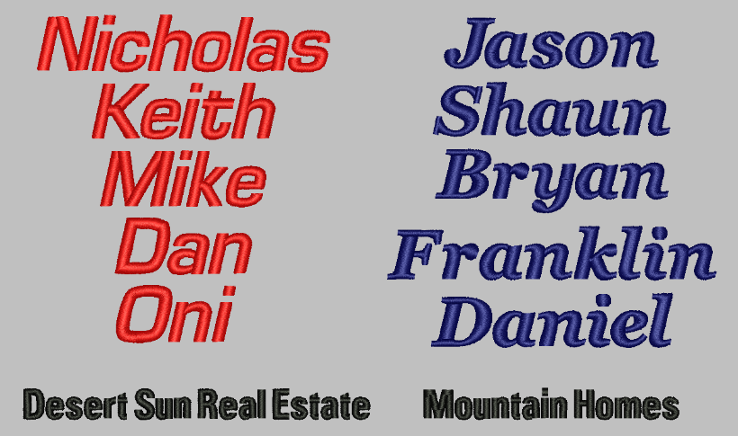
If you are decorating a classic work shirt with a single first name on the right chest, you likely won’t have to fit a long string of characters and can use a bold, square aspected font with open counters and apertures to make it very legible and fill the space readily. On the contrary, if you are decorating lab coats in the same right-chest area and need to fit a doctor’s first and last name with all of the attached titles, and the hospital in question requires this text to sit on a single line, you’ll need a narrower, condensed typeface. A thin and condensed font will ensure all of the necessary information fits in the available area and can still stitch legibly and without technical difficulties. With all that in mind, here are some further tips to help you select fonts and make them work for your next workwear project.
Never substitute logotype fonts
If you are digitizing a company’s logo or wordmark, never use an almost matched stock keyboard font to replace text in their branding. Even though it may be “just text” or you digitize other graphical elements, altering or replacing logo text damages the branding and makes your decoration look like an amateur effort. If it’s in the logotype, it’s important enough to be custom digitized.
Coordinate with existing branding
First, check with the company or with the main franchisor to see if they have typefaces specified in their style guide-you may have the selection made for you. Second, if the company in question doesn’t have a guide, look at the characteristics of their logo and complement them. Do your best to match the tone of their logo. If their logo has a clean geometric look with 90-degree angles, a nice square European sans-serif block might match well with their branding. If their logo is light and airy, use a typeface with thinner strokes and open space.
Judge at the “handshake distance”
Type on apparel is very unlikely to be seen at a distance of fewer than 3 feet. Judge the legibility and look of your selected type from at least this distance to see exactly how it will appear to a casual viewer. Any important text should be legible when viewed from the distance of a comfortable handshake between the wearer and the viewer.
Deal with durability
With jacket-back applications, large decorations featuring fonts that have bold strokes can result in wide satin stitch columns that are easily snagged. For garments worn by construction workers, contractors, landscapers and the like, these long stitches are often the first point of failure. Mitigate this by rendering your text in a split-satin stitch, or, better yet, short fill stitches with a narrow satin-stitch border. Smaller stitches stay tighter to the garment surface and are less likely to snag, making them more likely to survive the occasional scrape.
Consider going custom
For clients with large workforces or high turnover, it may be worthwhile to create a custom embroidered typeface specifically for their usage. If your software doesn’t feature their font, or their style guides feature a typeface for print that doesn’t have a pre-digitized counterpart for embroidery, you might consider digitizing or contracting a digitizer to create a custom stock typeface featuring their branding so that you can quickly and easily render personalized garments for their company. The investment makes your product look professional and coordinated, and your ownership of the custom embroidered font helps ensure customer retention.
All in all, selecting a typeface for workwear doesn’t need to be difficult. Just keep in mind the use of the garments, who is wearing them, what the important information is that you need to convey, and when durability matters.