Color is one of the most significant factors in our visual experience. Humans react to color emotionally. Cool, subdued colors can calm our senses, and warm, saturated colors can excite and motivate us. Color affects the decisions of our daily lives, such as whether we purchase a certain product or whether to cross the street. It affects our physical and mental state and contributes to our sense of well-being.
Color mapping
Because color plays such an important role in our lives, how we use it to visually communicate ideas is essential to the success of our images. The term “color mapping” refers to operations that go beyond brightness and contrast adjustments and simple color fills. These operations provide the means to alter the basic characteristics of color without compromising image detail. They are used to change the entire color scheme of an image or to create eye-popping graphic effects such as brilliant color transformation, high-contrast art, gradient-based colorization, and vibrant posterization. There are also new AI techniques that produce astonishing color shifts.
Image editing software packages such as Adobe Photoshop and Corel PaintShop Pro provide a plethora of features that map color. This article uses Adobe Photoshop to demonstrate these features.
Adjustments
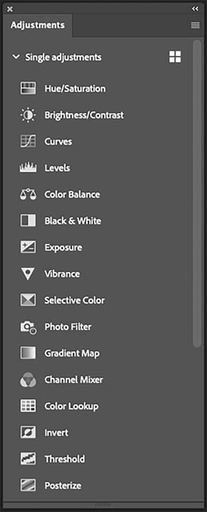
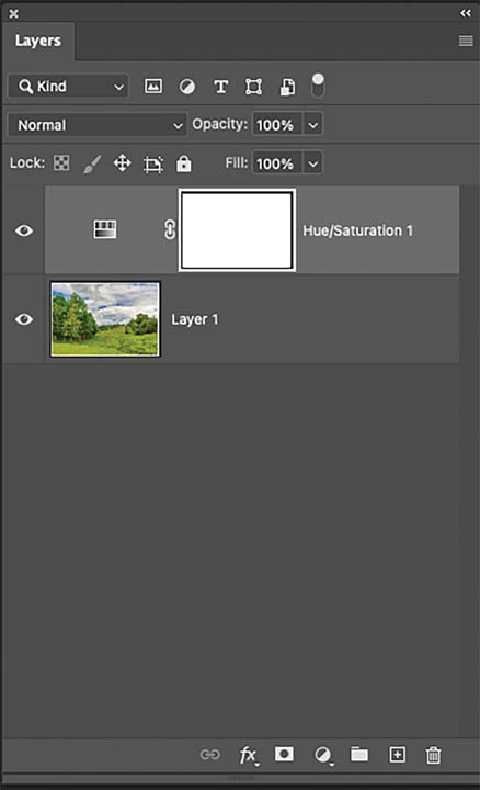
The color-mapping operations are found in the Adjustments panel (Fig. 1). Keep in mind that when an adjustment is performed with any of these techniques, a new adjustment layer is automatically generated along with a layer mask, so that the adjustment can be altered or concealed at any time during the workflow. (Fig. 2).
Changing the hue
The most basic color mapping process command is the Hue/Saturation control that alters the three basic color characteristics of an image: hue, saturation, and lightness. Dragging the Hue slider to change relative color relationships of the image or selection, can produce some beautiful and unexpected color combinations, changing the reality of an everyday landscape into a brilliant fauvist work of art. After all, who can resist the temptation to transform an everyday blue sky into an electric green and ordinary green foliage to an explosion of pink and red? (Fig. 3).

By default, the numbers you see in the Hue field are based on the affected color’s position on the color wheel and are expressed in degrees. Values in the box reflect the amount of rotation from the original color. Dragging the slider to the right, to a positive value, indicates a clockwise rotation of the color wheel. Dragging it to the left, to a negative value, indicates a counterclockwise rotation.
The colored bars at the bottom of the panel are a graphic indicator of how the colors change as the Hue slider is dragged. By default, the color bars are aligned. The top color bar represents a color wheel that has been cut at the 180 degree point, or blue. As you drag the Hue slider, the top color bar remains in place and represents the entire range of colors prior to the change. The bottom color bar is dynamic and realigns with the colors on the top bar to reflect the relative change of colors.
Targeting color ranges
The pop-up list at the top of the panel targets a specific range of colors. The colors are divided into basic color ranges of 90 degrees each, including the overlap (the amount that the colors adjacent to the target color on the color wheel are affected). The Master option (the default range) permits the entire spectrum of color to be affected when you move the Hue, Saturation, or Lightness sliders. The other options perform as follows:
- Reds: Colors to be affected from 0 to 45 degrees clockwise and 360 to 315 degrees counterclockwise
- Yellows: Colors to be affected from 15 to 105 degrees clockwise
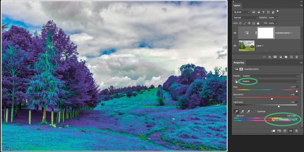
- Greens: Colors to be affected from 75 to 165 degrees clockwise
- Cyans: Colors to be affected from 135 to 225 degrees clockwise
- Blues: Colors to be affected from 195 to 285 degrees clockwise
- Magentas: Colors to be affected from 255 to 345 degrees clockwise
Choosing a color from the Edit list limits the changes to a specific range of hues (Fig. 4). An adjustment slider appears between the two color bars, indicating the colors that are being affected. To add to the range of color that is affected, drag the dark gray horizontal bar slider to the left or right.
Altering the saturation
The intensity of the colors in an image can be altered by dragging the Saturation slider. The default saturation value on the center of the slider is zero, representing the relative saturation of the color. Dragging the slider to the right, produces more intensity. At 100%, the pixels reach their maximum intensity. Dragging the slider to the left desaturates. At -100% the colors are completely desaturated or black, white, or gray.
Most of the time, the values will fall somewhere between the two extremes.
Modifying the lightness
Modify the brightness values of an image by moving the Lightness slider. Drag it to the left to darken the selected pixels, or to the right to lighten them. The zero point marks the existing or input lightness of the image. The extremes are +100% lightness that produces white, and -100% lightness, that produces black.
Lightness tip
If an area is very light and and adjusting the Hue and Saturation sliders have no effect on it, darken it a little by dragging the Lightness slider to the left. Then drag the Hue and Saturation sliders. The light areas will change color.
Adjusting the threshold
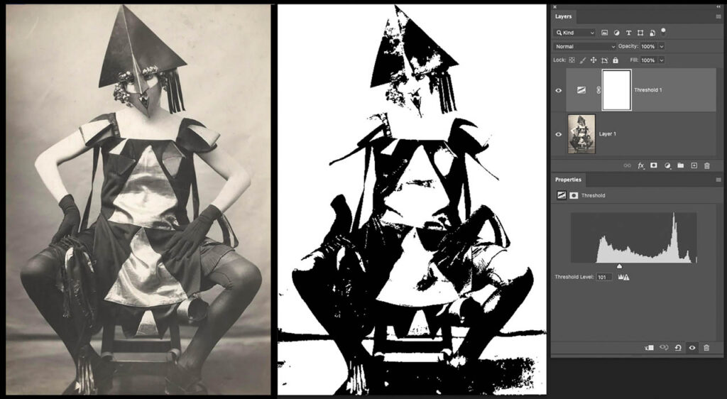
The Threshold icon in the Adjustments panel maps colors to either black or white, creating line art from a grayscale or color photograph. The Threshold panel displays a histogram of the 256 levels of brightness values. By default, the slider reads 128, or the midpoint. Values on the right side of the slider are white. Values on the left are black. As the slider is dragged to the left, more pixel values are included on the white side as the range of pixels indicated by the mid-point turn white. Conversely, as the slider is dragged to the right, more pixel values turn black and the image gets increasingly darker. The goal is to find the perfect balance of black and white to produce the best possible line art (Fig. 5).
Gradient maps
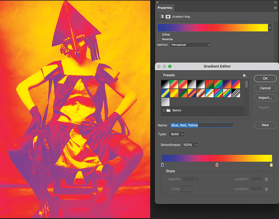
A Gradient Map applies color to an image or selected area based on a gradient’s properties. If an image is mapped to a three-color gradient, for example, the lightest colors of the image are mapped to the colors on the right side of the gradient, the midtones are mapped to the colors in the middle of the gradient, and the darkest areas are mapped to the colors of the left endpoint (Fig. 6). Because the application of color is based on a gradient, the feature produces smooth transitions between dark and light colors
Posterizing
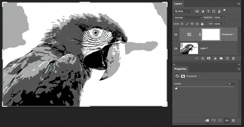
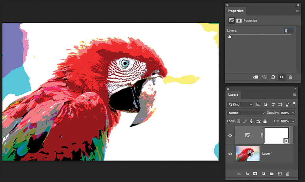
Threshold divides an image into two colors. Posterize applies multiple colors to an image. By default, the posterize adjustment applies the specified number of colors to each color channel (Fig. 7). If three colors are specified to a full-color RGB image, then nine colors are applied (3 X 3 = 9). This effect can be interesting depending on how many colors are input into the Levels field of the Posterize Properties panel — although the results can be somewhat unpredictable.
- For more control, using two color-mapping features produces a precise number of colors for a classic posterized look.
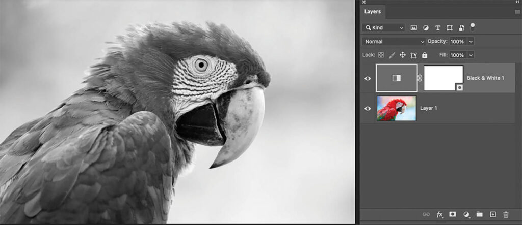
- Choose Black and White from the Adjustments panel to desaturate the image. The color sliders in the panel can be dragged to increase the darkness or lightness of specific color ranges in the grayscale image to create the perfect grayscale (Fig. 8).
- Click Posterize in the Adjustments panel and set the number of levels to four. The image is divided into four distinct neutral shades: white, light gray, dark gray, and black (Fig. 9).
- Choose the Magic Wand tool. Click the Contiguous checkbox in the Options bar to turn it off. Click a white area of the image to select all the white areas in the image.
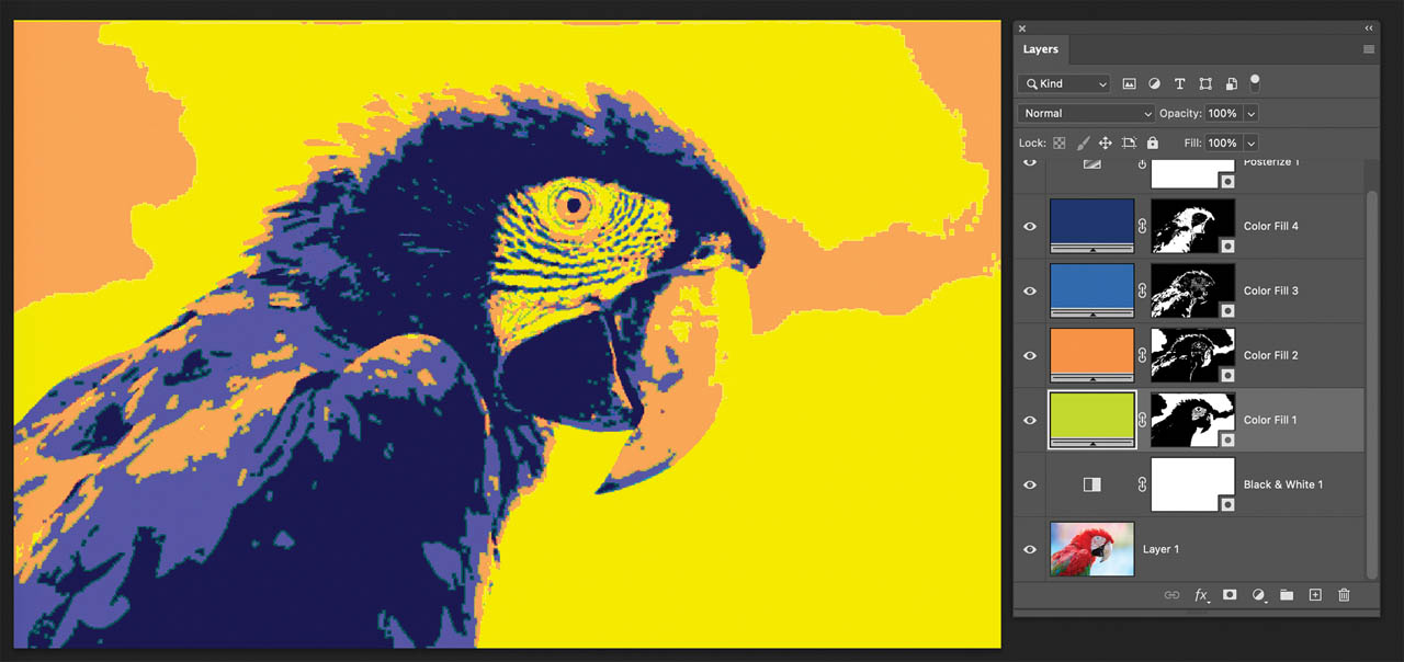
- At the bottom of the Layers panel, click on the New Fill or Adjustment Layer icon. Choose Solid color. Then choose a color from the Color Picker. A new fill layer is generated that replaces the white areas with the color.
- Repeat the steps for the light gray, dark gray, and black areas to produce a four-color posterization (Fig. 10).
Neural filters
The Neural filters interface, found in the Filters menu, contains artificial intelligence-driven options for modifying the surface texture, skin tones, style, and color of an image. It is well within your interest to experiment with this feature and to marvel at the kind of radical alterations it can instantly produce.
The Color Transfer option alters the colors of an image based on the color scheme of the existing image. First, click the Color Transfer button to activate the filter. Choose a color thumbnail from the menu or import an image. Adjust various characteristics from the color control sliders. The sliders include Luminance, Color Strength, Saturation, and Hue. Applying this filter automates the color-mapping process and can produce very interesting results — as you can see in Fig. 11.

Nonlinear workflow
The techniques presented in this article cover a small but important section of color-mapping options. On the Adjustments panel you can see quite a few more. These same techniques are also available in the Image >Adjustments menu, but when applied, they are not dynamic, so changing or deleting them can be problematic. It’s always best to work in a nonlinear workflow that adjustment layers provide.
Of course, experimentation is the key to producing the best results. Since there are so many color-mapping options and combinations, you’ll want to explore the numerous variations that can be generated. Once you become familiar with their controls you won’t hesitate to employ them as a mainstay of your workflow.
