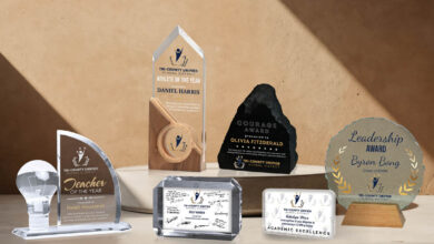
Typically, serif fonts are used for large bodies of text as the serif guides our eyes and makes words easy to read. Sans serif fonts are best for headlines, short-reading paragraphs, reversed out text, and to highlight important items. Fonts are often grouped into five basic groups: serif, sans serif (without serif), modern, script or hand-drawn, and decorative (including grunge). Modern fonts contain thin strokes with horizontal serifs. I almost never use modern fonts for any etching or lasering project as many of the strokes are too thin to be easily readable.
The key rule for font choices is never use more than one font from the same group in the same project. The second rule is don’t use more than three fonts in a project – two should suffice for most projects.
Award titles and names work well in scripts or serifs with large and small caps. Sans serif fonts are great for the short paragraphs and less important information like dates or the year placed at the bottom. Other fonts that are good for highlighting important items are sub-groupings of fonts like slab serifs, block sans, bold versions of fonts, and decorative fonts often used when a design is based on a theme.
-Bob Hagel, Eagle’s Mark


