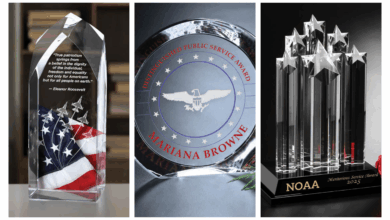
One of my most frequent challenges, and I bet it’s one of yours as well, is too much text – too little space. Text challenges generally come in two flavors: too many stacked lines (along with graphics) or lines that are very wide. Wide lines are often names of companies, programs, or award titles. Given enough vertical space, they can often be line-broken into two or three lines. Too many vertical lines and graphics create a proximity challenge, as well as a type size and readability concern. Readability can be enhanced by choosing the right font.
Fonts with long ascenders and descenders should be avoided. Simple sans serif fonts are often the best. Proximity, placing text that relates to each other closer together, and separating unrelated text are a few solutions.
A good way to create separation is the placement of a logo or other graphic between the unrelated text. Another great way to separate text is using an ornament or separator graphic. These are typically short and wide decorative graphics. Rules (lines) can also be used. The thickness of the line can be appropriately adjusted to look good and be functional. Separators can also be used in pairs to surround related text and create a relationship.
-Bob Hagel, Eagle’s Mark


