It’s 9 p.m. on a Saturday and you find yourself struggling to come up with the finishing touches on a monument sign concept presentation that’s due for a Monday morning review meeting.
Considering you were given little to no graphic guidance or influence to work from, the design of the 30′ tall shopping center sign is pretty darn clever, and the developer likes the direction you are taking it. However, the crazy thing about this design is that you are torn as to which type of base to use and how to design it. For this monument, the base has to be different-something unique but not problematic to build.
But there are some considerations that must be addressed so that the base design provides a solution to the sign design rather than creating a new problem of its own.
Where to start
I like to start the base design process by asking one very important question about the sign’s proximity to the general public: “Will there be foot traffic anywhere near the sign, such as in a parking lot or sidewalk area? And if so, will the base present temptations for teens to climb or hang-out on it?”
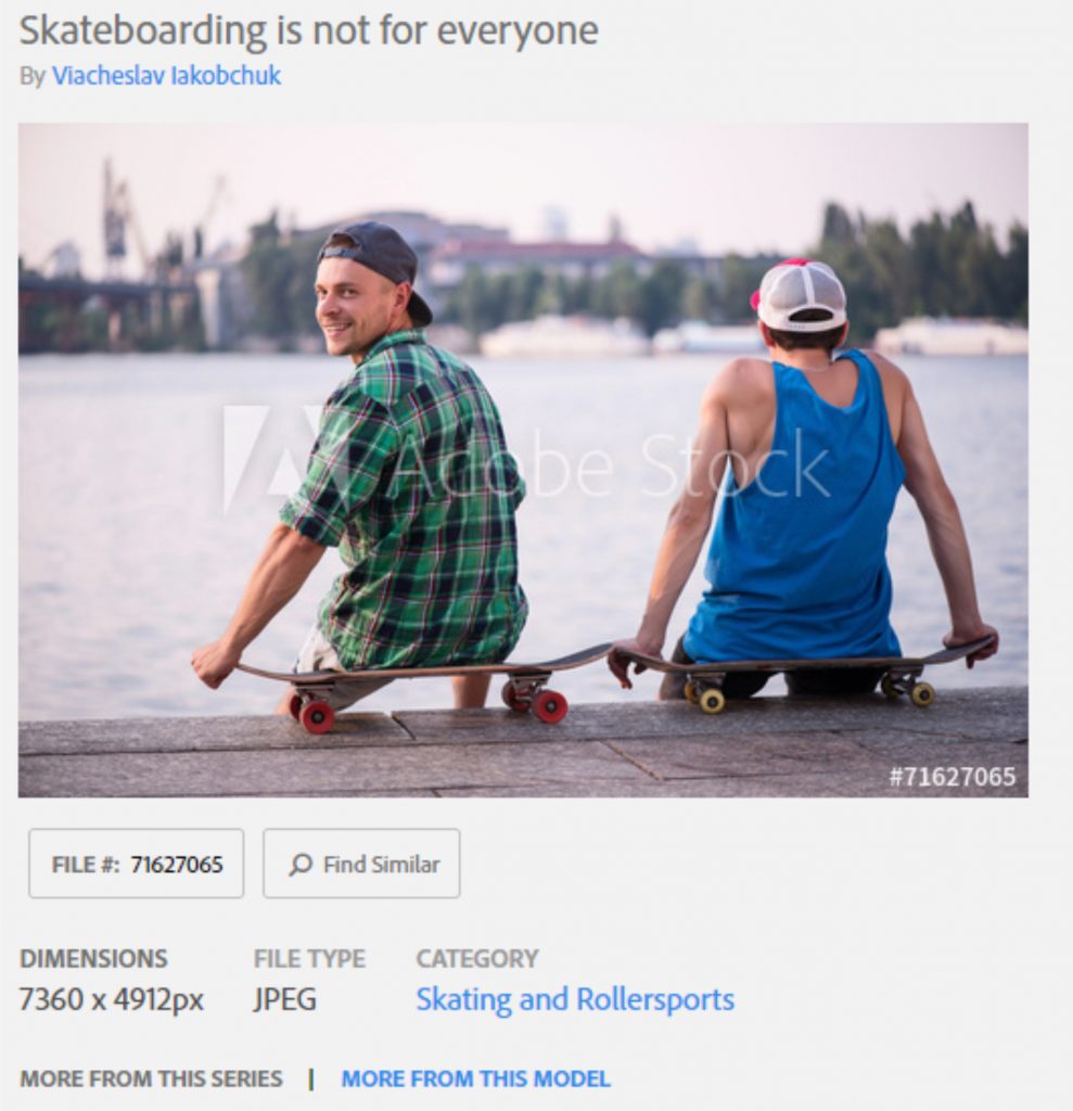
You may be saying to yourself, “Who cares about this aspect, really?” Well, it’s only a non-issue until it becomes a skateboarder’s hangout because of the cool, low-sloping curved top of the base (that you designed) which makes it the perfect ramp and rail for practicing their Ollies. (Fig. 1)
I realize that you cannot possibly plan for this sort of misuse and/or abuse of sign property, but how about overcoming the liability by designing it into an opportunity.
Let’s look at how we might possibly incorporate a shopping centers’ customer lifestyle into the design of the base. Perhaps the monument sign is for a shopping center with lots of foot traffic, and the sign is located right smack dab in the middle of the parking lot and walking areas. A problem if you do not want your sign to become a jungle gym. However, it’s an opportunity if there is perhaps to be an organic food store or an athletic/outdoor gear store where their customers’ buying habits are based around healthy lifestyle choices. In this scenario, you might explore the integration of a bike rack or some park-style bench seating built right into the base to add a unique value-added benefit to the space that the sign base occupies. (See Fig. 2) Where your creativity jumps in is how those benches are built and integrated into the base of the sign. If it were a ski rental shop, you could use old skis to build the bench and bike racks and incorporate natural materials from the area such as moss rock and stone to finish off the design.
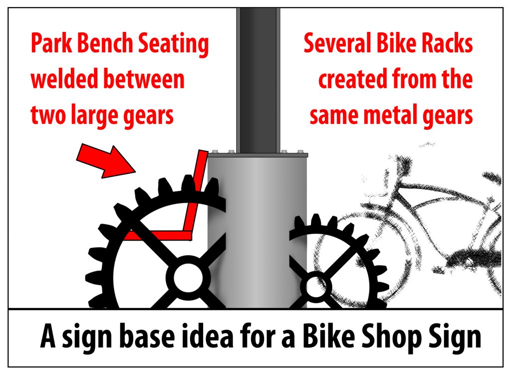
What if the sign is for a children’s science and discovery center? Might there be the opportunity to turn the sign base into a unique extension of the museum’s attractions? It’s all about exploring the opportunities that may be present by turning a potential problem into a benefit.
Preventing parking lot mishaps with more creative opportunities
Again, we are back to the question of, “Is the sign located where people congregate?” If there is any chance that a car may back into it, then there becomes an opportunity to get creative with bollards.
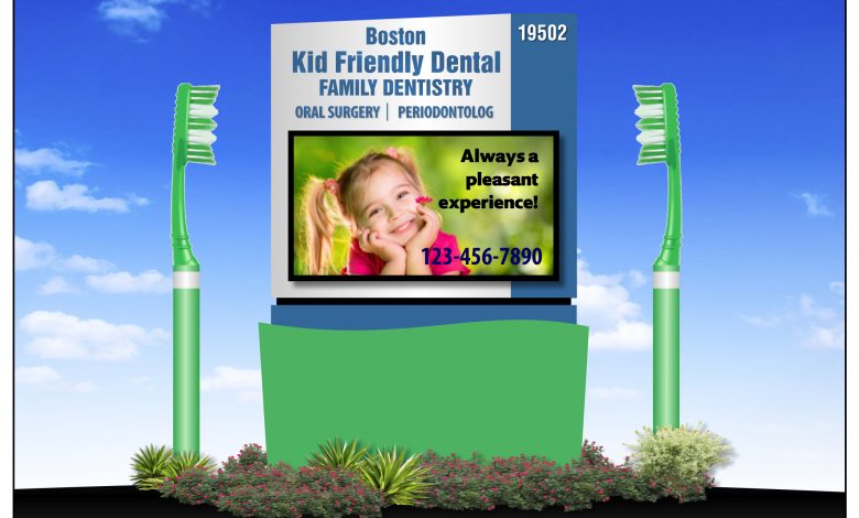
I am a fan of bollards, especially if the business is retail or consumer-related. The bollards are important for protecting the sign and fortunately, they can be decorated to create something directly related to the business or to reflect a holiday shopping event. Such as the example in Fig. 3, in which I used the bollards as the base of a kid-friendly toothbrush.
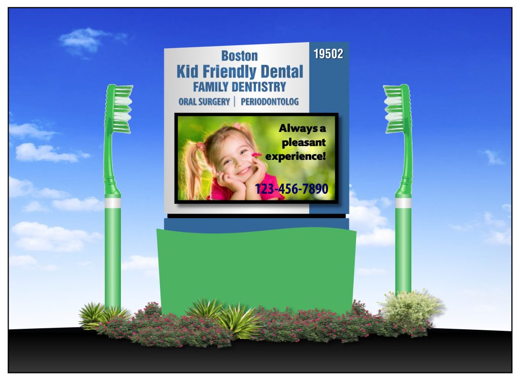
If it’s a candy store, decorate them with a digital print of a candy cane, or if it’s a cigar store you can make the bollards look like a cigar. Or they can also be used as advertising mediums by having digitally-printed socks that slide directly over each bollard allowing for additional advertising messages (if allowed by sign code). (Fig. 4)
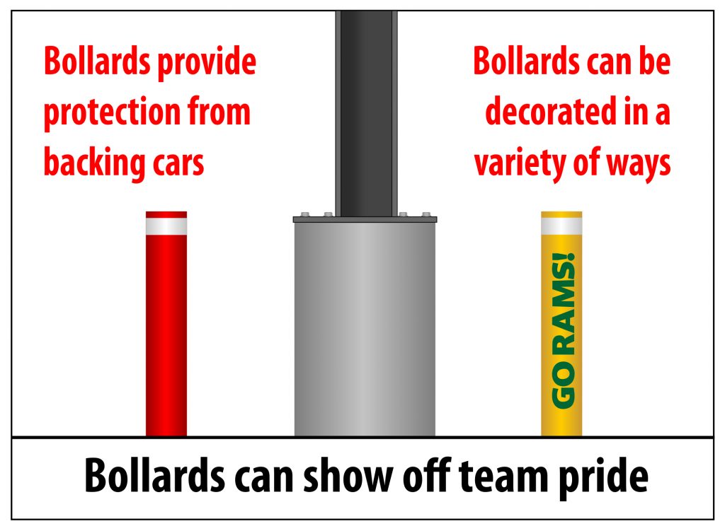
Regardless of the whimsicality, they should always include some sort of reflective film near the top so that drivers can clearly see them when backing up at night.
How tall, how wide, how deep?
Knowing your sign code goes without saying, however it may be worth exploring if the use of the sign base as an additional seating opportunity may win favor with zoning officials and may provide opportunity for more square foot allowances. In addition to seating, the base can be designed to incorporate flower planters and LED up-lighting, not to mention water features or the earlier mentioned bike racks and even dog-watering stations.
Knowing the ins-and-outs of the environment in which the monument will be located can make a difference in the base you design. To recap, these are some of the potentials that you might want to consider:
- Does the sign code include the square footage of the base?
- Vehicles colliding with the sign
- Opportunities for using exterior up-lighting and/or cool planters
- Incorporation of public conveniences like bike racks and bench seats
As you can see, the process of building a monument sign base can go well beyond the materials used and into the realm of expanded usability. It will never be considered if it’s never suggested, and if you are looking for one way to move your design to the front of the line, include a little out-of-the-box creativity with your sign’s base.
