Your client calls and wants to look into a set of channel letters for her storefront. She is calling because the set she purchased 15 years ago has trim cap and…
Let’s stop right here. If you don’t know what trim cap is on a channel letter, well this is your lucky day. This article covers the decision-making process of choosing to purchase or recommend trim capped or non-trim capped channel letters. What’s the big deal, you say? Well, I have gathered up around 1,500 words that will provide you with a better understanding of their differences.
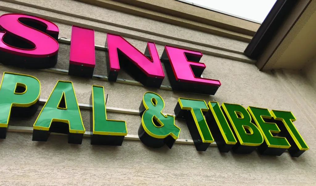
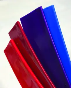
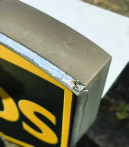
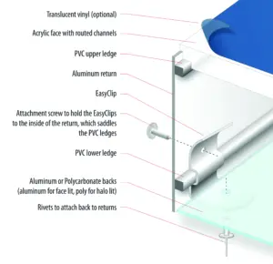
Trim cap is the product used to hold acrylic faces tightly to the aluminum returns of a channel letter. It works very well, it’s usually easy to assemble, and it offers a wide variety of colors and sheens that can be customized by preparing and painting the trim cap with anything similar to MAP. (See Photo 1)
Back to the client’s sign that has a failing trim cap condition…
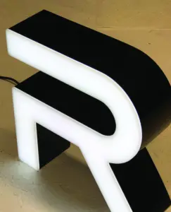
The trim cap is beginning to fail, as most plastics eventually do. It’s typically due to exposures to high levels of ultraviolet light (daylight). The business owner saw the clean-looking trimless letters that the bank installed and thinks they might look nice to replace her current sign. (See Photos 2 & 3)
The problem is her market would most likely not benefit from trimless letters specifically because of their look; they’re too crisp and clean and corporate looking. Not to mention, trimless letters will cost about 20 percent or more to fabricate. Here is a short list of industries that most likely would not benefit from a trimless channel letter:
• Most restaurants — other than Ruth’s Chris or Morton’s, for example
• Most service industries (plumbers, electricians, welders, etc.)
• Any business that’s in the holistic care industry
• Most chiropractors or physical therapists… the list goes on and on.
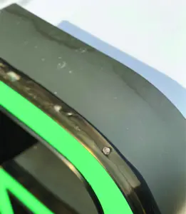
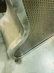
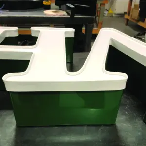
Before we dig deeper into our trimcap topic, it is important to mention one other face retention method: a fabricated retainer. It means exactly what it says… it’s fabricated by hand. It’s got some definite holding power on larger letters. (See Photo 4)
For larger letters or letters in high wind areas, this labor-intensive method of fabricating retainers from aluminum act like a retainer for a cabinet face. It’s L-shaped, routed and welded, and attached to the returns of the letter, demanding a higher level of accuracy in cutting and building.
Due to the labor intensive process, these retainers are typically reserved for letters over 48″ tall that are intended to be installed outdoors, possibly in high wind areas, and for letter sets that never get a break from the intensity of the sun, where trim cap might fail prematurely. (See Photos 5A & 5B)
What is trim cap constructed of?
Trim Cap is made from a flexible plastic with a thin aluminum core that helps it hold its shape in hot weather. It also provides stability during the chemical bonding process so that the “heat” of the glue (caused by a chemical reaction of the glue and the plastic) doesn’t warp or deform the trim cap’s outer surface.
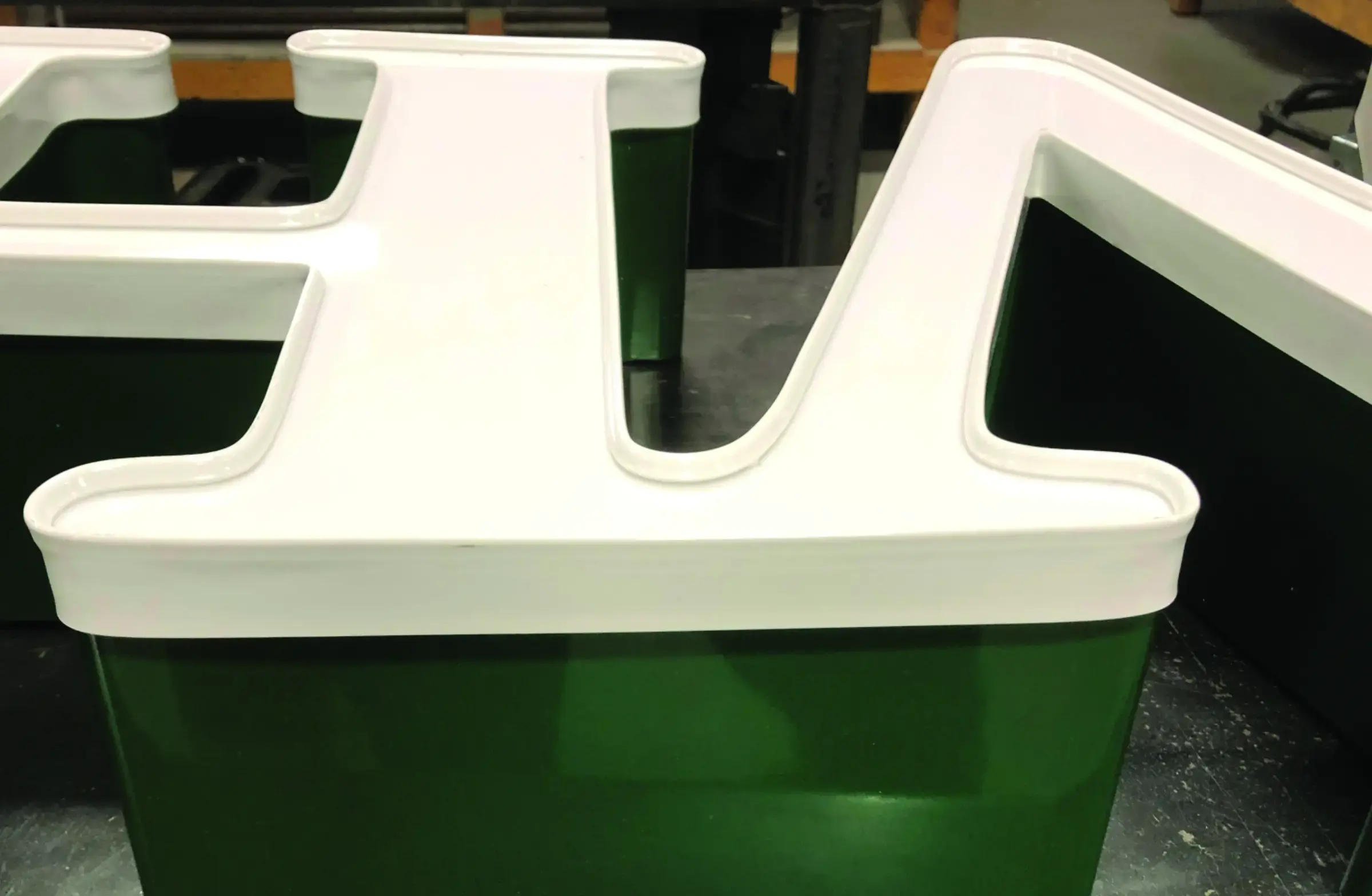
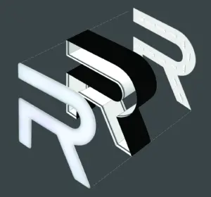
What is a trim cap-free channel letter?
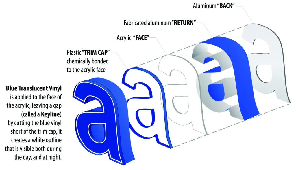
A trim cap-free letter is one that is fabricated without trim cap. I know, that wasn’t very helpful but let me try and explain it this way, with a visual graphic… (See Photos 6A & 6B)
The face of the letter is held in place with a retainer or bracket or via a created return surface (sidewall) of the acrylic that has a stair-step look. The various methods available all come with pros and cons, just as trim cap does.
However, one of the benefits that a trim cap free letter offers has been described as “a cleaner look” and all that a cleaner look might carry with it regarding the impression it leaves with the viewer. Banks, lawyers, and big box stores all need that laser-clean corporate look. A cleaner look can also work against the unique subliminal message being conveyed — which endorses the visual message.
This just happens to be one of the illustrations I created for a specific style of trimless channel letters. Note the fastening system inside of the letter return. This and other methods are available from some of the wholesale channel letter suppliers. (See Photo 7)
It’s time to design the client’s new channel letter sign
Here are a few conditions to consider when looking at using channel letters for creating a client’s sign. Will any of these affect the look of the letter the client is looking for?
Larger channel letters get 2″ trim cap! I have not seen the definitive rule of thumb on how tall the channel letter must be before it gets a 2″ wide trim cap. There are some disadvantages to the wider 2″ trim cap, and it may be a large enough channel letter set that you might consider a fabricated retainer.
Font or typestyle — some bold fonts have wide, fat surfaces, like the one used for the Best Buy logo. That wide of a letter for a big box store is perfect for the trimless channel letter. Stroke width variations — some fonts offer thick and thin stroke widths within the same letter. This can pose a dilemma if it’s too extreme, as the trim cap’s side profile on the return can conflict visually with the letter face, making it difficult to recognize it as a letter of the alphabet. This is one of the easily overlooked end results that can add visual clutter to an already challenging typestyle.
As a keyline enhancement — Trim Cap can add an element of visual interest when incorporated into a channel letter face design that uses key-lines. Adding a white trim cap to a letter with a white key line can provide a thicker, wider-looking letter face — or ruin a unique element of a font’s visual style. (See Photo 8)
Keylines are the gap that is intentionally created by applying vinyl to the face of the acrylic and cutting the vinyl in such a way that a gap is left between the edge of the trim cap and the vinyl, giving the letter face a white outline around its perimeter.
Now that you have a better understanding of how channel letter face retainer materials can affect the design, here are some sign examples that expand on my points about being aware of how trim cap can change the way a channel letter looks and feels.
Wall colors, return colors and multiple colors in the sign can add to visual clutter. Using trim cap and key lines to help your design look sharper, read better or be more visible is just one of the ways to consider readability when designing channel letters. (See Photos 9A-9E)