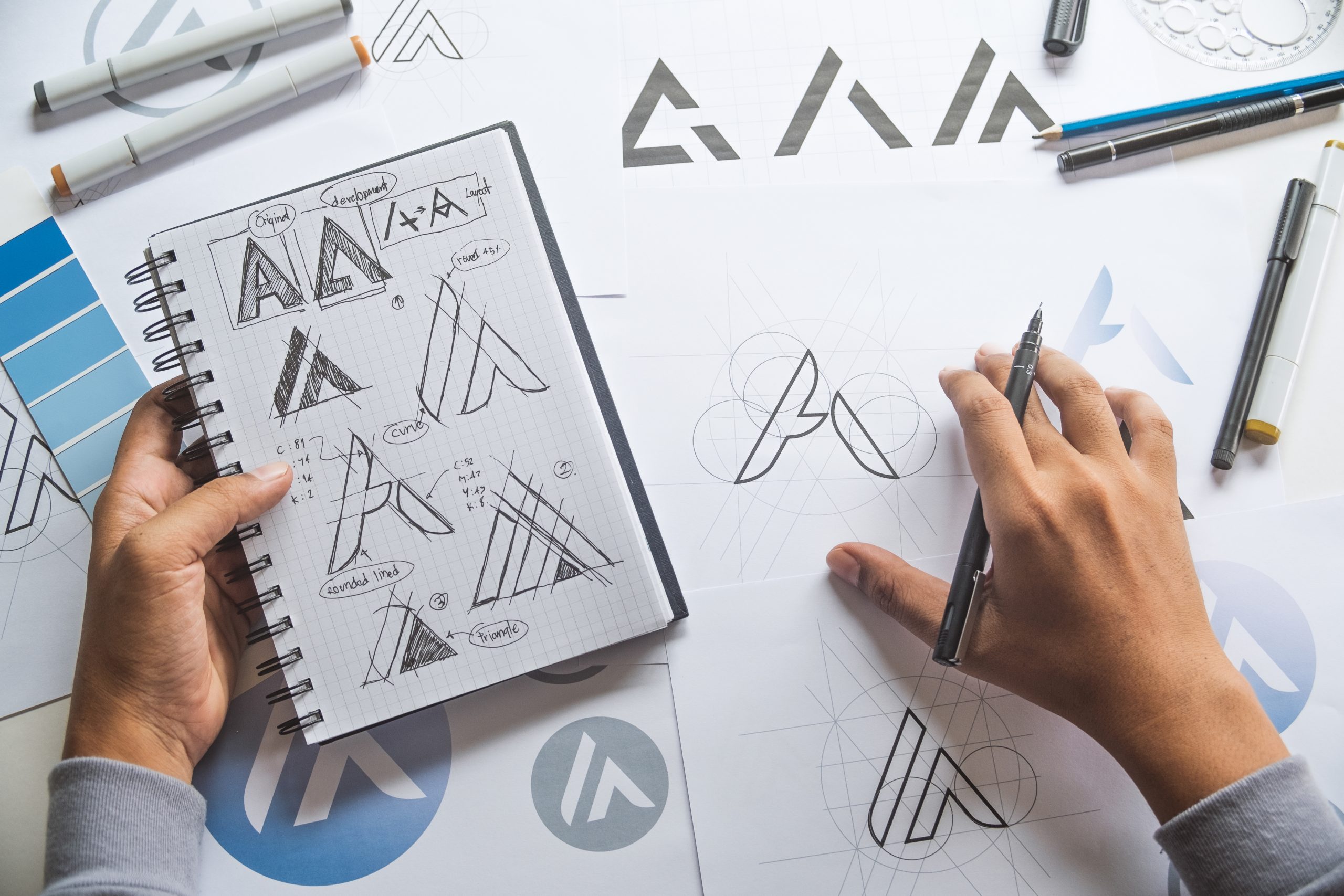
The psychology behind consumer behavior is the basis for design and logo creation, especially in today’s marketing landscape. Are there particular shapes that are more eye-catching than others? What about colors that trigger a specific kind of emotion? According to a survey, 76% of people associate red with speed, while black is the color most perceived to equal high-quality and high-tech.
For producers in the promo space, it’s essential to stay in the know on graphic trends and how the latest designs translate to the promo industry. Below are five logo and graphic trends to keep an eye on in 2019:
VARIABILITY
It’s a no-brainer that a logo must translate across platforms. But now companies are exploring how their logo can help them build a stronger personal connection with different groups or categories of customers, such as millennials and families alike. This approach is known as a variable logo, a logo that adjusts depending on which group it’s addressing. Adjustments in color, shape, texture, and size are all worthwhile explorations. The main challenge is to keep the logo recognizable while delivering on-point messaging to different end users.
GEOMETRICS
Historically, geometric designs are perceived as mathematical and authoritarian. Think software companies, labs, and science-based businesses. In 2019, designers are challenging that notion by intentionally pairing geometric shapes with vibrant colors and friendlier compositions to offset the hard, fixed lines. Colors such as blue and orange can be softly woven into logos to convey trust and reliability, while a hint of red can evoke passion and desire. Tread lightly here and don’t pair an intricate geometric design with equally intense colors.
NEGATIVE SPACE
Designers are pushing negative space to its limits in 2019. This trend relies on how our eyes perceive blank space in relation to matter, and it’s captivating. If you’ve ever noticed the arrow between the E and X in the FedEx logo, you grasp the multidimensional work of negative space. Whether it’s a website or a T-shirt, consider playing with colors, fonts, and textures to test consumers’ brain patterns and explore what they gravitate toward, visually.
MINIMALISM
Minimalism comes from a desire for simplicity and sustainability, a trending topic in the apparel decorating industry, among others. Whether it’s a logo consisting entirely of text like lettermarks or logotypes, or a design that features a basic outline, it’s easy to see why people love clean lines and a simple, standout presentation. Established brands wishing to bring a different perspective or launch a new branch or product line can rework their existing logo by stripping out elements to signify a fresh start.
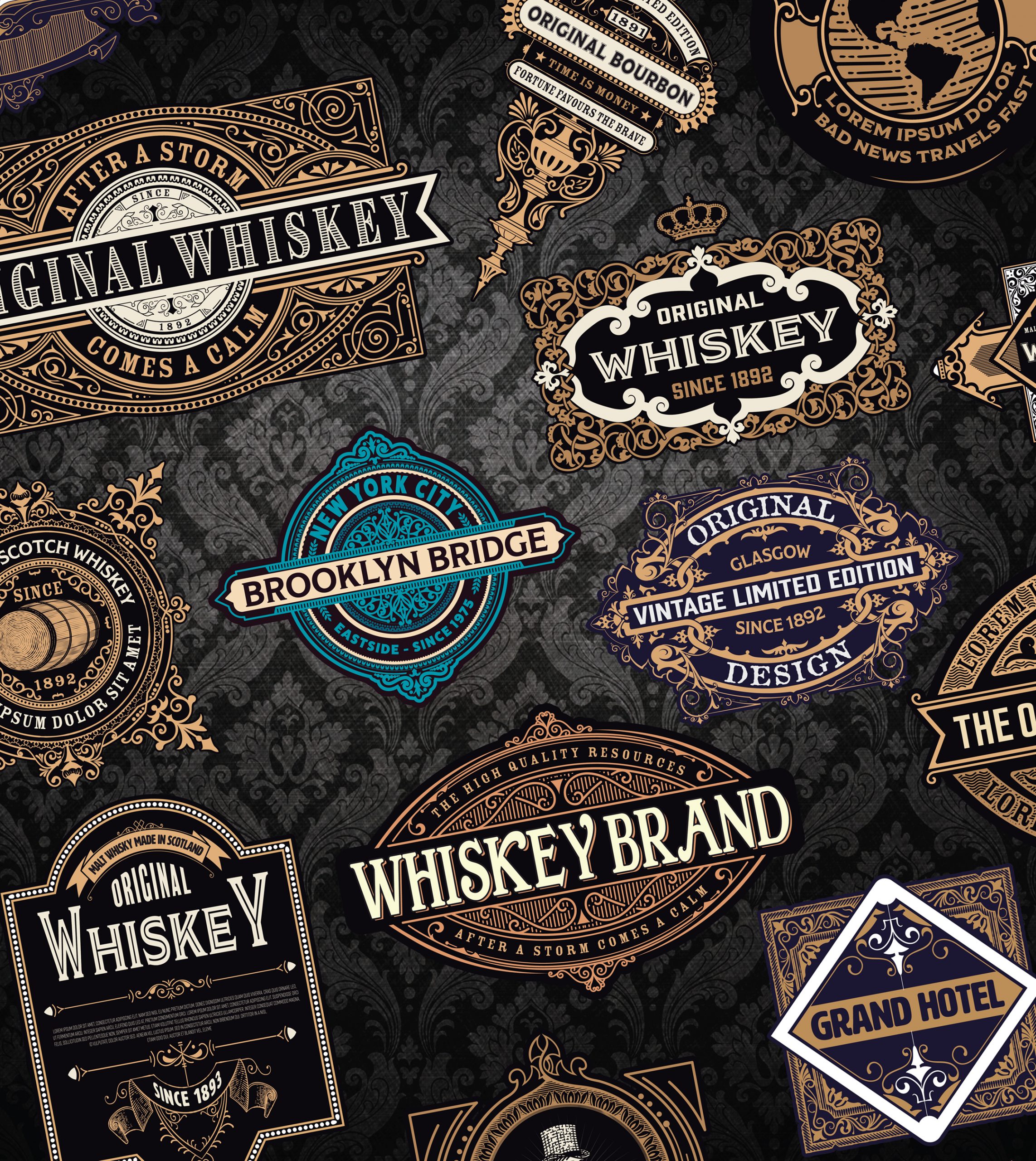
VINTAGE
On the opposite end of the design spectrum, some businesses are going with beautifully detailed logo designs, introducing a sense of vintage sophistication to their offerings. Intricate and exceptional detail can help represent a business focused on handcrafted, top-shelf products. Artisanal bakeries, high-end furniture dealers, and even liquor brands use this technique to add allure and respect to the manufacturing process of whatever goods they aim to sell. When translating these graphics to apparel or accessories, be sure to use techniques that capture details well such as direct-to-garment (D2) printing.
It’s a time where brands are hyper-aware of the evolving digital landscape, as well as the increasing level of competition. These graphics trends play a huge role in generating connection and evoking action from a potential client.
—Hirsch Solutions Inc.