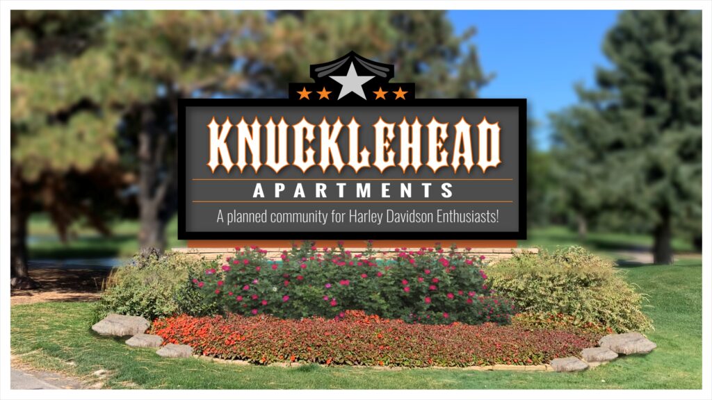
Let’s pretend there was an apartment complex that wanted to market strictly to the street biker Harley Davidson motorcycle-loving crowd. What do you think the identity of the property might look like? Sign style and design, as well as the materials used with certain colors, can make a huge difference on which demographic is noticing the property.
In considering the look and feel of the property, as well as their signage, you are now no longer selling signs — you are providing a visually identifiable and recognizable solution to their marketing challenges by helping them establish a very targeted visual identity.
First, let me say I am not a formally trained psychologist or psychiatrist; however, being a sign guy since 1985 does give me a unique perspective on how signage, design, style, colors, and materials can have a fairly predictable effect on the viewers’ behavior and actions.
I call this “design phishing,” and much like spammers do when they phish through social feeds and try to hook someone into clicking on their bait, signage has the same power to reach out and grab someone’s attention. If you plan it correctly, the look, feel, style, color, shape, and form of the signage can attract the audience that the management wants to attract.
Offering signage solutions
As far as my experience has been, most property managers reach a point where they are either:
- Frustrated with the property’s current visual condition and want to make it look better, somehow, magically through signage, or
- Upper management has authorized a reface of the property and signage is one of the areas they are improving. Those are the two most likely scenarios you will come across in the apartment and condo marketplace.
That being said, selling apartment signage packages is a lot easier than you might ever think. If management has contacted you, it’s most likely because they have had all their budget talks and planning sessions already, and the decision to invest back into the property has already been made. Your job is to provide the right solutions.
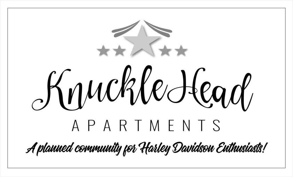
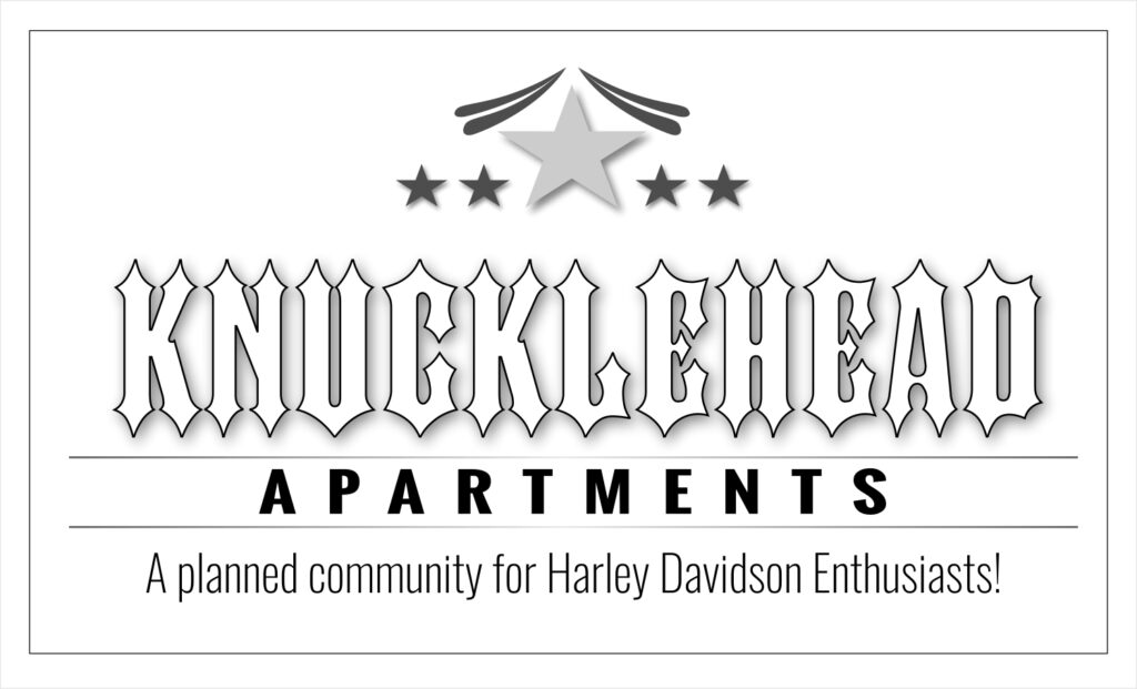
Here is just one example of how sign design can be used to attract the attention of a particular demographic. Same message, same information, yet each one speaks to a different viewer.
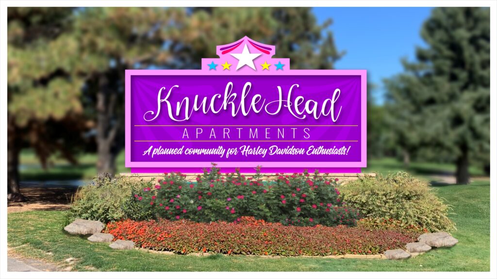
These are shown here in black and white, and even in grayscale, it’s still clearly obvious the demographic that is being solicited. Now imagine what adding color will do for the message.
For those of you who are rockstars in this area already, you will probably agree that there are many site conditions to consider that can help you close the sale. Understanding the psychology of what motivates a certain demographic to choose a place to live is paramount to understanding which look, feel, and visual identity will attract that crowd. Miss the mark on this, and you have a property that solicits the wrong demographic for the property.
Study the property and know it well before you show the property manager your solution to their needs. Make sure your solution addresses all their challenges, and even some they may not have thought about earlier.
When that next apartment complex calls you to come by and look at their signage, if you focus on asking the right questions and develop a relationship of trust, the rest of the process will fall into place because they will see that your solution will help them fill up their vacancies with the right applicants.
To learn more about reaching the right demographic for apartments and condominiums, check out The Psychology of Sign Design.
