The word layout can mean different things to different people. Other than laying out by the pool, the word layout typically refers to some sort of organized plan for placing, setting, or mapping out the items that are to occupy some sort of predetermined space.
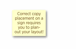
A bad sign layout
Bad layouts can prevent the chosen words from doing the job they were intended to do. The same can be said for T-shirt, textile or other graphic-for-production design process. But what does a good sign design layout look like and how do you know if it’s going to do the job it’s supposed to do?
Is it the way the text goes all the way to the edges of the sign?
Is it the heavy font that seems to command attention?
Is the quantity of information that is crammed onto the sign face?
Is it your partner who says it looks “really special”?
Substrate size = real estate
The process of laying out a sign starts with the available real estate you have to work with. How big is the substrate? Yes, that is what the panel or showcard or banner or surface the sign is being laid out onto for production. In fact, if you say substrate to a sign shop owner, they will at least realize you have a better than average grasp of the terms used in the sign industry.
This study
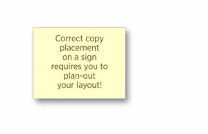
For this exercise, we are going to make up a sign need for which we will design a solution. It’s a flat panel sign to be installed onto a wall for viewing by the public, but the copy we will be using focuses on what we are doing. In this first image (Example A) you will notice that the copy has been added to the sign in a very uniform way that ignores the flow of thought for the message.
This very dull layout style is what I refer to as basic government block because regardless of the topic, subject or importance of the message, these signs are typically designed as the copy and fonts spill out onto the page, just as if someone were to speak them while someone types out the words.
It won’t read well
I mean, seriously, try to read the copy on that sign out loud, quickly… you can’t.
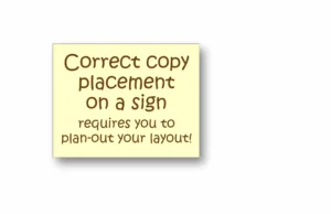
It’s full of what I call thought-filled speed bumps where the train of thought is fragmented by improper line breaks. This illustrates (Example B) how annoyingly ineffective this can be and how it affects the entire role that the sign must perform.
Proper grouping of thought
The next sign (Example B) shows how the words should be grouped according to the thought being conveyed. When this is done properly, the primary message is more clearly understood, and the sign has a good start to becoming an effective sign design. Now, take another stab at reading the sign… Notice how much easier it is to understand what is being said. This step is necessary for effective sign design. Next, let’s look at how it can better fit the sign space provided.
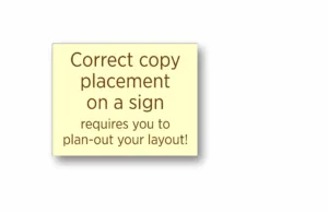
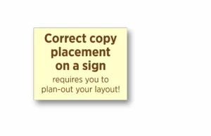
Great thought isolation, lousy layout so far …
Grouping the thoughts per line creates a new arrangement of line length(s) that now creates an unattractive layout of the copy on the sign face. Even if we enlarge the text, it still doesn’t fit the sign face like it should; there are weird-looking blank spaces that make the sign look unkempt.
Why do some designers stop here?
So much of the time, sign designs are taken to this point and left as-is. The designer doesn’t realize how much better the sign can be if they get just a little creative. In Example C I have enlarged the primary copy for two reasons: First, I wanted to better fill or utilize the space. Secondly, I wanted to visually separate the primary message from the secondary message. The secondary message is important for sure, but it’s not the hook of the sign’s role.
Remember, making the primary message dominant is not only the easy way to bring attention to the copy; it’s the way it’s supposed to be done for proper sign design.
Now, to get back to the design in Example C, this sign layout shows us a much better-looking design, and the letters are easier to see and read after I adjusted the top copy. But for a sign, it’s not popping like it should (or could). Signs can be (sometimes) very loud (visually). That means we have the room to get bold, dynamic, and attention-getting.
The design has got to grab the viewer’s attention and clearly convey the message being presented. This font is not optimum, but for the sake of brand consistency, we will continue to work with it and leave off other, bolder fonts that might really help the sign’s readability.
How creative does the sign NEED to be?
How many ways can you make the primary copy more visually dominant without adding a new font? Outlines? Shadows? In-lines (called key lines) that follow the inside shape of each letter, or even using colors and texture elements are all good ideas.
Who’s reading this sign? Does this sign require fancy creative elements to be added, which may pose a visual distraction that hurts the message being conveyed? Tread lightly when it comes to fancifying a sign in order to fluff up the impact of the message. Too fancy, or a graphically rooted font, can change the meaning, impact, and delivery of the sign’s message.
Changing the font makes a huge difference in what the subject might be, or who wrote the sign or who it’s meant to be seen by. Example D would logically lead you to think that the sign was for a daycare, or a kid’s group or school event. It’s not. The topic is sign design and a kid’s-style font is so inappropriate for this it’s not even worth mentioning, but I did. That font does nothing to promote the feel and vibe of learning sign design. In fact, it makes it harder to comprehend what the message really is as the viewer is wondering how this affects kids.
Hence the confusion that occurs when well-meaning designers use fonts that are not appropriate for the business, school, church, nightclub, or biker bar. Using the correct font is mandatory for a message to be conveyed appropriately, read by the viewers who it applies to, and done in such a way as to not create a bad impression.
So, being bound to the branding, the next logical step is to bold-up the primary text or message. In Example E you can see here that I did not go crazy; I simply made the font bold.
Now, notice how much easier it is for your eyes to know exactly where to line up for reading the sign.
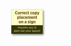
Let’s make this sign really grab the viewer’s attention (Example F). I’ve done that here by adding a dark contrasting color to the upper background. And, take notice, this works for either the top copy or the bottom copy as the top copy is readable and has plenty of impact all by itself.
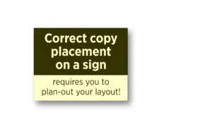
Add in the dark color to the bottom text (Example G) and again, it helps the top copy maintain its dominance for the viewer. Either way, the contrasting color helps to isolate the message to guarantee that the sign is effective for the job it’s been designed to do.
Experiment
Play around with layouts to determine the best way to place your copy so that the sign is actually able to do the job it was intended to do. Follow these examples and copy the spacing, font and layout parameters I used when I created the artwork examples.
It’s how signs are designed. This is how you create great signage. Don’t lose this article! Refer to it often with each new sign project. And in the end, the signs you create are equal to the signs… you make.