I’m about to ruffle some feathers on design versus function. Some logos are dependent upon colorful graphic imagery to paint a picture in the viewer’s mind about what the business or service offers. Those elements are what makes a logo design unique, memorable, and original. This all works great for the logo design process, provided the font choice, spacing, layout, and kerning are done in such a way as to promote the readability of the logo’s text when viewed at any size and distance.
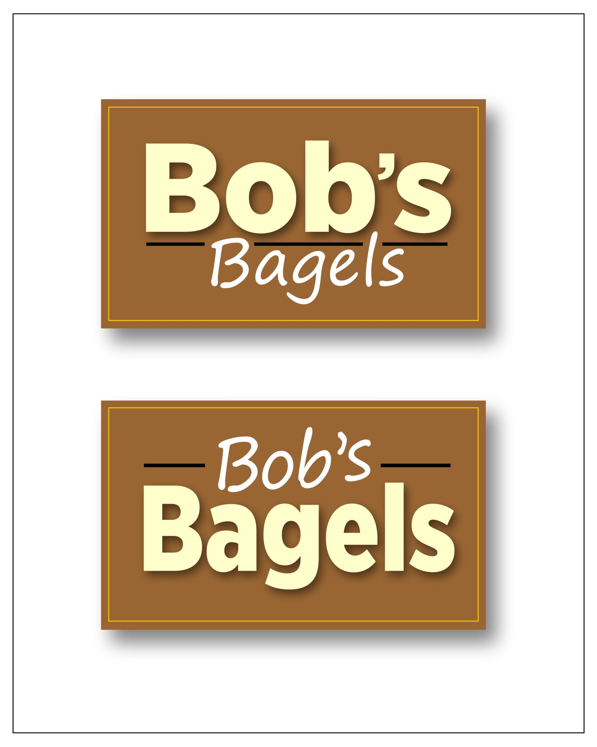
Also, when designing, decide on which element of the business name is the most important. Is the word “Bob’s” or “Bagels” most important to the new patron looking for bagels to take to their meeting? I don’t usually need to shop for a Bob, but if I did, I would scan the shopping center for a sign saying “Bob.” If I was looking for bagels, well, I think you get the picture.
If a logo is designed for website use, the viewer has loads of time to look at it, study it, and comprehend it. If the viewer only has three seconds to view and comprehend the logo, is “Bagels” or “Bob’s” the most critical bit of information that needs to be communicated? When driving on the highway, a typical conversation could go like A or B:
A. “Hey, the sign back there said ‘Bagels.’ Let’s turn here!” (Nobody cares if it’s Bob’s, Tom’s, or Joe’s bagels.)
B. “I could only see the sign for a few seconds; it said, ‘Bob’s something or other.’ I couldn’t read the rest.” (“Bob’s” does not explain what he offers.)
Every logo may one day need to be used as a sign, on a sign, or as part of a sign where it’s viewed from a long distance, such as sponsoring a baseball team with a banner on the outfield fence. If the logo isn’t easily readable from a long distance, it loses its visual dominance and graphic impact in the sea of visual clutter surrounding it.
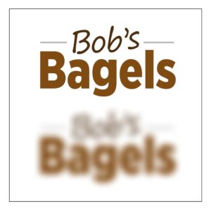
Logo text readability at all sizes is the hallmark of a well-planned logo design. Printing on pens and other small items is the extreme opposite of outdoor signage applications. Still, the same design disciplines apply and have a uniquely similar correlation between channel letter fabrication and small fonts that disappear when the logo is one inch across.
For the courtesy and consideration of the designers who may have done their best to design a logo for someone, I cannot show examples of badly designed logos. Nobody likes having their past mistakes brought up as a training exercise, so I choose to discuss what to do right rather than pointing out what’s been done wrong.
To see examples of design done right, check out Matt’s full article in GRAPHICS PRO July.