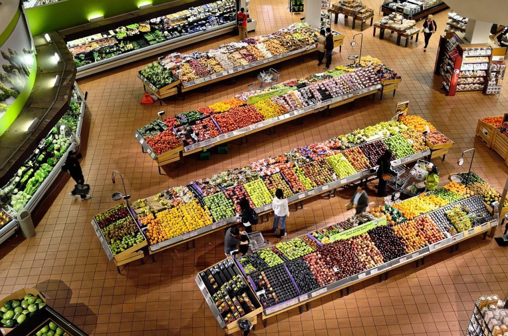
Picture a big box retailer like Target, Walmart, Lowe’s, Home Depot, Costco, or Sam’s Club. What are the key features of each of these stores?
- Lots of signage/wayfinding
- Clearly marked aisles
- Aisle flow (People should intuitively know where to start and where to end—usually with the cash register)
- The areas are clearly marked with hanging signs from the ceiling or graphics on the floor
- At any point during the shopping experience, you know where you are and where you need to go
- As soon as you walk in, it is very clear why you are there and what the company does
Your company’s website is no different.
Front door: Big, walkthrough openings at each company location. Lots of glass, lots of light. Motorized sliding doors reveal what’s inside. Lots of entry signage. For example, when you walk into Home Depot, you see a bright orange sign, “Welcome to Home Depot, your DIY home improvement warehouse.” Visitors know exactly what they do and why they are there. Lots of branding and color. Lots of splashy graphics.
Lighting: Everything is well lit and easy to see. The floors are clean, and bright lightbulbs illuminate everything. Long aisles facilitate clear sightlines to know what is located on the other side of the store.
Aisles: The aisles are clearly marked, usually with numbers in a logical order. Aisle No. 1 is against a far wall and the highest aisle number is against the other wall. It suggests a flow or travel if you do not already know where you want to go. The aisles also tell you where you are if you get lost. Walk to the front, and you see the cash registers.
Shelving: All of these stores have overhead shelving, and each of these shelving units has clear markings on what they contain. Your aisle number and the department you are in can be seen from anywhere in the aisle, and the shelves are marked with a general subcategory. On each shelf is a listing of products, sometimes with inventory numbers, and pricing. Generally, they have a short description of the product.
Products: Each product is clearly marked and facing the shopper. It is arranged alphabetically, or by expected interest. Sometimes it’s arranged by the financial contribution of the vendor. They are stacked with extra inventory behind them and positioned to be easily removed from the shelf and placed in your shopping cart.
Displays: In certain areas, such as aisle corners or end caps of shelving racks, you can find a special buy or an informational display. The display informs the shopper about products and services in this area. It gives a breakdown of key selling points and a feature breakdown. Sometimes these areas are populated by people who interact with the shoppers and sell these items. The displays have no pricing and are not designed to elicit a purchase, only an interest and a requirement to inform. These displays give the shopper an idea of how the products in the area compare to each other.
Cash register: Every shop has a cash register, usually by the door. They want it to be the last thing you interact with before you leave. These stores often place the checkout at the end of a long, traffic flow.
Traffic flow: The company has a pretty good idea of how and where you will travel through their store. They place big-ticket items towards the beginning to give you plenty of time to think about a big purchase. They place specialty items in the back because they are guessing you are specifically looking for them and they are the least likely to be impulse buys. They place the impulse buys all along the journey to catch your eye and try to get you to buy them on emotion.
Discounted items: Clearance and discounted items have their own areas. These companies very seldom place clearance items with other higher-margin items, and anything labeled on discount is segregated from full-price items.
OK, so what?
Your site needs to do the same thing. Let’s look at what we just talked about:
- Front door: This is your home page. It needs to accomplish everything the front door does (bright signage, logos, purpose, and establish the beginning of the buyer journey).
- Lighting: Make sure each web page is clean and organized. Leverage white space to separate content, images, and links. No pixelated graphics, no inconsistent fonts. Have a high contrast between images and copy.
- Aisles: Breadcrumbs along the top of the page. Where are we now? How did we get here? Where are we supposed to go? Which department is this? How can we get to another department? This is your main navigation or a submenu along the side of the page. People need a reference point on every page to know where they are and where they should go.
- Shelving: This is the URL and the headline on each webpage. Where are we? Why are we here? Where do we need to go next? How can we get what we need?
- Products: Product pages need to answer everything about the product, from size, weight, and dimensions to color, texture, price, description, and comparison to similar items. This all needs to be easy to see and understand, and easy to place into the shopping cart.
- Displays: These are pages dedicated to product information. These should be funneled from the home page and into the product pages. This is also the area on the side of the page where advertisements and specials can go. This is where you place the chat window to get to a human (or a high-quality chatbot).
- Cash register: This is the checkout icon at the top corner of the page or the ‘Buy Now’ button on each product page. Every page on the site should have a shopping cart icon if you sell stuff for visitors to buy.
- Traffic Flow: Where should people go starting at the home page? Do you ask any questions on your home page? Is there a ‘Start Here’ button or a guide to explain the site hierarchy? At the very least, do you have a site map in the footer? How do you want your site visitors to use your website and how are you communicating that to them? How do you know when your visitors are not following your map?
- Pro tip: How often do they press the back button? Your web analytics can tell you how much the browser back button is used. The more the back button is clicked on, the more broken your customer journey is. It’s not your bounce rate you should worry about, it’s the back button.
- Discounted items: Do you have a separate section for stuff you want to get rid of? Did you use a promo or discount code to get visitors to your site? Make sure these items are completely separate from your full-price and featured items. They need their own space.
Implementing the right web layout and design
Go to these stores and take notes on how they organize things. They spend a lot more money on customer flow and merchandising than you do. You can learn from them.
You know what the sad irony is? They haven’t figured this out themselves. Many of these big retail websites are awful to navigate. The retail and web experience are two completely separate things. Omnichannel consistency is a big word, but it simply means the digital version of you is just as good as the real-life version.
Fix your site and you are on your way to victory.