It took us three and a half years to wrap our shop van, but who’s counting? A combination of being absolutely slammed the last few years and being short-handed meant that our personal vehicle kept getting pushed back.
A recent slowdown right after Thanksgiving gave us some time, so we finalized the design and wrapped it. The budget wasn’t a concern, but we still chose to do a partial wrap on our shop van. We wanted to use our vehicle as an example of our workmanship and showcase the coverage options and the different types of vinyl available for wraps.
Coverage
We get frequent calls and walk-ins from people requesting vehicle graphics estimates. More often than not, the person will refer to it as a “wrap,” whether it’s spot graphics or a full coverage they’re interested in.
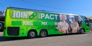 We explain to the customer their options; we can do spot graphics, partial wraps, and full wraps with various options in between, including stripes and a partial wrap plus spot graphics. Many times a full wrap isn’t necessary and we explain this to the customer. It doesn’t have to be an all-or-nothing approach. A partial wrap plus spot graphics often gives you the best advertising for the budget.
In our lobby are TV monitors set up to scroll photos of our completed work – one TV has sign projects, while the other TV has just vehicles. Using these examples, we explain to the customer that spot graphics are a great option if they have a fleet of vehicles they’re trying to letter within a budget. Usually, it’s all about identification and professionalism so that when the company arrives at a job site, there is no questioning who they are. These spot graphics may be large in some cases and, combined, cover a lot of the vehicle, but they don’t necessarily wrap an entire door, hood, or side.
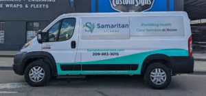
A partial wrap encompasses everything from a tailgate wrap to a ¾ wrap. Most of the time, we’ll combine a partial wrap with spot graphics to help tie together the advertising on the whole vehicle. For example, if it’s a half-wrap on the back end of the vehicle, we’ll also put the company logo or contact info on the doors and maybe a logo on the hood to help tie it all together. Stripes are also effective in doing this.
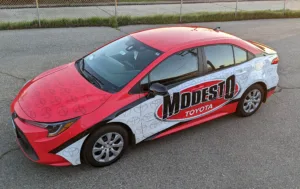
A full wrap covers the entire vehicle, with or without the roof. We don’t have a lot of high-rise buildings with people in them looking down on the cars below, so unless the vehicle is shorter or we’re covering the existing color of the vehicle, we still consider it a full wrap, even if we don’t wrap the roof. Since we specialize in commercial wraps, our full wraps are bumper-to-bumper and top-to-bottom but don’t include the door jambs or other intricate areas that are typically covered on full-color wraps. We explain to the customer that they may see the vehicle’s existing color in certain areas; our pricing reflects this difference too.
Budget
To determine the customer’s coverage, we have to look at their budget, company branding, and advertising expectations. These three items overlap in the conversation as we figure out the coverage and are an excellent opportunity to connect with the customer and build rapport.
Budget is an important part of the process because whether the customer knows what the specific number is or not, they generally want to keep the amount they spend within a specific range. Working through the process with them is how we determine what that amount is.
I like to ask them if they have a budget right from the beginning and then let them know that by having a number in mind, we can work backward to determine how much coverage they can get for that amount, keeping in mind design fees and installation costs.
We must determine a range if they don’t have a set number. I’ll start by offering a few suggestions – if we wrap the tailgate and the back side windows, plus spot graphics on the doors, it will be this amount. On the other end of the spectrum, if we do a full wrap, then the price would be this amount. This is usually the fastest way to determine where their budget falls in that range.
Brand
Once we’ve narrowed down the coverage or square footage we’re considering, we need to look at the company’s existing branding. In the case of our shop van, we have an angled stripe design that we’ve also used on our lobby walls and some other advertising. We decided to incorporate this on our van, so the design and colors are mimicked in both spaces.
If the customer already has an effective logo and colors then pull design elements from these items to determine how they can be applied to the vehicle wrap. In our case, the angled lines created an interesting stopping point for the partial wrap. Instead of just stopping the graphics at the door, we allowed them to fade off the top and bottom of the vehicle along the natural angle of the design.
Unique company colors, design elements within the logo, or a particular font may be all you need to jump start a design idea. Sketching these ideas out quickly on paper or on a template of the vehicle helps the customer visualize the coverage you’re quoting.
Expectations
What is your customer trying to accomplish with their advertising? This is an important question, because it really does play into the coverage they need. For example, I mentioned that we recommend spot graphics to customers that have a fleet that they simply want to letter for a professional look that identifies their vehicles on job sites.
If it’s a temporary advertisement meant to push a product, service or event, like on the transit projects we do, then we look at both coverage and material options to hit the budget and expectations. Sometimes the ad wraps a smaller section and sometimes it’s a larger wrap that may or may not include the windows.
For a customer that wants to reinforce their brand, but isn’t necessarily pushing a product or service then we consider their design elements and overall ‘feel’ of the brand. If there is a fleet of vehicles that we’ll be lettering or wrapping, then we want to make sure we’re consistent across the fleet.
This means that if we’re wrapping a car, a pickup truck, and a box truck for the same company, the overall design is carried across all the different shapes. The wraps we did for Modesto Toyota are all full wraps, including the roof, but they carry the same color scheme, watermarked repeating logos, and arch shape across the sides.
Most of the wraps we do are meant to be on the vehicle long term and incorporate both the company brand as well as advertising the services they offer. We want to make sure that who they are, what they do, and how to contact them are the three most important elements of the design. Anything beyond this on the vehicle should complement the designs while not detracting from the effectiveness of the advertising.
Extras
Since our shop van is not only a source of advertising when we’re out on installs, it’s also a showcase of our capabilities, we incorporated 3M Scotchlite 780mC Print Wrap film into our design. It adds a bit of flair during the day when the sunlight hits the spot graphics, but it also ads a level of safety at night.
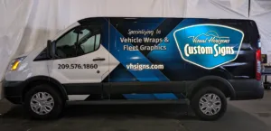
Our side logos, website, and a line of service across the bottom of the back are the only elements we did in reflective. We wanted to incorporate the premium wrap vinyl with the reflective vinyl to show how they can be used together.
Perforated view thru vinyl is another specialty film that is commonly used on wraps. We incorporated perf film across the passenger side window and the two back windows to continue the wrap design in a flawless way, while also increasing the visibility for those driving the van.
