We run two different printers. Both are Roland, and we RIP our jobs to both machines through the same VersaWorks RIP software, but because of profile discrepancies and differences in the inks used, there are noticeable differences in graphics printed on one printer versus the other.
We note the printer we output a job to on our output template, but we also note colors specifically within the paperwork. Often we’ll write or print out noted colors on the job proof so it’s with the layout of the sign or wrap.
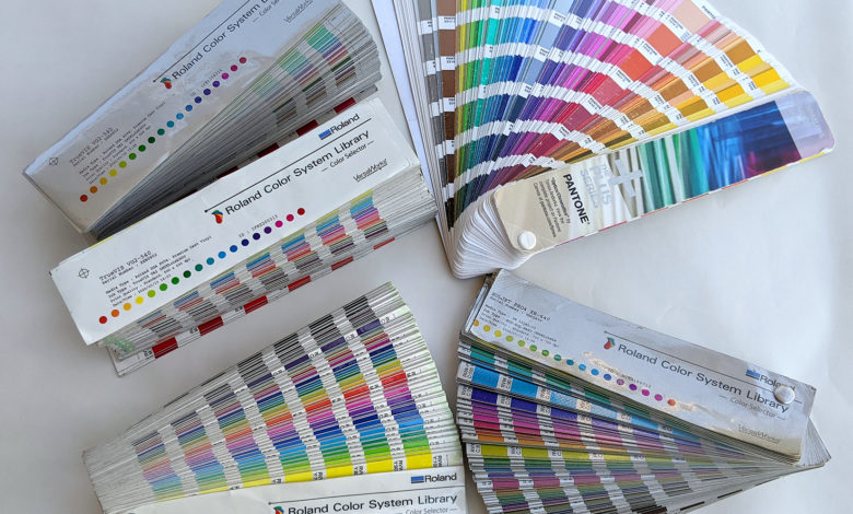
We typically color match using one of two sources — a Pantone color chart or our in-house-created color charts through Roland’s color system. Pantone charts are a great universal color source when matching up to colors a customer is already using.
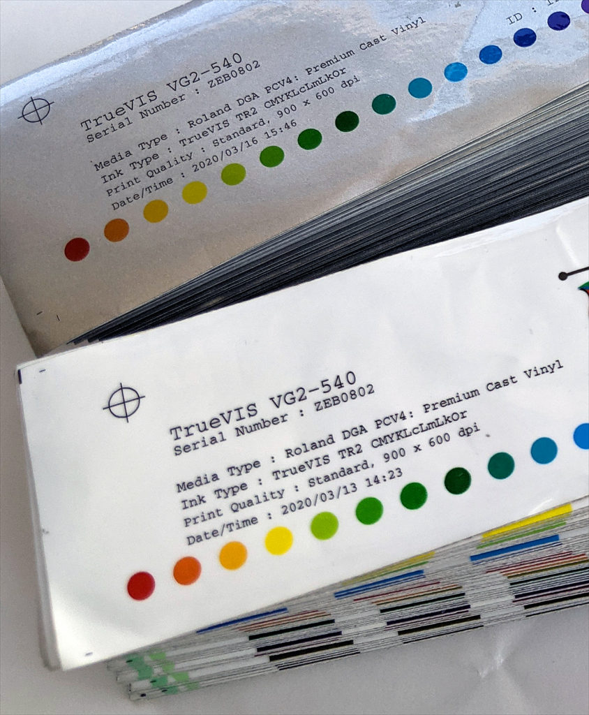
By creating our own color charts, we can print an array of spot colors on the media types that we use. For example, we have a color chart on our premium wrap media, 3M IJ180Cv3, a color chart on 3M IJ35c intermediate vinyl, and a color chart printed on 3M IJ180mC-120 printable metallic. Not only is the customer choosing the hue they want, but they can also see exactly how it looks on the specific vinyl type.
In addition to noting the spot color, we often apply an extra decal or piece of the printed graphic to the paperwork itself for future reference. If it’s cut vinyl, not printed, you can also clip a part of the material and apply it to the paperwork. Be sure to note the manufacturer and color number too.
