New alphabroder.com Offers Enhanced Customer Experience
The redesigned alphabroder website has new navigation and enhanced features

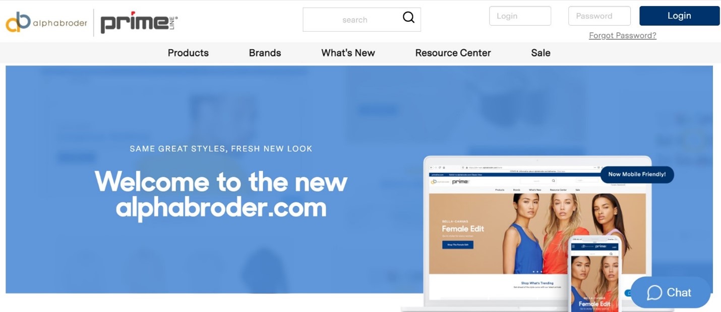
Apparel and accessories distributor alphabroder reveals a redesigned website (alphabroder.com) with new navigation, easier access to account information, enhanced product pages, and an updated checkout experience.
“The alphabroder.com site is central to how our customers run their businesses, so we’re making it even more powerful and easier to use with our biggest update ever,” says Cecile Pavot, web product manager at alphabroder. “We’re thrilled to see the incredible ways our distributor and decorator customers are taking advantage of our new navigation and enhanced product pages—they’re easily finding product categories, brands, resources, and more.”
The key enhancements the alphabroder.com design team made to the site include:
Redesigned navigation: On alphabroder’s home page, visitors can select Products, Brands, What’s New, Resource Center, and Sale from the top ribbon navigation bar.
Quicker access to account information: Account details are located in one place where users can view their account profile, order status, and invoices.
Updated product pages: There are multiple product images, larger product photos, and clearly defined buttons for downloads, samples, and product sell sheets.
Renewed shopping cart: The revamped shopping cart is easier to view, search, and make changes. Users can choose what distribution center product ships from, search for or remove specific items in the cart, and view swatches.
Enhanced checkout experience: The reconfigured interface follows a more traditional checkout experience, and order discounts are displayed.
The new site also offers an expanded chat feature, with experts ready to chat in real-time and upgrades to popular areas like the Digital Lounge, Featured Shops, and TMStudios sections.


