Fleece and outerwear aren’t just seasonal add-ons anymore, and with that comes new opportunities for decorators. What once were seasonal staples are now year-round essentials and are expected to deliver on comfort, form, and printability. Many decorators are already leaning into garments that feel better, wear longer, and hold decoration in a more refined way.
Let’s take a closer look at how fleece is shifting and where the creative possibilities are expanding.
Comfort is still essential, but structure and functionality are taking a more prominent role.
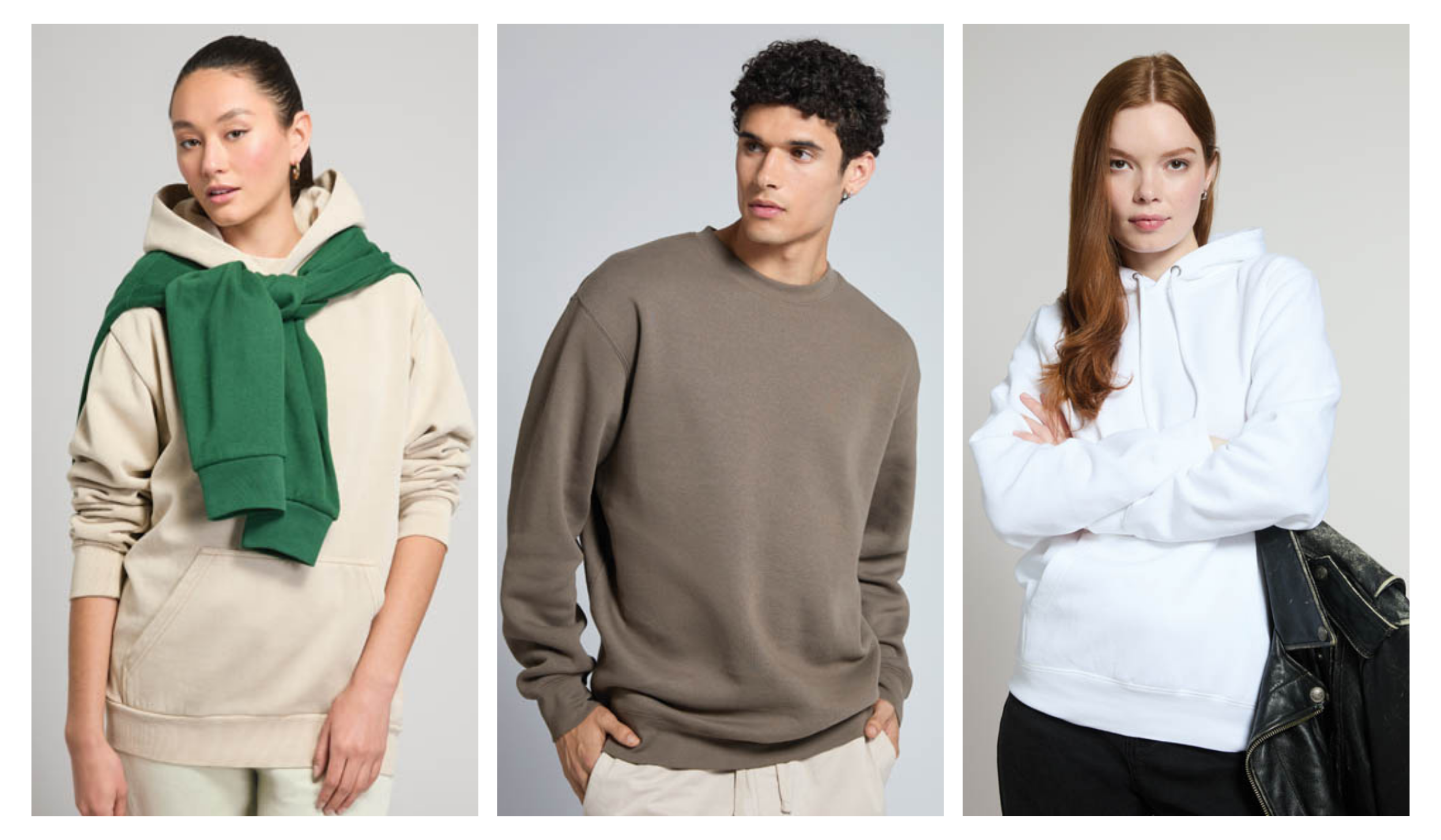
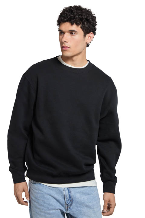
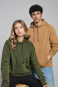
- The upgraded classic: Classic silhouettes are stepping up this season. Expect to see hoodies, pullovers, crewnecks, and full-zips that feel more intentional in both fabric and form. These styles are getting a noticeable upgrade with softer textures, cleaner seams, and structured fits that wear well and print even better. They offer a polished silhouette and a smooth, reliable surface for upscale decoration.
- Utility-inspired: There’s something about that workwear influence that just keeps showing up, and we understand why. Heavier fleece and boxy cuts with visible stitching are gaining traction because they not only wear well but also hold heritage-inspired decoration styles like throwback prints, stitched emblems, or textured patches that hold up well and add character.
- Athleisure: Athleisure’s grip on the market hasn’t let up, and it’s pushing everyday pieces to work a little harder. These garments offer flexibility and enough structure to carry bold graphics or tonal decoration.
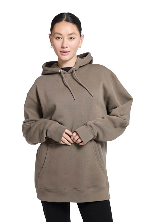
- Textured & oversized: If you thought sherpa had its moment, think again. Brushed fleece and plush textures are still going to be strong this fall. These fabrics offer a soft, plush feel and lend themselves well to more relaxed fits. Their texture adds dimension and makes them a great choice for larger graphics or subtle tonal designs that rely on the fabric itself to create visual interest.
Fall palettes are leaning grounded, desaturated, and wearable.
- Earth tones: Season after season, shades like deep brown,washed black, forest green, and charcoal continue to show up across collections. They’re dependable, wearable, and work well with most decoration methods.
- Muted jewel tones: Muted jewel tones are quietly making their mark. Plums, teals, and dusky navies add just enough depth to feel fresh, without overpowering a design. These shades bring just the right amount of color to tonal designs or collections that lean softer in palette.
- Vintage shades: We’re also seeing a return to colors that feel a little sun-faded, a little nostalgic. Mustard, dusty rose, and marigold work well with garment-dyed finishes and textured blanks for that broken-in, heritage feel.
- Black & white: Black continues to be a go-to for both versatility and bold prints. Off-white and bone tones, on the other hand, create an understated backdrop that complements everything from oversized graphics to minimal, tonal branding.
 Decoration techniques are expanding into more dimensional and detail.
- Dimensional techniques: By adding texture and depth, decorators are creating more visually engaging pieces. 3D embroidery helps designs stand out by giving them structure and lift. Puff ink creates a raised surface that adds both texture and softness. Chenille and felt patches bring a traditional, collegiate feel that pairs well with either retro or more heavyweight fleece.
- Tone-on-tone: Tone-on-tone is such a fun, subtle vibe we’ve been seeing grow in popularity. By applying thread or ink that is only slightly darker or lighter than the garment itself, decorators are achieving subtle branding with a premium finish. This decoration style works best on blanks with smooth surfaces and reliable color consistency.
- Oversized graphics: Oversized graphics — especially back prints — still turn heads. The right blank gives them room to breathe and makes the design feel deliberate, not overwhelming. Choosing blanks with clean, stable construction ensures the final result looks intentional and polished.
- Mixed media: Layered techniques are gaining traction. Whether it’s embroidery over screen print or a patch stitched onto a distressed graphic, decorators are finding ways to add depth and texture that feels intentional. Fleece with the right weight and stability makes this all possible.
No matter how creative the artwork or advanced the decoration method, it all comes down to the blank. Ask any decorator, and they’ll tell you the blank makes or breaks the outcome. A garment with uneven texture or poor structure can throw off even the most carefully planned design. But when the fit is right and the surface is smooth, every detail — color, ink, and thread — will land exactly the way it should.