The Oxford English Dictionary defines the word “texture” as the visual or tactile surface characteristics and appearance of something. Its origin is from the late Middle English denoting a woven fabric from Latin textura or weaving/woven, from the verb texere. It denotes the physical feel of something — smooth, rough, fuzzy, and all the above. The feel, appearance, or consistency of a surface or substrate. Texture has to do with how an object feels.
As a verb, it’s to give something a rough or uneven texture. The character or appearance of a textile fabric as determined by the arrangement and thickness and variation of its threads. The tactile quality of the surface. “A dark shirt of rough texture.” Hmmm … isn’t that interesting. It’s also absolutely apropos for this month’s Software to Substrate column. Let’s define apropos … or let’s not. We digress, once again.
There are several types of textures on today’s fabrics, particularly those of a worn or distressed feel. People love that worn-out look and after enough washes the feel is perfect. Most of the manufactures of the apparel don’t care about what that may mean to us decorators. Sometimes it can be quite challenging to do what we might refer to as “burying” that texture. We often joke about some of the blanks we must print on are like printing on a cat. Furry and inconsistent to say the least. And by the way, “soft” doesn’t always mean smooth. In fact, it usually doesn’t!
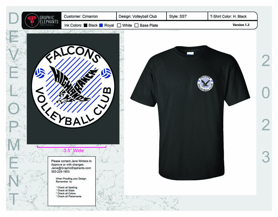
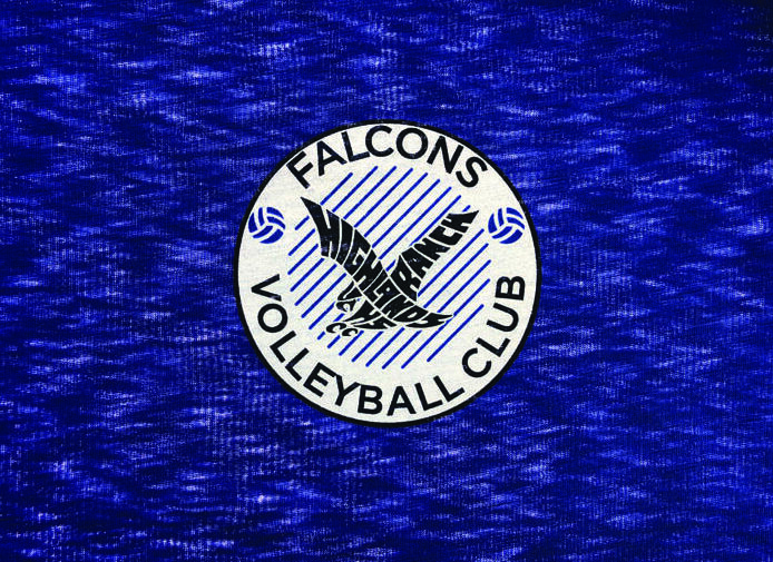
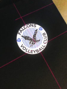
With this project, we started with a fairly straightforward circular shape and were mindful of our font choices, knowing that thin or condensed fonts sacrifice legibility on some of these creative surfaces. In Adobe Illustrator, we first made our shape using the eclipse tool, holding down the shift key for a perfect circle. Using the direct selection and rectangular tool, we built some horizontal stripes, then copied and pasted each into its appropriate length and place. For the text, we chose a clean font and, of course, the school logo that would be knocked out of the circle for the garment to show through.
With this selected, we went through our fonts and chose one that would work well with this layout. We sized it appropriately here as well. Still selected, we changed our font to outlines for additional manipulation. We added the graphic volleyballs with horizontal stripes to fill the space as well. We used Pathfinder to link into a solid shape and used white and black strokes to match outlines. Once we had our overall layout created, we maneuvered the type and shapes to fit properly. We reshaped the layout a bit and stretched everything into place where we duplicated it and locked the original. Since it was a left chest print and only at 3” in diameter, during our assessment of the composite we manually opened up areas that might fill in on press. Again, in anticipation of the texture of the substrate.
We can’t control the shirts we print on, right? Our customers choose the garments they want us to print on. In this case, we were printing on a burnout texture. Quite literally, portions of the fabric are all but missing. Typically, on a blended fabric, areas of the cotton are “burned out” leaving only the polyester. It’s very difficult to print on and bridge the fabric well. What we can control is the printing technique we would use on these shirts.
These 80% polyester/20% cotton blends had that difficult texture of varying, different thicknesses and densities throughout the fabric surface. First, we ran a carbon-based black blocker ink to keep the polyester dyes from bleeding. This was thicker ink and left a nice surface or shelf to print the balance of the inks on top. The ink also mats down the fibers and often leaves a smooth surface. We were trying to bury the texture.
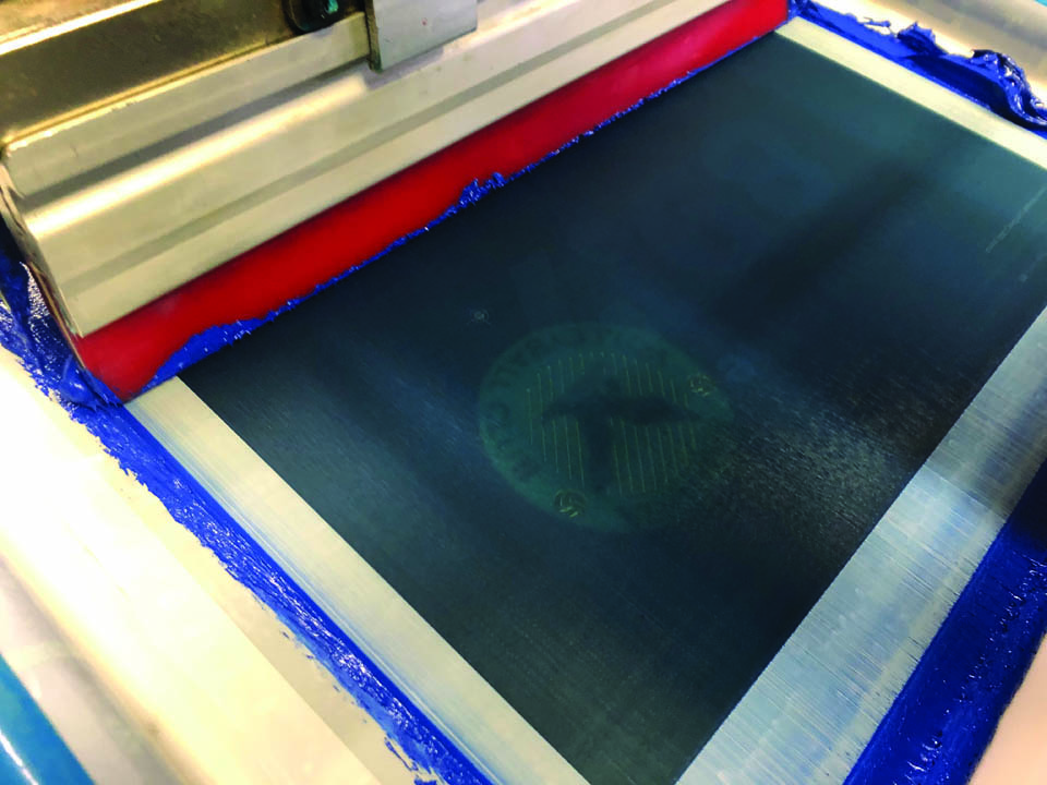
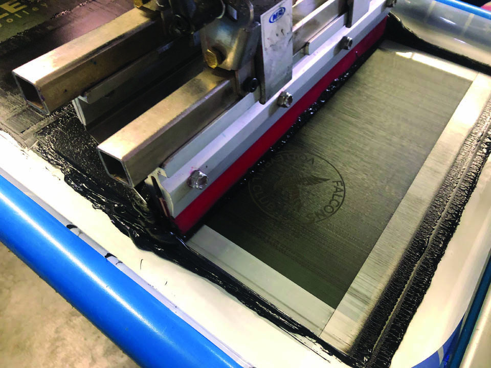
On that and our first white down, we ran the same low mesh 110 tpi (threads per inch) with a good stencil of 20% EOM (emulsion over mesh) for a substantial ink deposit. With some squeegee pressure and angle manipulation, we were able to clear the ink from the screen properly so that the missing fabric areas would fill in. We chose a low bleed white, with no blowing agent because the texture of the fabric in the thicker areas versus the thinner areas of deposit will blow at different rates, creating its own texture causing us further problems.
 After flashing, we kiss it with a Teflon smoothing screen and a heated iron. This matts down those pesky furry fibers. We printed the rest of our colors on top with no problems. That first layer down needed to be consistent and as smooth as possible. We output and exposed all the separations via CTS (computer to screen) with on-board LED exposure.
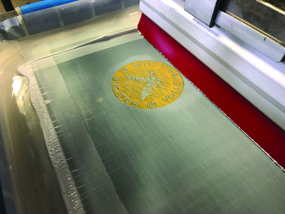
Blocker, white printer on lower meshes and the blue and highlight whiter were on 230s with a thinner 12% stencil for a clean ink deposit. Opacity was not important here. All screens were stretched to 30 – 35 N/cm. We developed, dried, taped, and inspected the screens after imaging. Four screens total. The preregistration fixture on press made set up a breeze. The first strike off was almost perfect. Our squeegees were 65/90/65 triple ply dual durometer for the blocker and white followed by 75/90/75s on the blue and hi-white all at 10- to 15-degree angles with minimal pressure and medium speeds on the flood and print strokes.
The challenge in this project wasn’t the art, screen-making, or printing part of the process; it became the added difficulty of the fabric surface or texture. Actual texture, also known as literal texture, is texture that’s actually present and something you can feel when you touch it! You can say that again!