When we approached Dane Clement, VP at STAHLS’ about collaborating on a T-shirt design for live screen-printing demos at a big trade show in Las Vegas last year, it was an easy yes. We’ve been friends for over three decades and always know that working together means the final product is going to be something truly special: an excellent design, expertly printed, visually strong, and memorable. We decided to work together on a concept and design. Dane would make it all come to life, and we would handle the production and the demos. We’ve done this a few times.
On the surface, this sounded like a straightforward project. But as with most creative endeavors, the simplicity was deceiving. We had a rough vision in mind, but getting there would be anything but simple. It never is.
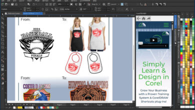
Though we are still not completely sure how we feel about artificial intelligence, rather than building the artwork as an illustration from scratch, we decided to utilize AI as a creative tool, specifically Midjourney. We’ve used it quite a bit and found it to be a powerful platform. That said, getting specific imagery from AI can be tricky. We’re flexible and always open to surprise. AI can sometimes deliver gold, but chasing this precise subject matter required us to roll up our sleeves. We knew it was a great place to start our ideation.
Vintage Vegas vibes
We had an ambitious goal to capture vintage iconic Las Vegas in a single image. We were thinking old school slot machines, playing cards, roulette, dice, chips, and a nod to the Vegas skyline of the past. We wanted the texture and depth, and the grit and glamour of the Strip’s heyday.
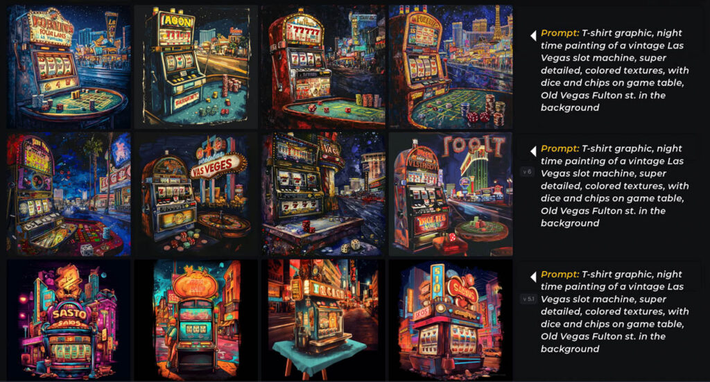
That’s a tall order. It made sense to try to prompt for an item or two at a time before we worked them together in Photoshop later. From our prompts, the initial outputs from Midjourney gave us a handful of direction, some of which was pretty solid right out of the gate. No human could generate these rendered images in mere seconds. But even the best AI-generated pieces didn’t check every box for us.
That’s when we started thinking like artists and looked for the skeleton. If the structure was there, we could fix the rest, often with Photoshop’s Generative Fill. We selected our favorite slot machine and roulette table to become the backbone of the final piece. Ironically, the playing cards, which seemed simple to generate, turned out to be the hardest. After multiple attempts, we ended up shooting photos on the kitchen counter. Sometimes, old school beats AI! We worked through multiple iterations of the details of the image before finalization.
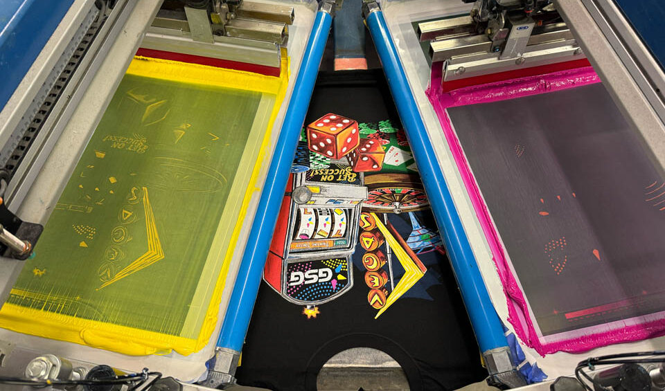
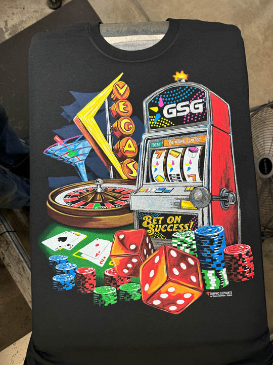
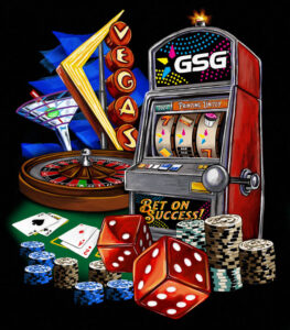 With the composite image dialed in, we moved to separations where we would employ Separation Studio NXT. We would go back and forth between the software and then open the channels in Photoshop for additional manipulation. We would need two sets of seps. One was a six-color version for the live demo with a smaller press in Vegas. The second was a larger, 11-color version designed for a bigger automatic press we have at home where we would utilize special-effects inks and specific spot colors for maximum visual punch.
Once the color was developed, we carefully considered our white printer or base plate’s opacities. The black fabric helped us achieve secondary and shadow colors. We managed a number of tones with each color using various percentages. By removing positive information of the black areas and defusing densities, we built our deep tones. To make the color bright and bold, higher percentage densities were used.
Once seps were completed, we outputted on CTS with a frequency of 45 LPI (lines per inch) at a 22.5 degree angle. We ran the white on a N-166 tpi (threads per inch) screen at 45 N/cm2. All squeegees were 65/90/65 a triple ply duel durometer. Next, the colored inks and the highlight white all ran wet-on-wet on N-272’s. The SFX screens were on N-102’s with 400 micron stencils. We ran the bulk of the order at our place and shipped to the show for attendees. The dumbed-down version printed live at the show using similar screens, inks, and squeegees.
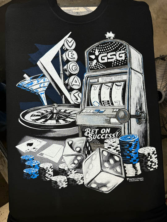
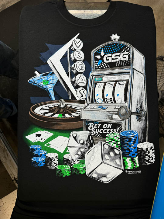
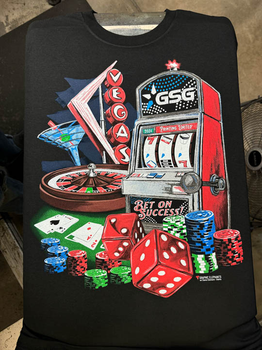
We picked bright primary and secondary colors as well as the CMY that are part of the logos. Straight forward color theory. To add a little Graphic Elephants stank, some special effects textures and foil were also used. That added a tactile component and some reflectivity to catch the light. The high-density plate required a little thought since it printed under other colors. We choked it with a full point stroke so that it had room to expand and kept the shapes simple.
This printed before the other colors that were knocked out from each other. The smaller shapes on the clear printed last and randomly. The clear was also used as an adhesive hold for the nontraditional foil treatment applied at the end of the dryer.
 We also prepped files for direct-to-garment (DTG) and direct-to-film (DTF) printing. For the DTF transfer, we removed the black for a softer hand and applied a 20 LPI halftone — large enough dots to ensure good adhesion of the adhesive powder and allow for a clean transfer to the garment. If you want to dig deeper into this and other processes, learn more at DaneClement.com and GraphicElephants.com.
This was a project that merged human creativity with cutting-edge tech. A true collaboration between vision, experience, and tools that are reshaping how we work. And, as always, working together made the process just as rewarding as the
final print.