Updating a Classic
How one music venue leveraged new technology while maintaining its iconic look.
As the Fillmore Auditorium, one of Denver’s most iconic music venues, neared its 20th anniversary, the Fillmore team wanted to spruce up its current look. The main outdoor sign particularly needed an update to give the venue a more modern feel.
Winning the Bid
Conveniently, Freeman Signs, an outdoor sign shop in Denver, also noticed the Fillmore’s sign looked worn and contacted the Fillmore before even realizing the venue was interested in a new look, says J Dexter, director of digital services of Freeman Signs. While the Fillmore team opened bidding to other sign shops as well, proactively contacting the venue went a long way in helping Freeman Signs ultimately secure the contract.
“It got us into the conversation,” Dexter says. “Had we not been proactive, they may never have asked us to bid, but by reaching out, we let them know who we are, and it definitely helped us get the job.”
Along with Freeman Signs taking a proactive approach, Dexter says that the local connection helped his team win the job.
“The people over at the Fillmore are big on supporting the local economy,” Dexter says. “They loved the idea of having technicians and people who know their signs and the project and are close enough to provide service and support. That was a huge driving force behind the Fillmore team going with us over someone else.”
Creating a New Look
While the venue was ready for a new sign with a modern twist, the Fillmore team didn’t want to stray too far from its original look. As such a popular music venue in Denver, the Fillmore’s façade is a recognizable icon to the community, and creating a new look that doesn’t embrace those traditional elements wouldn’t feel right for the beloved space.
“We wanted to give the Fillmore a facelift while still being able to maintain the classic feel of the 20-year-old venue,” Dexter says. “Having that classic look was super important. The Fillmore team wanted to maintain the feel of the original venue while still being able to bring the sign more up to date on technology.”
To create the design, the Freeman Signs designer worked closely with the Fillmore team to decide on the right look, Dexter says. The Freeman Signs and Fillmore teams initially discussed their vision as a starting point, and then the two went back and forth sharing drawings and feedback until they settled on their perfect design.
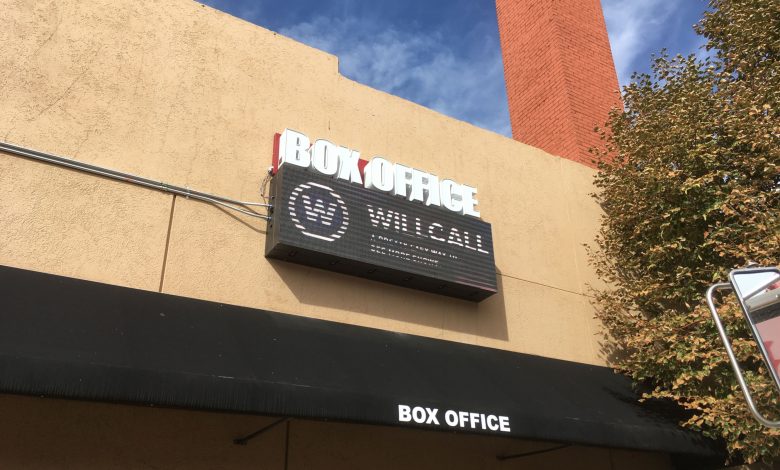
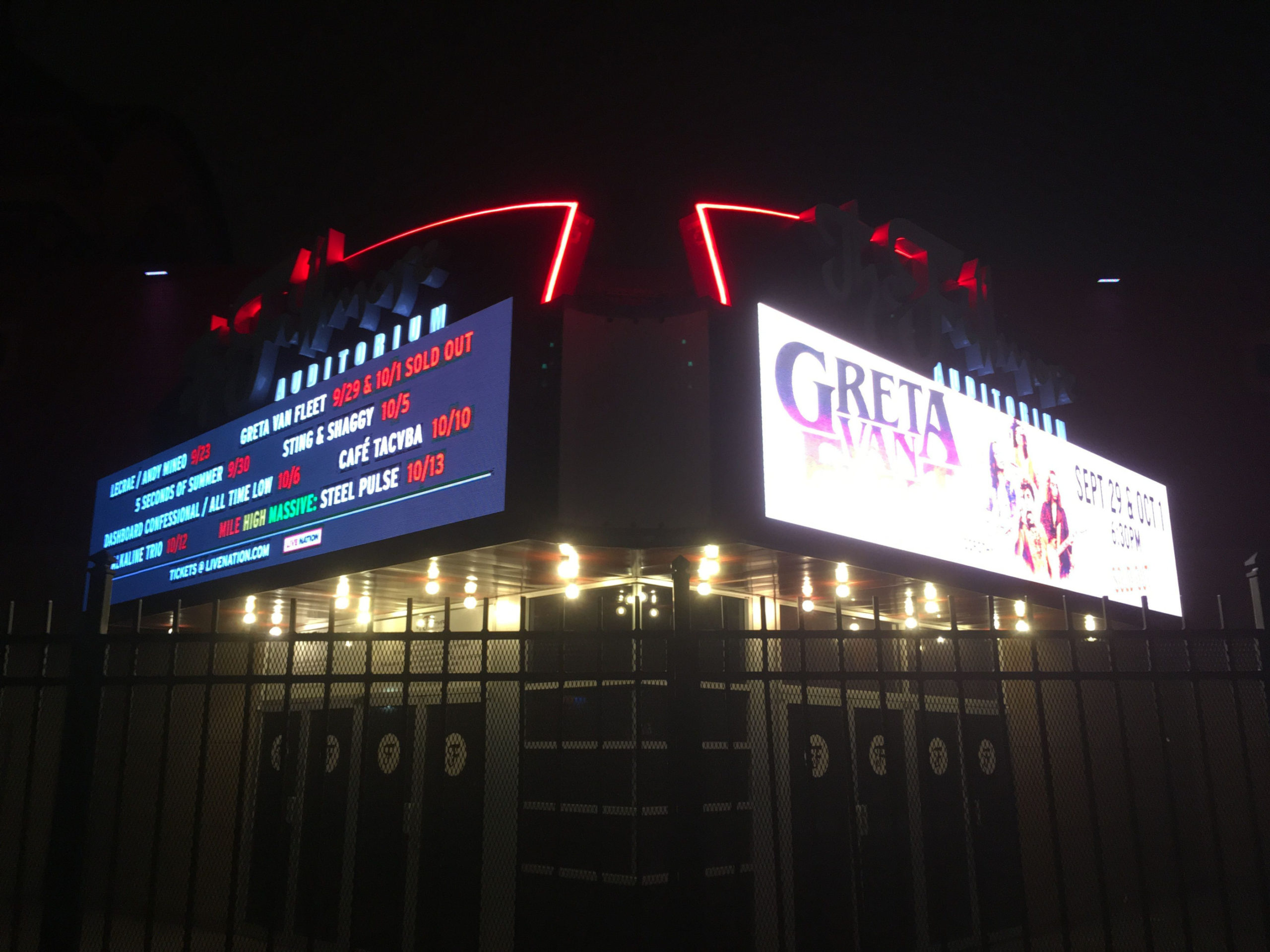
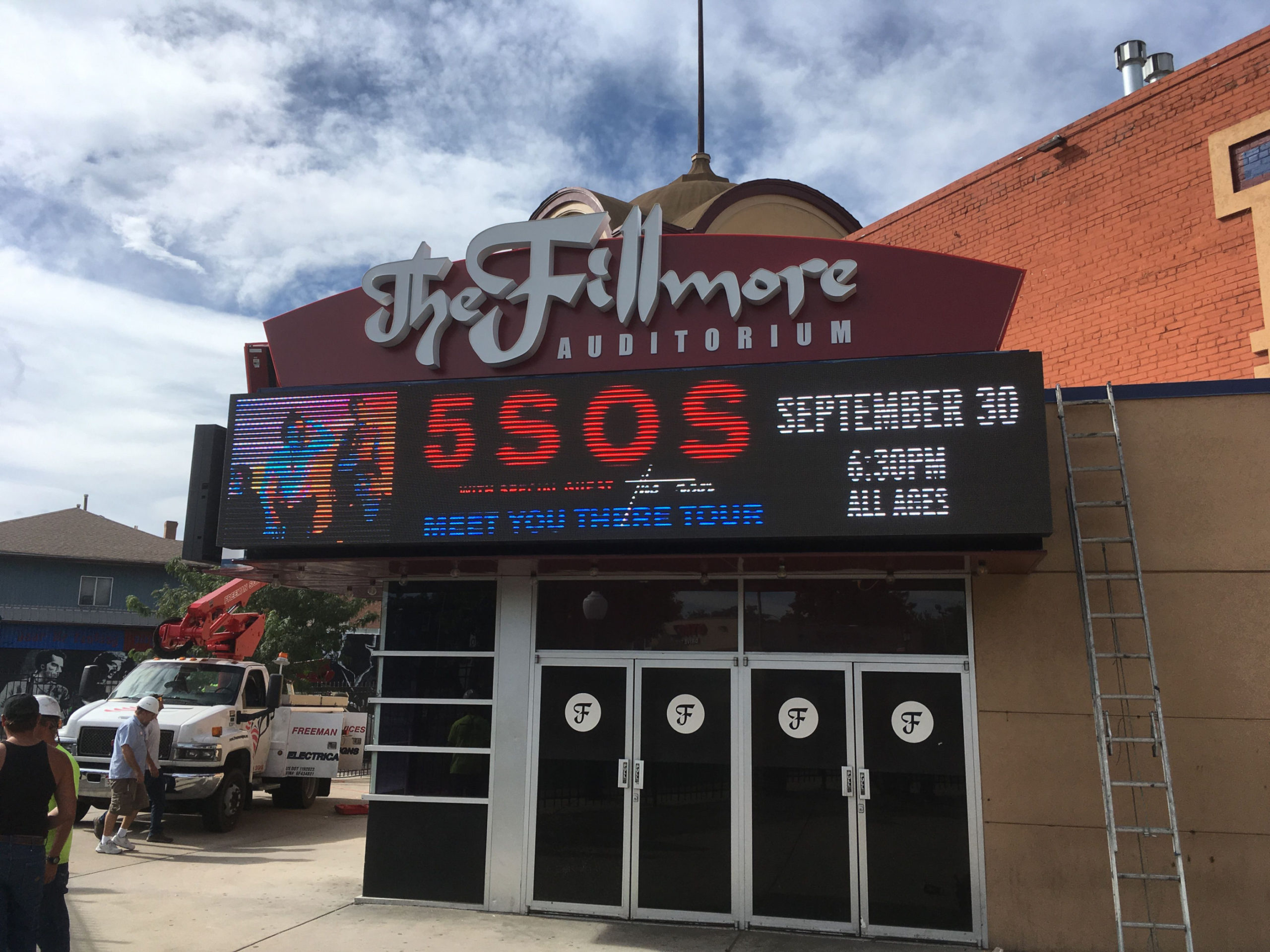
The Freeman Signs team ultimately created a signage system with RGB-lit pan channel letters and a static-lit cabinet on top of two 20-foot-by-4-foot EMCs as well as a third EMC over the box office. Rather than using a prefabricated product, the Freeman Signs team imported the parts and manufactured the signage system in-house. In keeping with the classic feel, Freeman Signs also replaced the neon with a flexible LED product for a more energy-efficient and up-to-date configuration, Dexter says.
“The previous sign was one of those old reader boards where you’d take the letters, put them on a suction cup and hang them in the tracks,” Dexter says. “Being able to instantly share and change digital messages and add photos was a really big step forward for them and added to the ambiance of the venue.”
Exceeding Expectations
While the Fillmore’s 20th anniversary is in 2019, Freeman Signs started the project early and set a deadline-dependent schedule to ensure delays didn’t get in the way. Dexter and his team made sure they planned all elements upfront before executing the production, and that kind of organization paid off. Freeman Signs installed the new sign in October 2018.
That organization was especially important to the Fillmore team, Dexter says. For such a busy venue, the Fillmore team didn’t want the installation interfering with day-to-day operations. With a detailed installation plan in place, Dexter broke down each segment into manageable time blocks to make sure his team had the resources and talent to bring each of element to fruition on time without getting in the way of daily business.
Now that the sign is up, the Fillmore team has been nothing but pleased, Dexter says. The EMC allows the Fillmore to connect with its audience more effectively while retaining the classic neon look.
“In the end, they absolutely loved it,” Dexter says. “They thought it was everything they wanted and probably a little bit more. The sign has been featured in the Denver Post, and you can tell they’re very proud of it with the way they’ve shared the new sign on their Facebook and Instagram. We’re so happy that we helped such a prominent local venue achieve the new look they wanted.”


