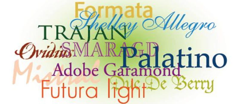
The main thing to focus on when using fonts is to decide when you want the font to disappear so the reader can focus on content and when you want the font to attract attention and graphically express something that serves the content.
Reading works best when the reader is so absorbed in the content that they are not even aware that they are reading. Designing with type, if done well, can make that happen.
On the other hand, if someone hands you a page of perfectly laid-out, easy-to-read paragraphs, most folks would set that page down and find something more interesting to do. Why? Boring! Your other job is to get the reader’s attention and make them curious enough to read the whole thing from start to finish. That is where expression is key, and headline fonts do their best work. They give the reader a quick overview of the content and stimulate curiosity. Then the reader wants to absorb the text without distraction.
-Jim Sadler