You’ve been marking school logos on stainless-steel tumblers using laser marking material for months. They all turn out great, with a dark contrasting result. Then you’re given some black powder-coated tumblers to mark. No problem. Using the same graphic, you run a job that vaporizes the color to expose the stainless steel underneath. You clean it up a bit and… it doesn’t look quite right. It looks like a negative! What just happened?
Much like writing with chalk on a blackboard, the laser vaporizes the coating and exposes the stainless steel underneath, making a light contrasting mark on the tumbler. What’s black in the drawing translates to stainless steel on the tumbler and a negative image is engraved. In order to create a positive image, the graphics in the drawing need to be inverted.
The subject of inverting graphics is easy enough to understand. Many may question the need for an article on something so basic. But I’ve seen enough examples of completed works, done by skilled craft people, that failed in this regard, so there must be some confusion regarding it. Hopefully this article helps.
A DARKER OR LIGHTER MARK?
Before anything is marked with the laser, there is one question to consider: Will the mark that is made, even if color-filled, be darker or lighter than the material being marked? If darker, there is no need to invert the graphic. If lighter, then inverting the graphic in the drawing may be necessary.
I qualify this because many graphics, particularly text, borders, and simple clipart, look just fine either way. Grayscale graphics, photographs, and more complex graphics such as those where relative colors and contrasts need to be preserved should be inverted. “If the mark or fill is light, invert the graphic to get it right. But if the mark or fill is darker still, the graphic should stay in a positive way.”
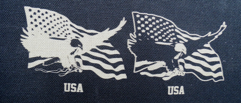
When a graphic is engraved with the laser and makes a mark that is lighter in color than the material being marked, a negative image is created. Text that is black in a drawing will be white on a wineglass. A positive image of an American flag in a drawing engraved on a dark-colored, powder-coated tumbler results in a flag with dark stars on a light field, seven white stripes, and six darker stripes. And a bald eagle will have a dark head and a white eye on a dark-colored, cotton duck canvas bag. While the white text on glass is, in practice, acceptable, the others are not. I’ve seen enough negative flags and black-headed bald eagles to know that this is an issue. [Photo 1 in below slideshow]
ACCOMPLISHING INVERTED GRAPHICS
Inverting graphics is simply another term for changing a drawing or a graphic component from a positive image to a negative one. It’s accomplished in graphics programs by selecting an object and using a tool or function that converts that object to a negative version of the original. In some programs, it’s known as inverting colors; in others it’s simply called negative. Regardless, the graphic’s color values are reversed. It’s usually best, for the purpose of engraving with the laser, to have the graphics in black and white or grayscale before inverting.
Many clipart graphics are in black and white and can be inverted without much of a problem. Some, however, are just black, with the white parts of the drawing being empty spaces. Invert them and the graphics “disappear.” The black areas are now white, and the empty spaces are still empty. The same happens with black text. To get a negative image, you need to fill the empty spaces. This is done for most graphics by adding a white background to the original graphic. A white border can also be added, particularly around text, to differentiate it from the background of the piece being engraved. [Photo 2 in below slideshow]
The tiles in the photo of the rams demonstrate the need for inversion and some of the problems you can have inverting graphics. The white tile with the black image is actually a black tile painted white. The engraved image is made by vaporizing the white paint and exposing the black tile underneath. The graphic in the drawing looks just like the engraved image. Engraving this tile is akin to drawing on a white sheet of paper with a black pen. That same drawing will get similar results on other materials where the mark will be darker than the material being engraved. It’s a straightforward process with no inversion needed.
The black tiles are white ceramic tiles painted black. For those, the laser removes the black paint exposing the white tile underneath. The laser is making a mark that is lighter than the material. It’s equivalent to engraving on materials such as dark-colored tumblers, dark-colored cotton duck canvas, black granite and glass, or clear cast acrylic.
The tile in the upper right of the photo was engraved using the same graphic that marked the white tile. The engraving, while recognizable as a ram, is clearly a negative image. In order to get a positive image of the ram, the graphic in the drawing must be inverted. But, as you shall see, it’s not that simple.
The lower left tile in the photo was engraved with the graphic in the drawing inverted. The engraved image is a positive; however, two of the legs and the tail have been lost from the engraving. They are still there in the drawing, but because they are the same color as the background, they cannot be seen.
Fixing the lost parts is fairly simple. The lower right tile was engraved using an inverted image with an outline, which defines the limits of the shape of the legs, tail, and everything else. The outline in the drawing is black, thus it draws on the tile exposing a white outline. An alternative would be to create a background shape filled with black or even a gradient.
So be aware that outlines or backgrounds may have to be added in order set the engraved image apart from the material being engraved. “If the mark is lighter, invert away. If it’s darker, let the graphics stay.”
DEALING WITH DIFFERENT MATERIALS
How different materials react to being engraved by a laser determines whether a drawing should be inverted or not. Some materials engrave darker, some lighter, and some can be a toss-up. Here are a few common material types and how to deal with them.
For color-coated tumblers, every time black text in a drawing is rastered onto a dark color-coated tumbler, a negative image in stainless steel or aluminum is created. With text, that usually isn’t a problem; it’s the contrast that is important. If, however, a photograph, grayscale image, or other graphic where relative colors are important is engraved without inverting the image in the drawing, a negative image will be the result.
To get a positive image, you must use a negative image. The exception is when the color of the tumbler is lighter than the exposed metal, as in some of the can coolers in the photo in the slideshow below. You can see that the engravings appear dark on the light-colored coolers and light on the dark-colored coolers. It comes down to judgment when deciding what to do with these exceptions. [Photo 3 in below slideshow]
While white text and other design elements are perfectly acceptable, I can say without exception that any grayscale or photographic image must be inverted to make a positive image on glass and clear cast acrylic. Unless it will be color-filled, laser engraved marks on glass and clear acrylic are always white. Even though the material is clear, glass and clear acrylic can be considered to be a dark material. Put an engraved glass in front of a white background and the engraving will disappear. It has to be seen against a dark background.
Also remember that if engraving on the reverse side of glass or clear acrylic, the entire drawing needs to be mirrored. That way it will look normal when viewed from the front through the material. Glass seems to be the medium where most of the negative image mistakes are made. Sadly, I’ve seen negative images on projects as large as church door windows.
Slate, black granite, and black marble fall into the same category as glass and clear acrylic. They all engrave with a whitish mark, so inverting the graphics in the drawing is required to get a positive image.
On most colored, opaque cast acrylic, the mark made by the laser is lighter than the original color, so an inverted image is usually required. If, however, the raster is to be filled with a color darker than the original color, the graphics in the drawing do not need to be inverted. [Photo 4 in below slideshow]
What is done with graphics on wood depends on the final finish and the desired outcome. Always determine whether the final engraving will be darker or lighter than the final finish of the wood. Dark burn marks on lighter wood means a positive graphic is needed. Lighter marks, whether lighter than a stained wood or color-filled to be lighter than the wood, require a negative or inverted image.
There are a few ways to make marks on fabrics. The two most common methods are burning and fading the color. Burning is usually done on lighter colored material. While not recommended if the integrity of the material is to be preserved, it is acceptable for display pieces. In this case, a mark is made that is darker than the material being marked, so the graphics in the drawing do not need to be inverted. A positive image should be used.
Fading the color on material is usually done with a low power, high speed raster on dark material, like blue jeans or cotton duck canvas. A lighter mark is being made, so the graphics – at least any grayscale or photographic images – in the drawing should be inverted. “Darker mark let it be. Lighter mark, inversion is key.”
SUBJECT OF INVERSION
I positively tried my best not to be too negative about the subject of inversion. It’s not as clear-cut of an issue as first might be assumed. You may have to invert an entire graphic or just a part of a graphic. Adding backgrounds and borders may also be necessary. It takes some judgment and trial and error to get the best results. It will eventually become second nature when it comes to knowing what to do. There will still be mistakes but just own up to them and make the corrections. Be positive by going negative – invert!