When I was asked to write an article on color-matching solutions, I wondered what I could possibly bring to the table that hasn’t already been done or said by some great sublimation industry members. Now here’s the thing: color matching means a few different things to different people. For most, it’s matching a certain shade of blue in a company logo or getting a sky to actually come out blue, or the skin tone on a person to not have a green tint to it. Sometimes, people are referring to a color looking faded as well.
There have been numerous articles released over the years, long and short, by various authors (including one by yours truly published last year). When searching for videos online, I found various resources on YouTube by sublimation industry voices like Condé and JDS Industries. The problem is these great resources are out there and online, but they are all over the place and can be hard to find.
I thought what might be helpful for those who have missed these great resources or if you are new to sublimation (welcome to the industry!) is to recap some top tips and provide a resource list for you to watch or read at any time—whether to remind yourself or learn for the first time and grow your confidence when it comes to color in your dye-sublimation business.
Top tips
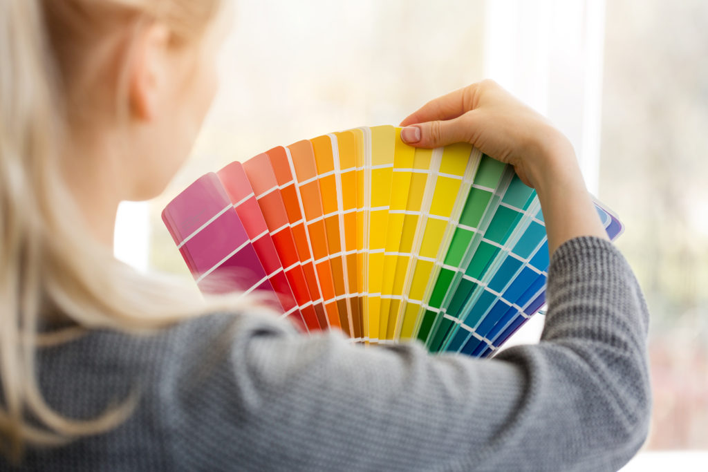
Let’s start with top tips for dealing with color and your equipment. These are quick things to do, check, and keep in mind:
- Perform a nozzle check.
- Keep in mind that the print head may need to be cleaned if the nozzle check pattern shows gaps. There are several ways to initiate a print head cleaning on various printers. For complete instructions on print head cleaning, see your printer manual.
- Sublimate the nozzle check.
- Make sure you are in RGB color mode.

Sometimes an issue is related to your ink. Have you switched brands recently? Is it expired? - Are you using the correct paper and the correct side of the paper?
- Make sure you are printing with the correct color profile.
- Use the correct driver settings: Photographic? Vivid? Fabric?
- Make sure that the color printing is set up to include all colors, not only one.
- Check the heat press platen temperature.
- Check your material. If you aren’t buying from a distributor but a major retailer, the poly content stated is not always true. Numerous social media threads online support that theory.
- Did you change ink brands or kinds? If so, those printer ink areas need to be flushed out very well. Distributors like BestBlanks.com offer cleaning cartridges for printers, so that may be something to look into if you’ve switched your printer to sublimation inks.
- Check the ink expiration date.
- Time slips by, and suddenly you didn’t realize that ink has an expiration date of yesterday. It matters. Check the dates when your package arrives and mark that date on a calendar. I suspect it’s like milk or eggs when it comes to expiration dates. The ink won’t suddenly spoil, but be wary once you hit or get close to that date.
Pro tip
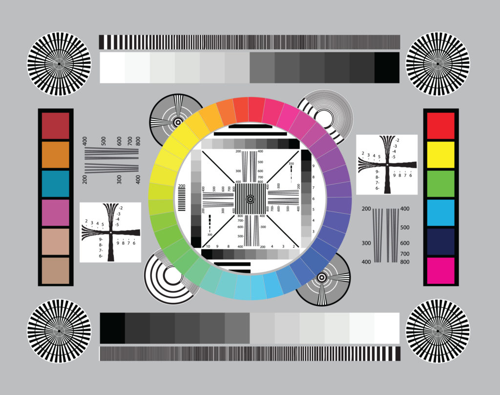
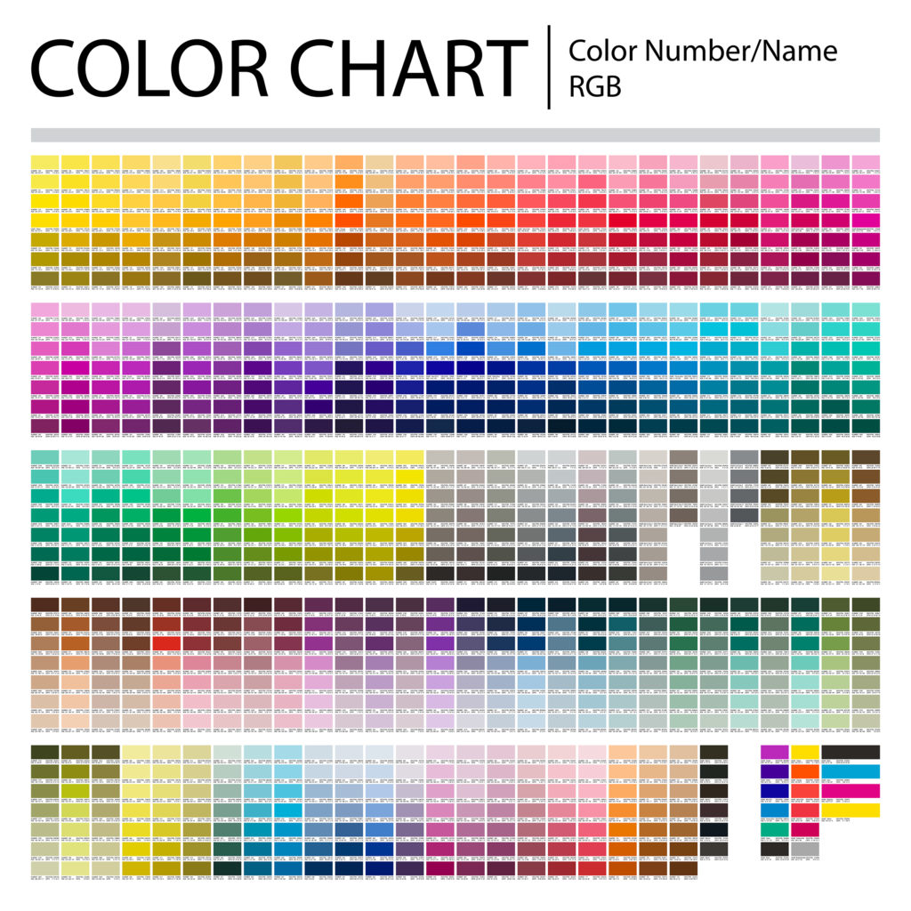
Sublimate a color chart to start with on a metal print or if you are sublimating fabric, do a plain white shirt. To go one level up, sublimate a color chart and a group of small photos (that includes various people and color shades that show a bright white, shadows, and a solid black). Looking at skin tones, shadows, and then solid colors allows you to see all the options.
Is the solid color smooth? Does the person look a little green? Is the shadow blotchy? Review it and ask questions. Not sure you can focus and concentrate? Set a timer for yourself to look at the pressed pieces for 15 minutes. After just a few minutes, I guarantee the voice in your head will start analyzing the colors you are seeing, asking questions, and before you know it, you’ll be able to see the color of the printed samples.
One last tidbit to help you organize your color chart reference: add a date to it. You will want to go back again in six to nine months, run off the same chart and photos, and then compare them to the older date to check your color consistency.
Image fading
Do the color and image look faded? Image fading (if the above checklist has been used) could be due to the incorrect pressure, time, or temperature. Double-check the recommended settings from the company where you purchased your sublimation blanks. This is another reason to purchase from a distributor—the support they offer can help save your sanity.
Coastal Business Supplies notes that “image fading is usually caused by too much time and temperature, and/or pressure. We suggest double-checking the recommended settings from the company where you purchased your sublimation blanks. Every heat press is different, which is something to bear in mind. Another suggestion is to double-check the temperature of the top platen on your press to make sure it aligns with the stated temperature; for this, we recommend heat strips.”
Using color management software is essential. Yes, there are various levels of software available. Some are free or included when you purchase a printer or a system, like CreativeStudio; others like ICC Color Profiles may be offered from your distributor at low or no cost. While color management RIP software is the cream of the crop, start with your training wheels on a smaller scale, understand your equipment, and just get started. I promise it’s easier than you think.
Additional sources
Are you looking for some of the supplies mentioned, like heat strips, cleaning cartridges, or solutions for your printer, etc.? Many of these items are available from distributors across the country. Check their websites to see what they suggest and what they have in stock to help you on your journey to awesome sublimation color.
Remember, we are all in this together—if you encounter a color-matching problem, most likely someone else has had the same frustration. Contact your distributor for help, join a few sublimation groups, and one last resource for you, use the search function on the GRAPHICS PRO magazine website. You will find all sorts of articles and tips previously shared by industry experts. Good luck and happy sublimating!

