The Visual Side of Branding: Part two
What key messages do you want your brand to communicate? Get started creating your visual language - and while you're at it, catch up on part one.
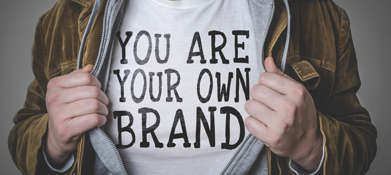


We wrapped up the first part of this two-part series in the previous article (The Guide issue, page 44) with what branding is, why is it important, and messaging about consistent branding on items from invoices to packaging and employee apparel. With that, let’s talk about the visual side of branding. This is the visual identity, including the logo design, but think beyond just the logo. This is the feeling and characteristic of your business.
SET THE BRAND VOICE
You set the brand voice through words and visuals. The colors you select, the typefaces, shapes, etc., should all support the voice and tone. Particular words or phrases you use become associated with your company, mission, or goals and become part of the brand identity. How would you describe your brand? Is it masculine, feminine, or gender neutral? Is your brand traditional or modern? What are the key messages about your brand that you want to communicate? Stick to your brand promise and be true to it.
Employees and customers won’t be loyal if you can’t stick to your promise. Create basic looks or templates and use them in different ways. For example, use the letterhead layout for your invoices and so on when possible. Look at all your systems and signage to make sure you are consistent on what fonts and colors are used. If something looks out of place, fix it up to make it work for your brand.
Consider employing a professional graphic designer or someone studying design at a local college. Put it out there online or on a thumbtack board on campus that you are looking to work with a local designer for some branding and identity work. You might be surprised at the cost or trade agreement that can be worked out. There are also some online design services that pair businesses or projects up with designers, such as fiverr.com or upwork.com.
When working on a visual identity, break it down to colors, typefaces, shapes, patterns, and more. The artist Louise Bourgeois stated, “Color is stronger than language. It’s a subliminal communication.” The purpose of forming an identity system is to create an easy-to-use, consistent visual language that supports the logo. This system then complements the logo and creates flexible elements to be able to use in different forms on media or promotion. You don’t need to go as far as creating formal style guidelines (but you can if you’d like), which would include things to not do with the logo mark (such as switching colors around, stretch it unevenly one way or another, changing the font used, etc.), as well as if the logo is under a certain size to not use the tagline with it, when to use iconography versus the full logo mark, or even how much space must be between the logo another images or logos, etc.
When you pick your color palette, stick with it. If you update your website or change your location, stick with your color palette. Don’t just add an orange wall in your new retail shop because you love the color. If it’s not in your color palette then don’t use it. If you have a spring-inspired palette (yes, you can even use seasons to help create your identity system colors), then stick with that season; don’t add in a dark evergreen shade to some signage to “make it look different.” If you need signage design help, enlist a professional.
If you are working with a graphic designer and move to work with a different designer, be sure to have the exact color formulas for RGB, CMYK, and the hexadecimal numbers for web use.
Brand images or photos can visually set the tone as well. Whether they are tinted yellow and square for a nostalgic feel or colorful still-life images with candy decorating the background, how you show or treat the images should be consistent to help set the mood. The same idea applies to textures as well.
If you want to create a cheat system for your identity, look on Canva or Creative Market online. Both of these templates for identity systems are available to purchase for around $10 to $40. The template can then be filled in to use as a reference with employees and for yourself when creating a piece, whether it be an invoice form or patterned tissue paper to be used with your packaging.
KICK OFF YOUR BRAND
Looking to save money as you kick off your identity system? Make friends with a small local printer for small amounts of letterhead. You could even purchase some nice paper from them and run the letterhead off yourself. Get envelopes printed professionally, unless you are comfortable navigating your printer setup or settings to hand-feed for printing envelopes on site.
Other cost-savings ideas: get a stamp made to use on bags, boxes, tags, or envelopes. Look for special deals on sites like Vistaprint to run off 250 business cards at a great price savings. Want a square business card or something a bit more creative than what Vistaprint may offer but don’t have a local printer to work with? Try the company Moo online for various sizes, paper textures, and more. Both of these companies have fliers, postcards, and other products besides business cards that they offer as printed products. Sign up for online mailing lists to receive email discount codes. I’ve ordered business cards before at 50 percent off and with cheap shipping for one heck of a deal.
Once you have a logo and an identity system, use it everywhere. Be consistent, promote the heck out of it, and enjoy it!