Text Layout Tips for Easier Communication
Whether it be a plaque, trophy, or another item you need to design, the layout of text either helps or hinders the reader.
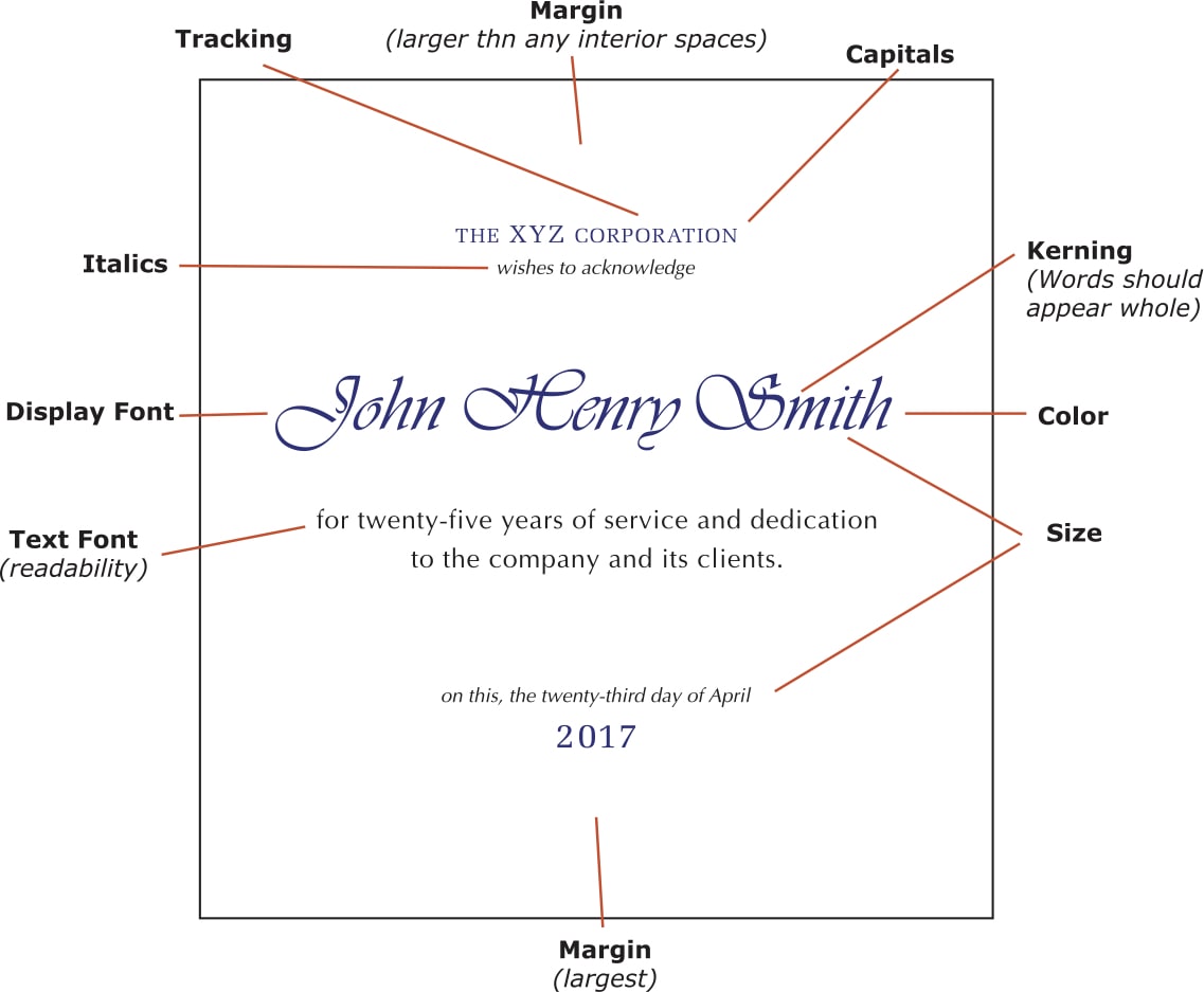
In our industry, the messages tend to be relatively short without much in the way of long paragraphs full of text; however, there is generally a message there that needs to be communicated. Beyond font choice, we are left with the relationships between the various design elements.
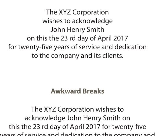
Especially with short messages, it is important to make sure the lines are broken in a way that helps, rather than hinders, comprehension. If the following line lands on your desktop, how do you go about breaking it up to help rather than hinder readers from absorbing the content: “The XYZ Corporation wishes to acknowledge John Henry Smith on this, the 23rd day of April 2017 for twenty-five years of service and dedication to the company and its clients.”
Initially, it’s common sense, such as: The XYZ Corporation | wishes to acknowledge | John Henry Smith | on this, the 23rd of April 2017 | for twenty-five years of service and dedication | to the company and its clients. The idea behind breaking it up is to look for whole phrases that mean something and place the breaks in between. In long paragraphs of text, the breaks are random, but when there is little text, where we break can make the phrase clear or confusing.
-Jim Sadler

