Seventy-five years is a long time. In the changing Colorado region, Cimarron Elementary has stood since its founding by the Cherry Creek School District in 1950. Cimarron has educated generations of students and has been a constant in Elizabeth, Colorado, a community that has seen plenty of growth. Elizabeth is a sleepy little cow town from which my company, Graphic Elephants, hails.
Cimarron has always been more than an elementary school, it has been a pathway, living up to its motto: “Pathway of Purpose.” So, for us, this project wasn’t just another spirit tee. It would be a piece of history. Every alum, every teacher, and every parent were a part of Cimarron’s story. We would be tasked with not just an image, but to capture a legacy. This is how we build ourselves up and make it seem important. And the design certainly was important to the admin at Cimarron.
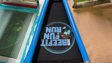
The back was simple. The client provided a one-color JPEG file that we would need to trace and clean up for printing. The front, however, got a bit interesting. A bold, full-color starburst graphic exploding out from the Cimarron name and slogan. Quantities were modest at about 100 black shirts. At first thought, that kind of volume at full color screams for direct-to-film or hybrid transfers. In many cases, that’s the economical choice.
 No seps, no screens, no setups, no color matching, just a digital transfer applied with transfer machines. But here, the artwork had other ideas. Too many color transitions from bright to fading into the background. Too much subtlety. Too much color directly on black fabric. This wasn’t going to translate well to a transfer. Screen printing was still the way to go. Maybe the only way to go.
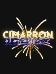
The heart of the design was the starburst, a radiating explosion of colored light and energy. In Photoshop, we worked in RGB to size at 300 DPI on a black background. The burst was built using Gradient Tools and Radial Options. A yellow and orange core expanded outward and dissipating into darker tones as it blended with the shirt color. A second purple and blue were built similarly below that. Layers stacked, each one masked and adjusted. We used a combination of Gaussian Blur, Soft Brushes, Linear Dodge, and Overlay to simulate light radiating outward. The Cimarron and Pathway of Purpose text were set and outlines wrapped the type. The burst was alive, vibrant, and loaded with transitions.
Simulated process separation was the obvious choice. We built alpha channels for each color: yellow, red, blue, purple, and highlight white. A secondary black channel was added to help us simulate how this channel stack might look when printed. A bit of a guess at that point. The white printer or base plate would be of most importance. We would need 100% under the areas of colors that popped while transitioning down to zero. The colors would overlap with significant higher percentages, and they’d also transition to zero.
Once the channels seps were completed, we output to CTS (computer to screen). Even though there were subtle fades and transitions, we chose a frequency of 45 LPI (lines per inch) at a 22.5-degree angle. We would need to try and hold as much of the low-end halftone as possible, especially in the gradients where glow transitioned to shirt black. The larger dot would be a little easier to resolve.
The screens were coated with a dual cure emulsion for that maximum resolution. We used 230 TPI (threads per inch) dyed mesh for the highlight and colors and a 156 TPI for the white printer. The screens were all in the 35 N/cm2 tension and EOM (emulsion over mesh) at about 15%. While developing, we were able to get some of the 1% to hold open while the 90s still held on.
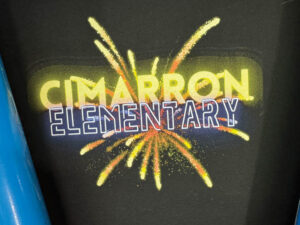
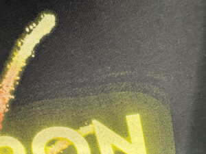
The initial set up didn’t go so well. The yellow quickly became a problem. On the computer screen, it looked as bright and explosive as it should. But on black cotton, it was too much. Too dense. It overwhelmed the design and killed everything. It just had way too much information. We went back into Photoshop and isolated the yellow channel. Using Levels and Curves adjustments, we pulled the top end way back. This let more of the other channels and the shirt do their work.
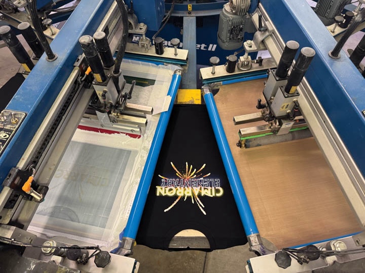
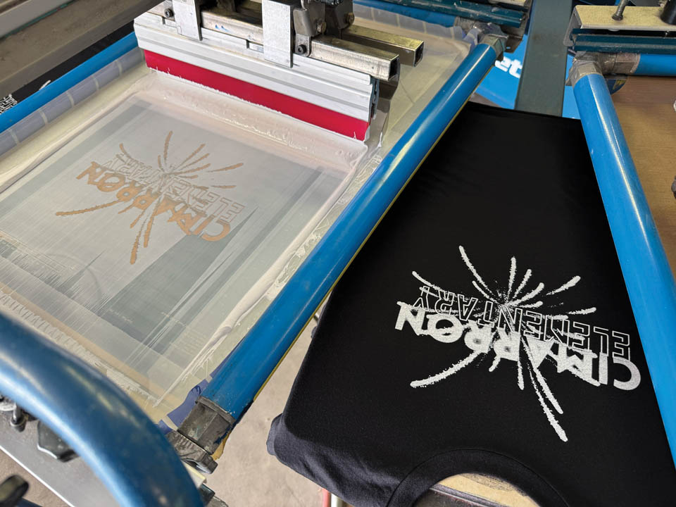
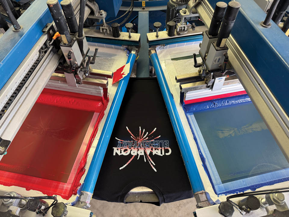
On the press, setup was tight, but straightforward with our registration system. Print order was white printer, flash, smooth, blue, purple, red, yellow, another flash and cool, and finally the highlight white. Darkest to lightest, and most coverage to least — unwritten rules pretty much applied on this one. Ink color selection was primary and ready for use for its consistency and predictability.
The transparent blends sat over the white printer and each other, adding warmth and depth while feathering into the gradient zones. The yellow was the last color in the rotation and was the ink we’d battled in round one. Because we’d dialed it back digitally, the transitions were much better. It popped where it needed and faded into the shirt as desired. The highlight white punched up the type solution at the end. After a few test prints, a hundred tees were folded and stacked at the end of the belt.
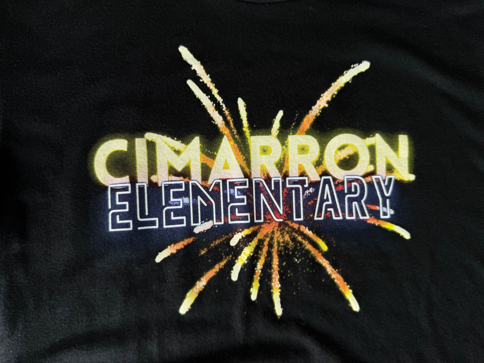
Each shirt carried a bright starburst with Cimarron’s 75th shone proudly. The school staff beamed. See what we did there? For them, it wasn’t about screen tension or channel adjustments, it was about school pride that celebrated their history. Cimarron Elementary has been part of the Cherry Creek story for three quarters of a century. Kids who walked those halls in the 1950s have grandkids attending the school. The building has changed, the neighborhood has grown, but the pathway of purpose remains. Cimarron is an anchor in our community. We did our best to represent that legacy.