You’ve probably heardus say before that we get over 300 days of sunshine a year in Colorado. The state, however, isn’t exactly known for its beaches. Some decades back, we stumbled across a local treasure that defies geography.
The Island is a sand volleyball complex, restaurant, and bar tucked into an industrial area of Denver proper. The building’s massive floor is covered in sand, there are acres of outdoor courts, nets stretching in every direction, and a full bar sitting like an oasis in the middle of it all. Funny, we should say “oasis,” because they have another property north of Denver called The Oasis. For one night in the fall, after it starts cooling off each year, The Island transforms into The Island Bash, a volleyball beach party.
We’ve been printing for this event for so long that we can practically call the art before we ever get direction from the client. We are charged with printing a full tropical experience, so to speak. This year, though, they changed things up — not in difficulty, but in perspective. Instead of the typical layout, The Island wanted something different. A scene from the water looking inward. The same elements, palm trees, net across the sand, some tropical drinks, and a sunset, but a viewpoint from the water. It was a twist and a refreshing creative challenge. We had to take that idea and translate it.
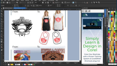
The foundation was a loose pencil sketch, enough to guide our layout. After we inked it, we scanned the keyline into Adobe Illustrator. We started with the horizon line, the ocean foreground, and a sandbar or two using the Pen Tool. Palm trees came next, the volleyball net and the ball to follow. We have a library full of these shapes to draw from and simply reshaped them to fit our illustration here. We’ve learned, though, that the owner has a favorite ball.
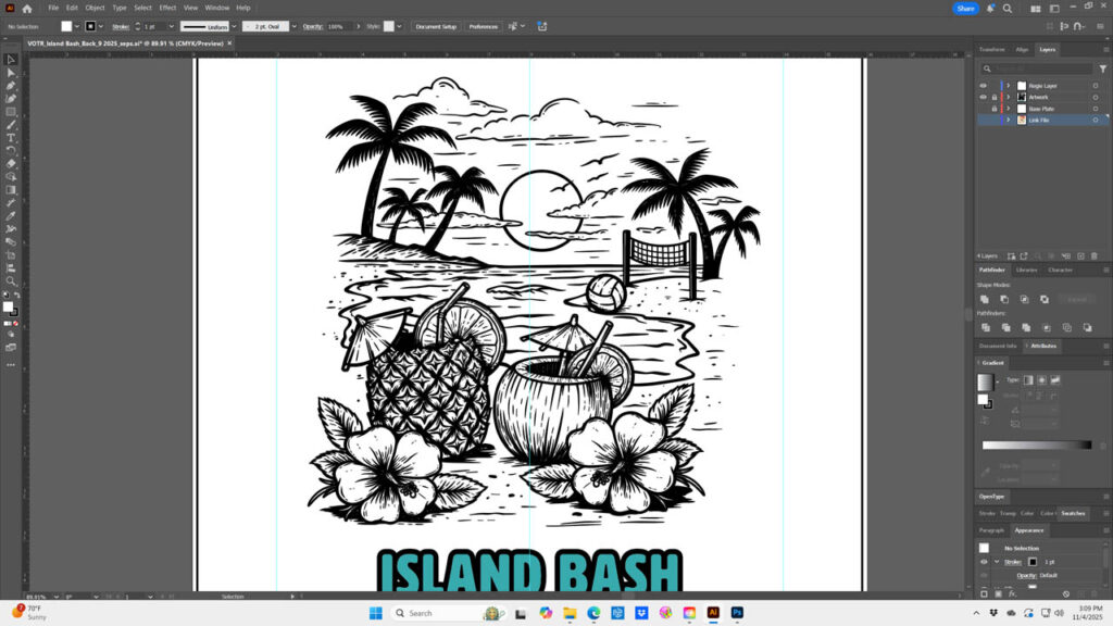
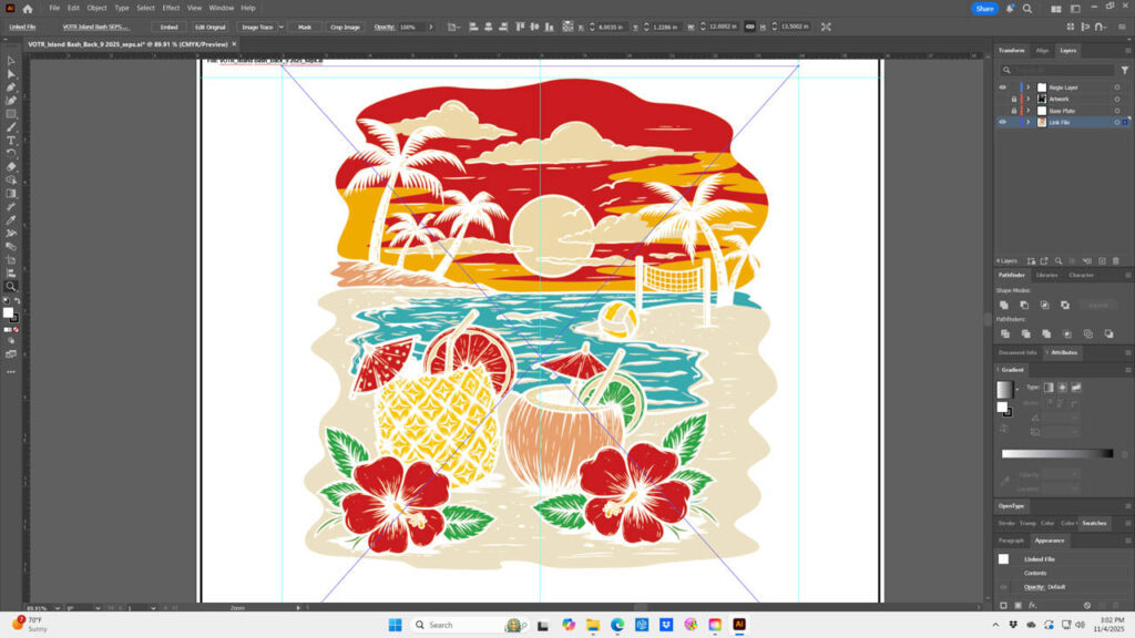
And then there were the tropical drinks. What says island beverage better than a hollowed-out coconut and pineapple? We created an illustrative version of each with simple traces including, of course, the umbrellas. You can’t have tropical drinks without umbrelas and straws. The sky is always the heart of these compositions and, like any sunset, we would use reds blending orange into gold and fading into softer cream tones. For halftone friendly transitions, we built it manually in layers with the Blend Tool. We stacked them in the background, midground, and foreground — almost using the darkest to lightest rule.
 After the proof was approved by the client, an internal debate began: how to separate. The file was vector, so it made sense to keep it in spot colors. But we have seen sunsets fall apart with banding, which led us in a simulated separation direction, especially because this had way more colors than intended. We went back and forth on the idea of running spot versus sim process. The number of colors and the transitions were a concern, but we wanted that vector clean imagery in the black outlines.
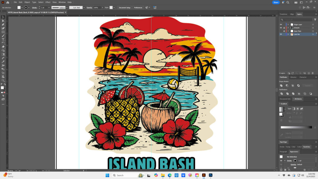
To maintain this crisp detail, and since it was built in vector, we removed the black outline, flattened the rest of it, and reopened the file in Photoshop. We would separate the colors in channels using the RGB and CMYK channels as masks. Then, once those separations were complete, we reintroduced the black line detail in vector over the sim process channels for output. This gave us the best of both worlds. Smooth halftone transitions, building secondary colors, and clean, sharp vector black lines, locking the composition together. Other than laying in type and logos, it was a trick we don’t often use.
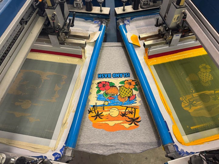
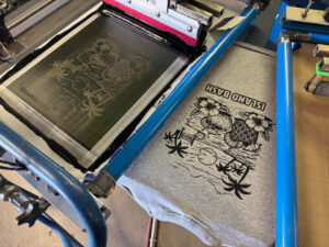
With the channels finalized and the vector black added back on top, we sent the file to computer to screen (CTS) for output. Because of the illustrative nature, we opted for 45 lines per inch at our standard 22.5-degree angle to avoid more interference with our screen mesh. As we made screens, we prepared for what was one of the more demanding Island Bash designs. The image had more screens than usual and when you add the whites, multiple flashes, cool stations, and smoothing screens, set up became a bit dicey.
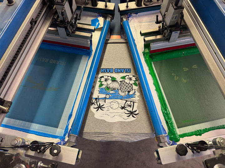
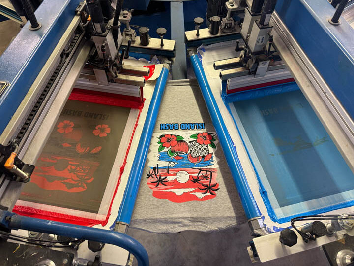
 We started the sequence with Teflon smoothing screen and a rollerto flatten the fabric. The first print screen was the black linedetail on an N-228 TPI (threads per inch) mesh followed by the white printer or base plate on a N-166. Then a flash and a heated iron in the cooling station to lock down potential peaking fibers. The remaining colored screens all on N-272s, green, blue, and red printed wet on wet. Another flash and another smoothing station, followed by the gold on the same mesh with the final flash and smoothing screen and finally the cream acting as a highlight white. All screens were work hardened at 45 N/cm2.
If there was a theme to the print, it was the surface. We used more smoothing screens than usual. The second heated iron after the white printer was critical and helped control potential fiber show through, giving us the smooth surface for the other colors to sit on. The final smoothing screen had craft paper on the bottom which matted the print, knocking back the gloss that Teflon can introduce.
When the first sample came off the dryer, we were good to go. Aided by our post-vector insertion approach, the transitions were smooth and the outlines were crisp. Not sure we got the “view from the water” correct, but 1,000 T-shirts later, we brought another Island Bash to life. Though landlocked, The Island is all about a tropical fantasy. Our job, each year, is to take printed Island Bash apparel straight to the beach. A beach Colorado didn’t even know it had.