


Back in 1991, when rumors started circulating in the engraving industry that a new law called the “ADA” might put engravers out of business, the United States Department of Justice wrote a reassuring letter. Many signs could still be engraved. Only restrooms, exit doors, and doors that were already numbered needed Braille signs. Everything else could still be engraved.
A few years later, the engraving industry has stepped up. Most ADA signs were being made by engravers who were part of the sign industry, using new ADA application and substrate materials, Raster Braille, and specially fitted engraving machines with Braille software. The ADA became a niche market for many sign companies, and especially those with a background in engraving.
However, engraving shops specializing in awards of all kinds tended to hang back. It seemed easier to send customers to the sign shop down the street than to learn about the ADA rules. We say, don’t let fear of the rules hold you back! If you have been turning away customers who ask for ADA signs, it’s now time to say, “Yes,” to the ADA.
DETAILS MATTER
It’s true that as I travel throughout the country, and even in California where there is more compliance to ADA standards than in many other states, I see more signs that have errors than I do correct ones. I open up websites of shops that reassure customers that they provide legally compliant signs, yet still see error after error. I have joked many times that if I can find a building in California with correct restroom signs, I’ll break out some champagne on the spot!
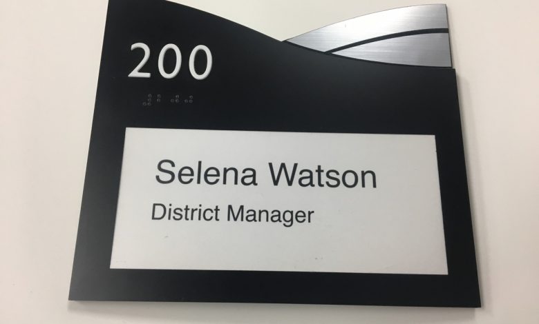
Yes, it is true that “the devil is in the details.” After all, we’re talking about tiny items, like little Braille dots measured in millimeters. There isn’t a lot of space on a sign, so getting raised items far enough from each other so they are still readable, but at the same time grouping them so they make sense, is important.
At the same time, there are some big-picture items that are the most important if signs are to be readable by a majority of people, such as people with various vision conditions, including aging.
DESIGNING WITH DISABILITIES IN MIND
There are two vague standards in the ADA, and members of the American National Standards Institute (ANSI) Committee on Accessible Buildings and Facilities have been discussing those and trying to get them more specific now for 25 years. They are the finish standards, for both the sign backgrounds and the graphics, and they deal with glare or reflection, and contrast. Virtually every expert in vision, and especially those who have worked with signs and public communications, has said that those are the two aspects of signs that have the biggest influence on people being able to read them.
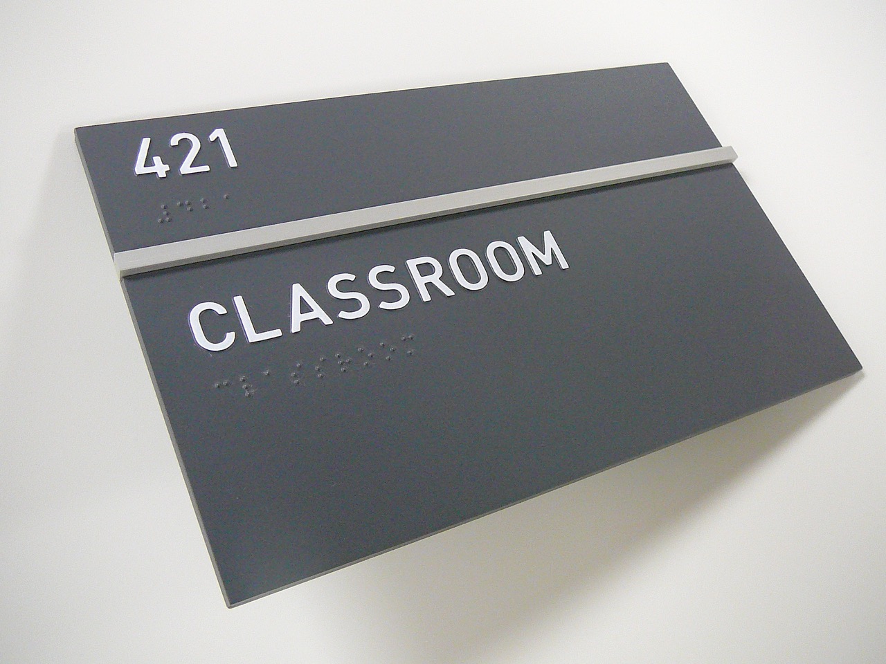
Finally, in the ANSI’s last revision cycle of the standards, a glare standard was established: use engraving materials with a gloss finish of 19 or less. Contrast is more controversial, but it’s important to remember that we aren’t talking about colors, but about darkness and lightness, which are measured in LRVs or Light Reflectance Values. If you choose a lighter color with an LRV of 50 or more, and then apply a formula that results in a contrast of 70 percent or more (.70) when you measure your darker color, your sign will be readable by the majority of people who can read a newspaper headline or recognize a friend’s face from about three feet. Just subtract the lower LRV number from the higher one, and then divide the answer by the higher LRV to get a decimal answer. Paint and plastic manufacturers should be able to tell you the LRV of the materials you purchase for signs.
We emphasize contrast and glare because even if you get some small detail wrong in the tactile graphics, if your signs have the contrast and glare standards licked, you will have met the needs of the greatest number of people with disabilities.
DON’T FORGET TOUCH AND FEEL
Engravers can have a huge influence over the readability of tactile graphics. Right from the beginning, even though it wasn’t included as an absolute rule, the government talked about beveled edges on characters. Although it’s tempting to cut characters out with a laser, using a rotary engraver or router with a bit that creates a bevel makes your signs actually readable.
As far as Braille is concerned, the use of small acrylic or metal balls, or “rasters,” pretty much solved the early problems of Braille dot shape. The software spaces the dots correctly, and the use of a reputable translator, kept up to date, means little chance of Braille spelling and translation errors. I recommend the use of the California standard font, even if you are not in California, that way your signs are legal everywhere, and California spacing is easier for beginning Braille readers, as well as for people with diabetic neuropathy.
In 2010, the federal government finally adopted the revised signage rules we wrote back in 1998, so be sure that your fonts and spacing comply if you want your signs to be readable. For raised characters, you must use sans serif fonts, all uppercase, and make sure to maintain at least 1/8-inch space between the closest sections of any two characters. You can read about the rules and see an excellent “animation” on signs on the government website, www.access-board.gov.
EQUIPMENT AND SKILLS YOU NEED
Most engraving shops have much of what they need to start making ADA signs. Number one is, of course, a router or rotary engraver. If you start out with simple orders, you can purchase all your materials in a variety of colors, so you won’t use painted or printed backgrounds. Then, the only extras you need are the proper bits, a Braille translator, Braille font, and software to drive the engraver, a license for the Raster method for Braille, and preferably a small laminator to run the finished signs through so that characters are fully adhered to the sign surface before the adhesive cures.
Small shops can stay busy just by supplying tactile exit signs and restroom signs for businesses who don’t have many offices. The tactile signs can then be supplemented with non-tactile informational signs and directional signs, and decals with the International Symbol of Accessibility (ISA). However, if you want to design really attractive signs and move beyond blue and white standardization, you need to learn more about the do’s and don’ts of ADA sign design and expand beyond already-finished materials.
MOVING ON UP
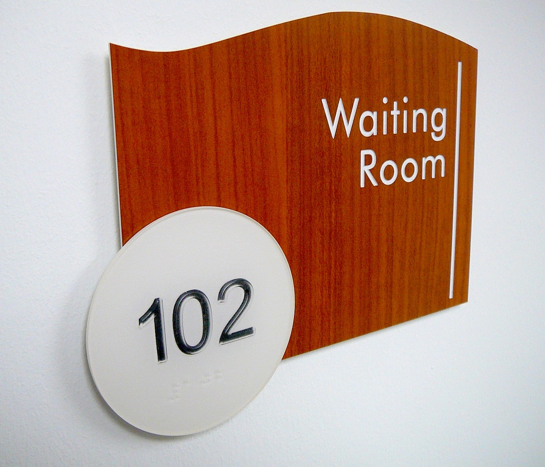
One of the most important pieces of equipment for expanding your ADA design horizons is the color printer. The entire background of a sign can be printed on vinyl and then adhered to the second surface of a sign. As long as there is still adequate contrast, that means you can still cut the raised characters out from colored application material and apply them to matte clear acrylic. That opens up the possibility as well for “window” signs, where a second layer of acrylic is sandwiched behind the top layer, a space is created by using double-faced tape, and an insert with changeable information can be printed and inserted between the two layers.
Layering is also an effective way to add design elements to simple cut-out shapes. Suppliers now have many interesting materials, such as metallics, woods, and colorful overall designs. Tactile information can still follow all the rules for easy visual and touch readability, and then the tactile sign section can be applied onto highly decorative and even shiny backplates.
When we wrote the changed standards back in 1998, one of the most interesting new possibilities is creating two-part signs. You use the same information on both, but the visual section emphasizes high-contrast, non-glare surfaces, and larger, bolder typestyles. The tactile section can be “invisible,” hidden in a decorative area of the sign with a digital print or shiny metal surface. The tactile characters are small, rounded, and easy to read by touch, as well as accompanied by Braille. This solution can use two separate signs, installed on the door as well as adjacent to it, or one sign creatively divided into two sections.
GETTING HELP
A last possibility for an engraving shop with routing equipment is to utilize the fairly new technique of thermoforming for tactile sign components. If you aren’t ready to purchase a thermoforming machine yourself, some wholesale companies even use your molds, which you can create on your router, and ship you the unfinished clear thermoformed pieces after they press them. You design modular signs and incorporate the tactile pieces in your design. You can print the backgrounds or paint them as you wish. The characters can be screen printed on the surface or the color can be supplied on the second surface.
TAKE STEP ONE NOW
Whether you decide to begin with simple exit and restroom signs and create a market from there, or you are a designer at heart and want to find a partner who will help bring your vision of exciting and accessible signs to life by taking on some of the fabrication or decoration, this is a market that is just waiting for you! Every building open to the public in the entire United States, whether government owned or private, needs these signs. It’s time for your shop to get its share of that market, and at the same time, go about making the environment more usable and friendly for everyone in your community.