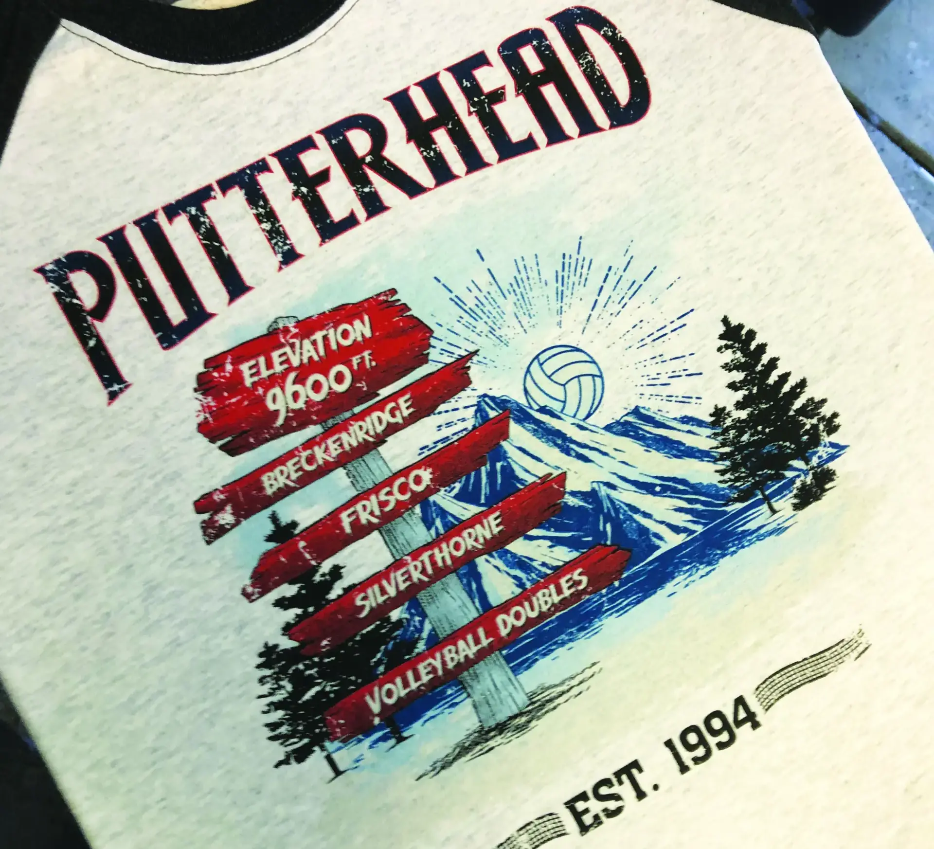
Started in 1994, Putterhead remained a small, locally-run doubles volleyball tournament in Colorado for nearly two decades. In 2003, the Breckenridge Parks and Recreation Department asked Volleyball of The Rockies (VOTR), a Denver volleyball league organizer and tournament event management group, to assist with the event. The now three-day tournament has grown from a little more than 50 teams into one of Colorado’s largest volleyball events with 20 different divisions and approaching 1,000 teams in attendance.
Each year, players take over Summit County with games including Silverthorne, Frisco, and, of course, our favorite, Breckenridge. The Summit County altitude is 9,600 feet. You had better be in shape. If you have never
competed in a sporting event in the mountains, you are in for a shock. Top that off with awesome player parties at sponsors’ establishments on Friday and Saturday nights, and you’re in for one heck of a weekend.
Just under an hour and a half from Denver and with super affordable lodging options, the Putterhead Volleyball
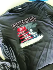
Tournament is a perfect choice to escape the city and enjoy cool mountain air for the weekend. As a little bonus, each player gets a Putterhead event T-shirt. These coveted shirts have now become collectible items. Next year will mark 30 years for the tournament and, believe it or not, there are a number of volleyball enthusiasts who own every shirt.
For nearly three decades, we have created every one of the designs for Putterhead. Many were quite simple — some not so much. Many years ago, we wrote about the cartoon caricature animals we created for the tournament. Those days are past. They’re too corny; new management, don’t ya know? This year the organizers were looking for something new. They always are.
Our contact provided us zero reference and direction to what they were looking for in this year’s T-shirt. “You know, do something cool!” was the directive. This year, the client would be treated to a totem multidirectional resort sign look that we would use to step up the game for them. You see these signs at the beach and, of
course, the snow ski resorts. That would work perfectly with the multiple cities Putterhead takes place in.
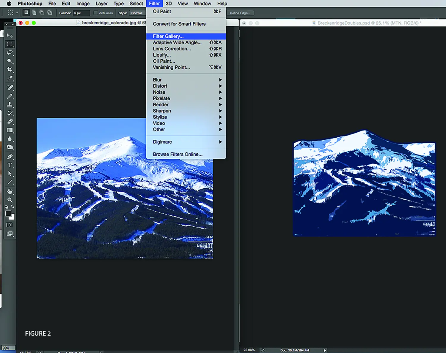
In this day of the internet, we were able to find numerous examples of different sign styles for reference. We used a few basic shapes we liked that we placed into Adobe Illustrator and traced. Additional basic objects were created using the Rectangle Tool, and a stroke was applied to them to help break up the spacing for what will be the final outcome. To create a little more interest, we added wooden texture. This also was found in various versions online. Since the event is primarily held in Breckenridge, what better way to display than to add a scenic image of the area. This image was brought into Photoshop for some treatment to give it an illustrative look for the final design by selecting the Filter menu. We used the Cutout filter to simplify the image, then cropped and scaled to fit into the layout behind the signage we built in Illustrator.
We placed vector objects to help with the design structure. The treated images from Photoshop were placed within this file for preview only so the other design elements could be added in the right places. We created some simple vector graphics to be used for the background and then they were put in behind the comp.
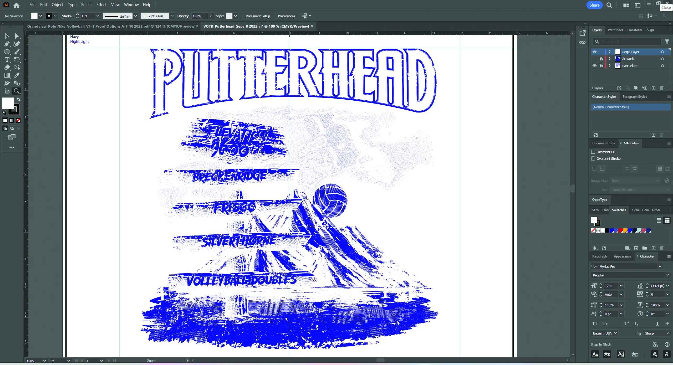
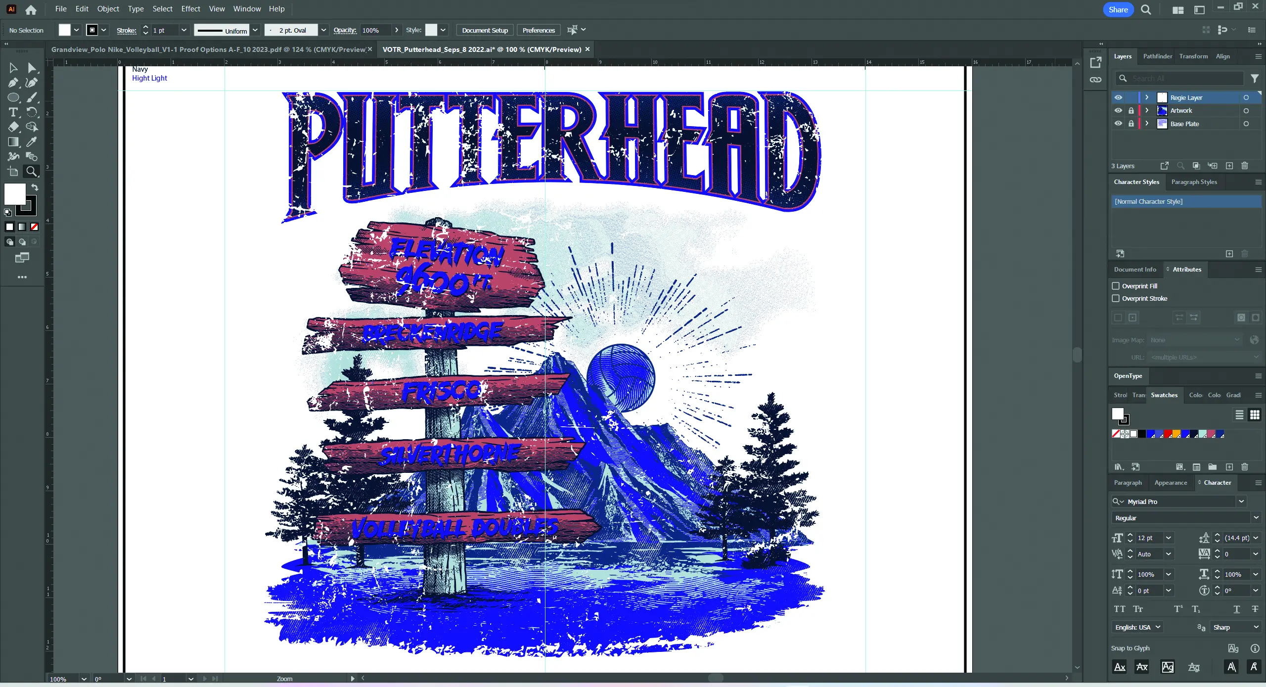
After most of the elements had been created, we then brought all the vector images over to Photoshop as Smart Objects. We added some effects for the wood grain. Finally, we created the type and adjusted the shapes accordingly to fit where it belonged. We then moved to the separation process. We used Channels for our final output to screen and for direct control over halftones as they applied. We extracted each color in the design and applied it to a Channel of its own. Then we designated that color in the Swatch option of each individual channel. After all colors had been assigned their own channel, we went to output, where we applied our 55 lpi (lines per inch) halftone frequency, twenty-two-and-a-half-degree angle, and a round shape via the Random Image Processor (RIP) for computer to screen (CTS).
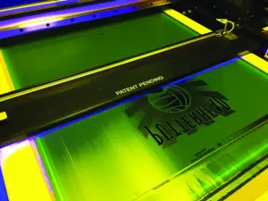
The screens were imaged and exposed on N-272 tpi (threads per inch) at 45 N/cm2 for a soft, smooth hand and drape. For enough opacity, the white printer would go on a N-166 with the same tension and print first in the rotation followed by a flash and cool. We printed the balance wet on wet. Because of the higher tension, our off-contact distance would only 80/1000 of an inch. The inks would be easy, for a change. We opted for ready-for-use (RFU) inks right off the shelf.
The print order was straightforward as well. We had a black key line, so we printed that last. The separations were all but registered and very little ink was deposited, so flashing was not necessary. Common print order rules were applied. Lightest to darkest and least coverage to most. We were able to use all the same squeegees and flood bars, all set with our fifteen-degree standard angle, light pressure, rapid stroke speed, and all 65/90/65 triples.
The print set up quickly and ran like the wind. We ran the job at a smoking pace — too bad the order was for only 1,000 shirts. The customer was happy and the tournament was a success. The walking billboards looked great. We wish all jobs came together this well.

