Out West, where the horizon seems endless, we like to say there are two kinds of music: country and western. Twice a year, thousands of boots walk the grounds in Indio, California, for the Stagecoach Festival. Stagecoach is all country: fiddles, guitars, and honky-tonk attitude. Launched in 2007, it is one of the largest country music festivals in the nation. Stagecoach isn’t just a festival — it’s a cultural experience where western brands are part of the whole scene. What we wear matters as much as what we hear.
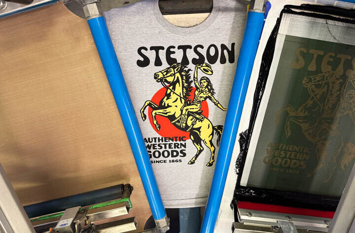
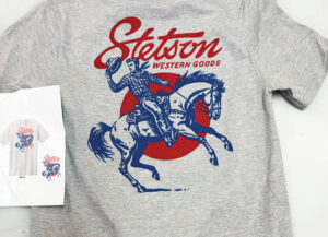
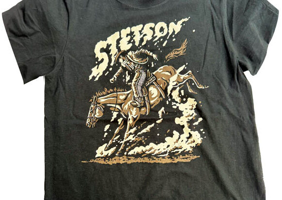
That’s where Stetson comes in. A brand with over a century and a half of history, Stetson is woven into the fabric of the American West. Founded in 1865, their cowboy hat has become synonymous with the West. Cowpokes, officers, ranchers, country boys and girls, politicians, and ordinary Joes have worn the Stetson crown. Stetson has become a cultural icon worn by actors, at rodeos, and by country music stars for decades.
Being from Colorado and the West, we’ve been working with Stetson for over 30 years now, and when they approached us with a project tied to Stagecoach, we were in. We would need to create shirts tough enough, stylish enough, and authentic enough to stand alongside official festival merchandise, but distinctly Stetson. Quantities weren’t huge at about 288 shirts per style, but this wasn’t about big production numbers. It was more about representing the brand and the West.
The first requirement was nonnegotiable. A heavyweight, 100% cotton, American-made T-shirt. Makes perfect sense. No thin, fashion forward, tapered, or fitted cuts would do. Stetson wanted a classic heavyweight that felt sturdy and would hold up to the country way of life. Their vision centered on these heavy tees with oversized prints. While nothing extended beyond our standard pallet size, the designs required longer print strokes with edge-to-edge squeegee and flood widths. Once the garment selection was finalized, we arranged overnight delivery to get blanks as quickly as possible. From there, the team went to work on the art.
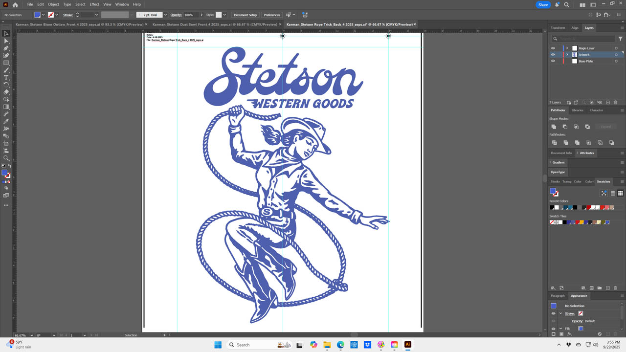
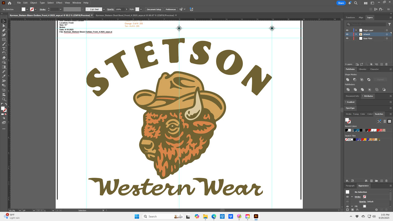
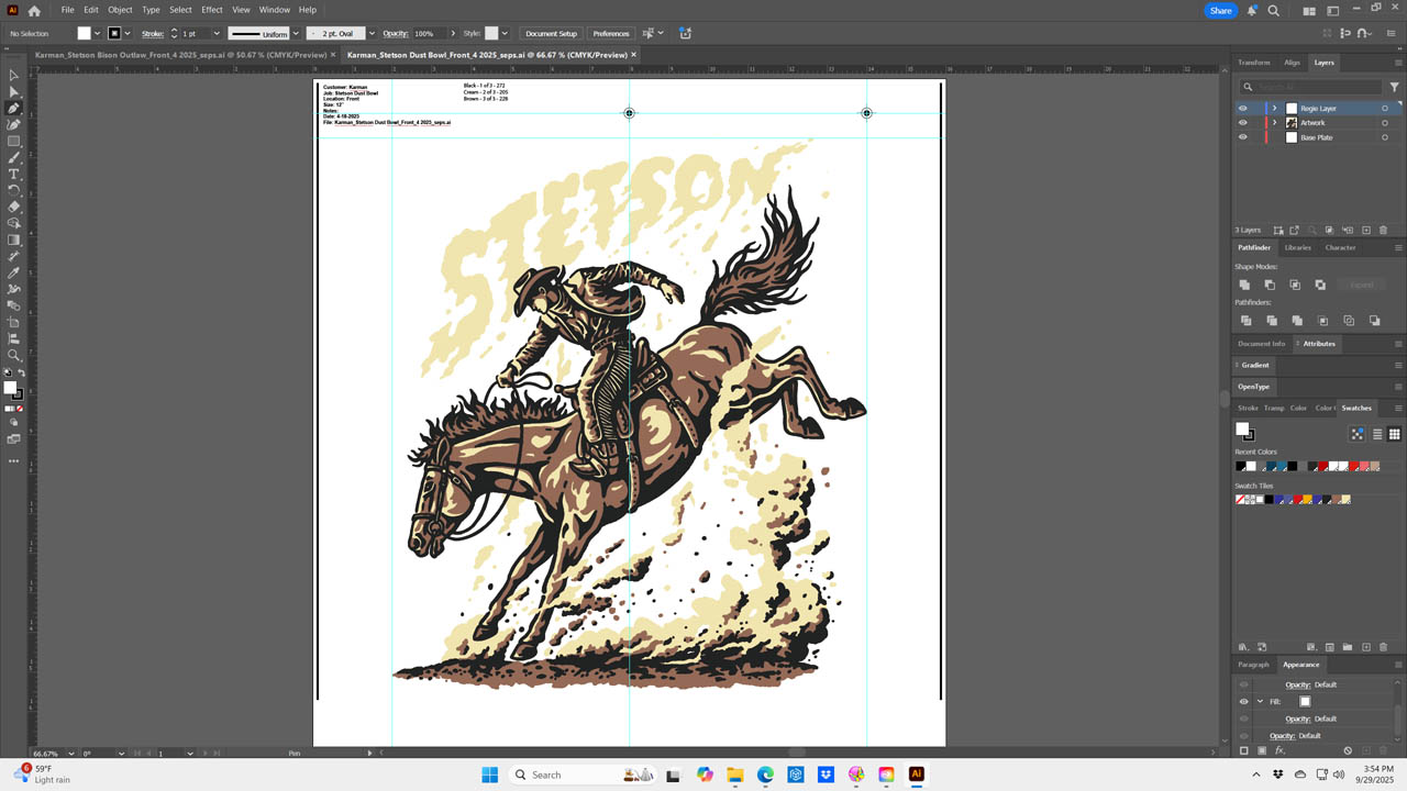
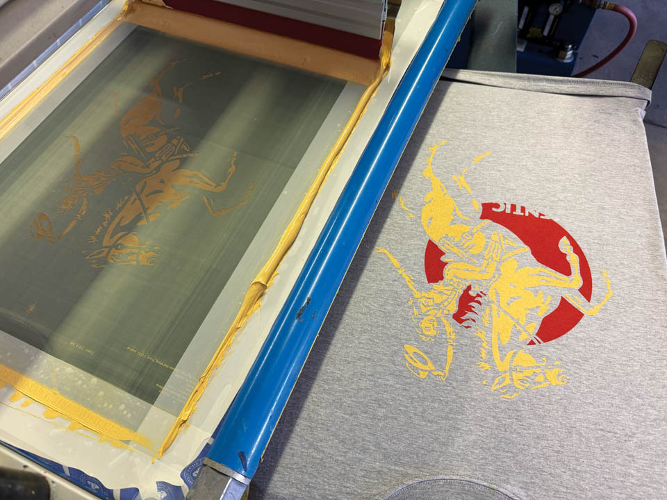
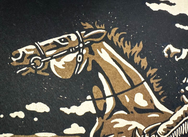
When the files landed in our inbox, we knew we had work to do. The concepts were straightforward and solid as always — Western motifs and characters on bucking broncs — but the files were low resolution JPEGs. At best, they looked like mockups for a PowerPoint presentation — because that’s what they were. We loaded the images into Adobe Illustrator for redraws. Each file was placed on a locked layer. After reducing the transparency to about 20%, these served as rough sketches or templates.
 From there, we began the painstaking work of reconstruction. The Pen tool was the go-to. Click, drag, adjust the points and handles, repeat. Every curve, every arch, and every outline was redrawn point by point. We tried some auto trace, but with so many rough edges, it just didn’t work. Every design was built in spot colors and individual layers and pretty much separated into colors. There would be no white printers or base plates on this project as we wanted the inks to print transparent and allow the shirt color to influence the final colors. Perhaps this was a mistake — I’ll explain later.
A key request was for a soft, smooth feel and drape across all the designs. For the lighter garments, higher mesh counts ranging from 228 to 272 tpi to minimize ink deposit were chosen. Most inks were cut 50% with curable reducer to improve feel. On the dark garments, to prevent fibrillation, we chose 205 to 228 screens and we relied on our Teflon smoothing screens. This ensured a clean, smooth surface even with a little heavier ink deposit. The combination of mesh selection, ink modification, and smoothing techniques allowed us to deliver consistent, quality results across all nine styles.
After exposure and development, we checked the screens under a loupe for pinholes and resolution. Here’s where one design threw us a curveball: even though we’d traced the bulk of the artwork, some of the background had been auto-traced to save time. The result? Noise. When we looked closely at the screen, dozens, hundreds, thousands of tiny pin holes sat outside the image area. We hadn’t noticed this on the computer screen. The fix was an old-school one using a brush and blockout.
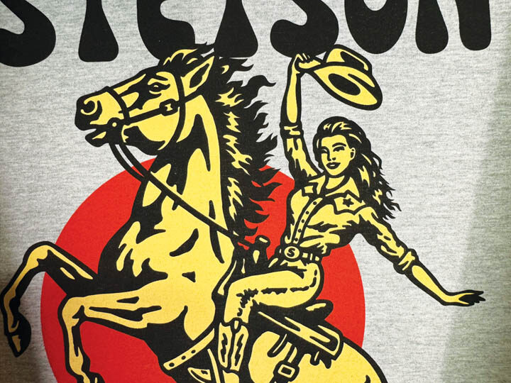
Color choice was important as well. Stagecoach isn’t neon lights — it’s more dusty and faded earth tones. The goal was a set of inks that felt as though they’d been around as long as the brand itself, rugged but not tired. See what we did there?
The shirts were certainly heavier than lightweight blanks, so off contact was increased slightly to accommodate the thicker fabric. Print sequence began on most following the print order rules, so to speak, each beginning with the least amount of coverage and darkest to the most coverage and lightest colors. Strategic flashing was used to keep the colors bright enough on darker fabrics. Triple-ply dual durometer 65/90/65 squeegees were used almost exclusively for a clean ink deposit at a deliberate speed with minimal pressure.
The inks sank into the cotton and gave the prints a soft hand and a weathered authenticity. We did, however, have to run a couple of designs around twice, as some of the inks were just not opaque enough on the dark fabrics. If you recall, no white printers — poor choice.
Stagecoach is more than a festival. It’s a statement that country music and western style are alive and well. Stetson, with its roots stretching back to the mid-1800s, fits that stage perfectly. Their hats have been worn by legions of famous folks. Now, their shirts walked the festival as part of that authenticity — wearable pieces of Stetson’s history and Stagecoach’s present.