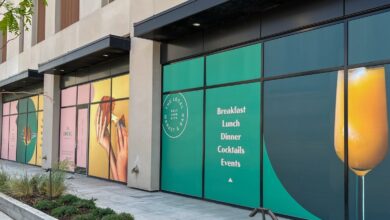


In this article we take a look at designing complete storefronts as opposed to reacting to piecemeal requests like, “How much for a sign?”
It is my sales strategy to treat sign design as a holistic design art. I am never satisfied with a simple request for “a sign.” Anyone can admire a given graphic design at first glance but it should be our job as sign designers to posit the question: how will this design be employed as a sign at a given location? How will its 3D rendering fair when it is fending for itself in the rough and tumble street environment?
It is amazing that once I started to think of myself as a “storefront designer,” that’s how people would treat me. I can sell holistic solutions because I have experience in addressing storefront design problems on a daily basis. I am constantly mindful of the fact that clients have a pressing need to convert their flat digital creative elements into 3D realities, at a physical location, in a specific neighborhood. I endeavor to maximize each set of design solutions until they can live up to their highest potential for the client. The expertise and judgment required to assist in the necessary design choices should be the sign maker/storefront designer’s bread and butter. Follow along with the pictures as I pick out some key principles that support my argument that storefront design can and should be the domain of the sign maker.
Now, let’s walk through some of the sign jobs pictured in the gallery above.
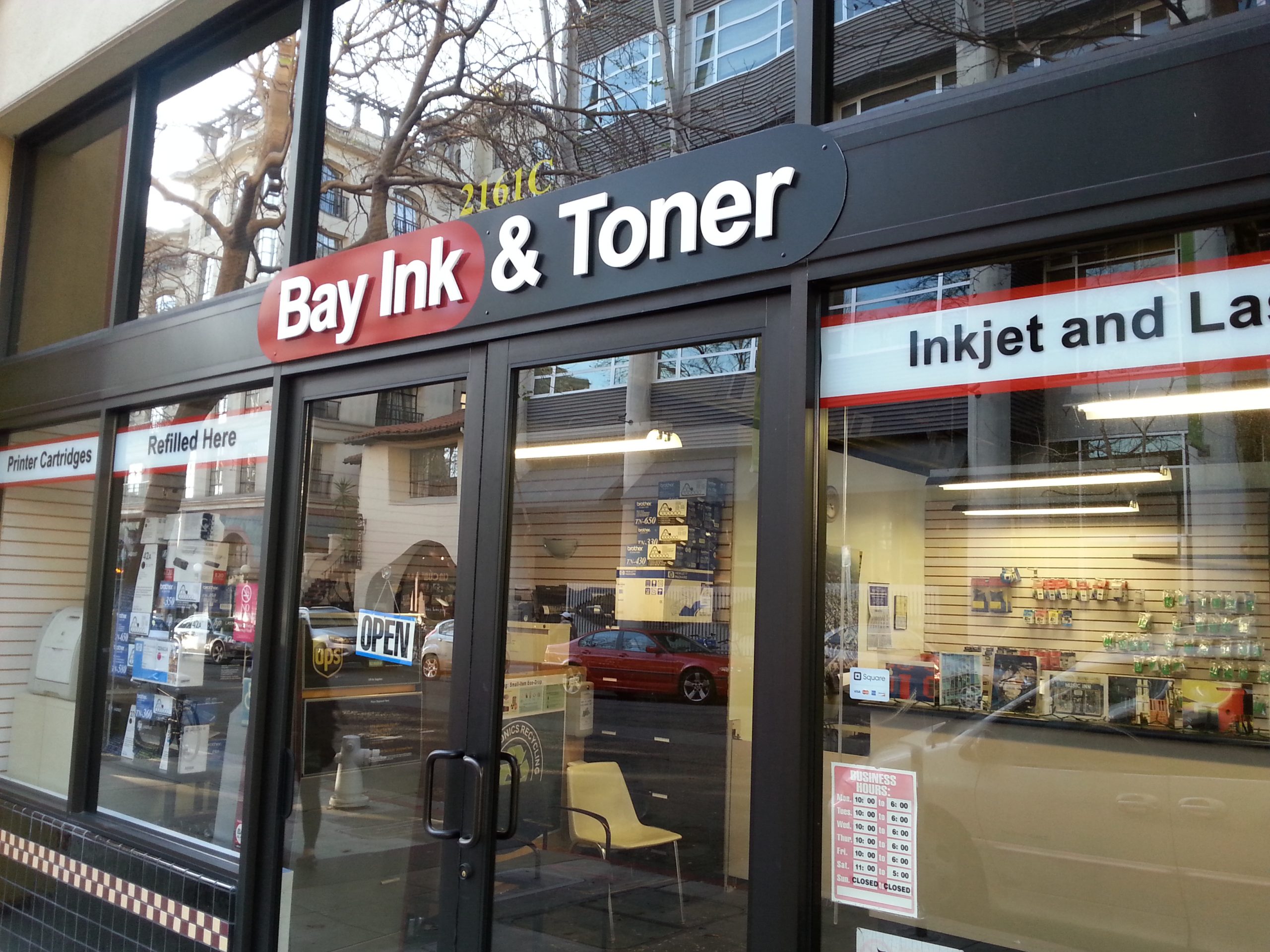
In the Bay Ink and Toner sign project, I maximized the existing graphic assets. In this case, a very plain logo does have high contrast (black and white is the best), legible font (Helvetica takes the prize), and an attractive red. I used black Alupanel, red vinyl, with Gemini white gloss acrylic letters to highlight these attributes. A band of lettering is often the most effective way to make the most of window space. I put all of the vinyl on the outside of the window to add visibility against the dark window.
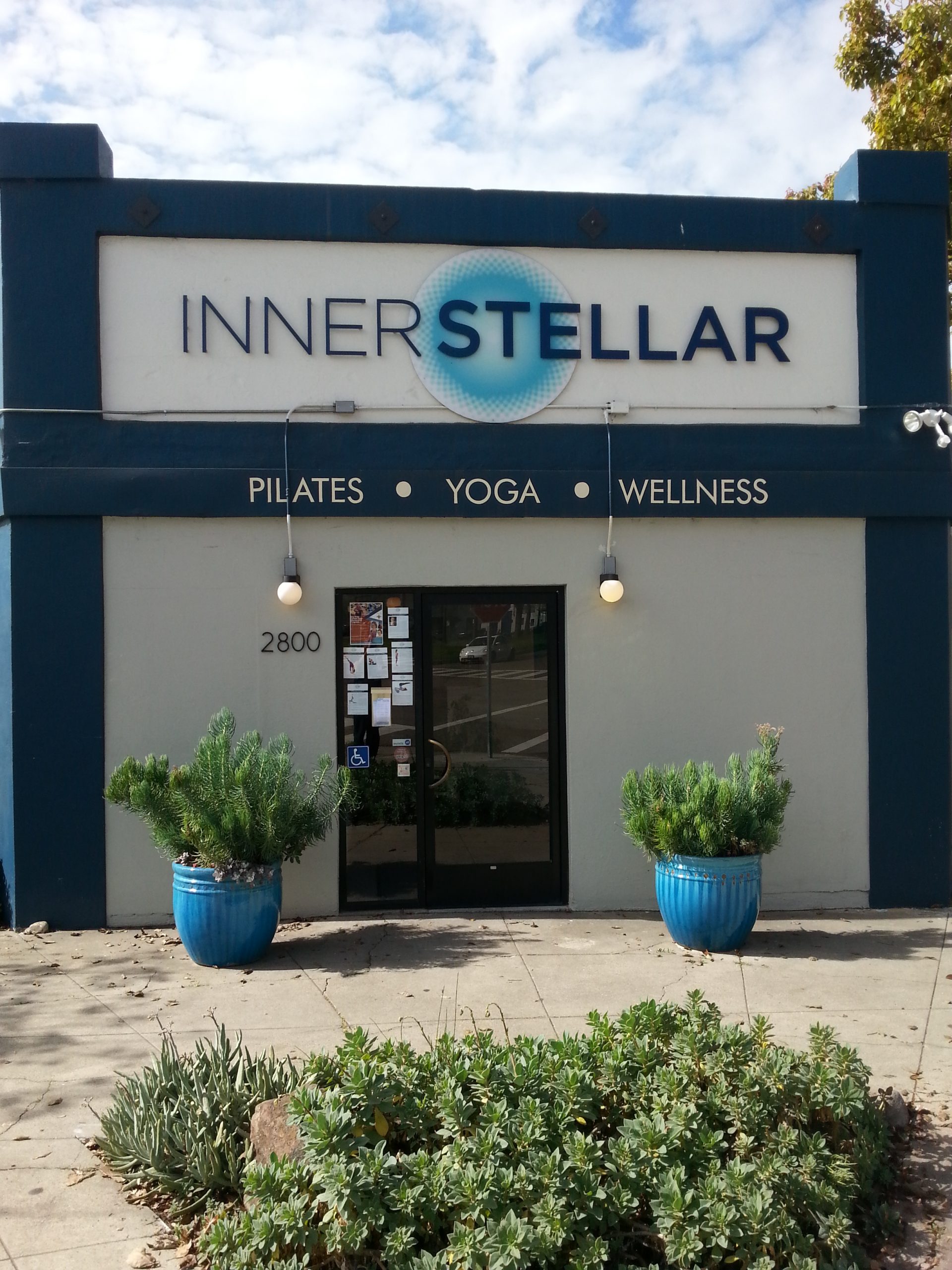
With the Innerstellar Yoga project, the lettering has post off-sets, which make the whole sign float nicely in the inset area. The graphic pops because it is a nifty print installed second surface, with a white background layer. The hand-layered wall painting doesn’t compete but instead makes the dimensional logo area appear very dynamic.
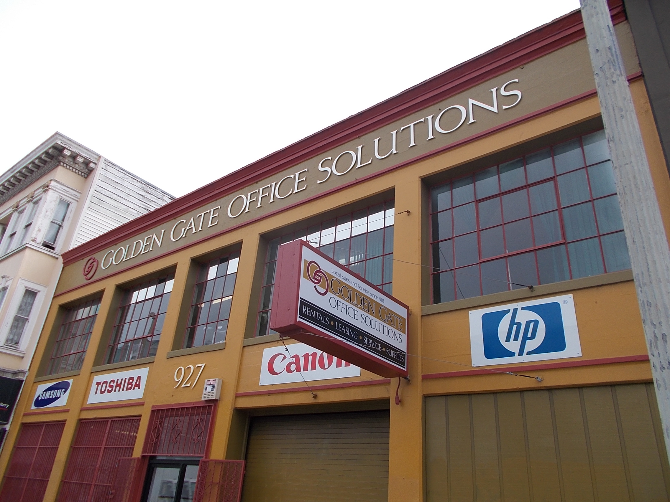
Try making the whole building your design, like I did with Golden Gate Office Solutions. Assume that the light-up sign face should have an exciting design and not be redundant. Balance out the purpose and content evenly. Give brand logos their due without competing with the umbrella brand of your client.
In this Amphora project, there were two graphic logos to work with. The artwork was naturally a good fit for their business but it was also necessary to make that presence felt and project some high-end attitude. The circle logo is carved with a sculptural element and the entire sign floats in the eave space. The window is 12-karat white gold that looks much more precious than any print or vinyl could.
When a client’s idea is simple and good, make it happen for them. The Zatar client wanted to make a tile sign that looked like a genuine Mediterranean work of art. I suggested blasting the lettering out and filling it with gold. So, that is what we did.
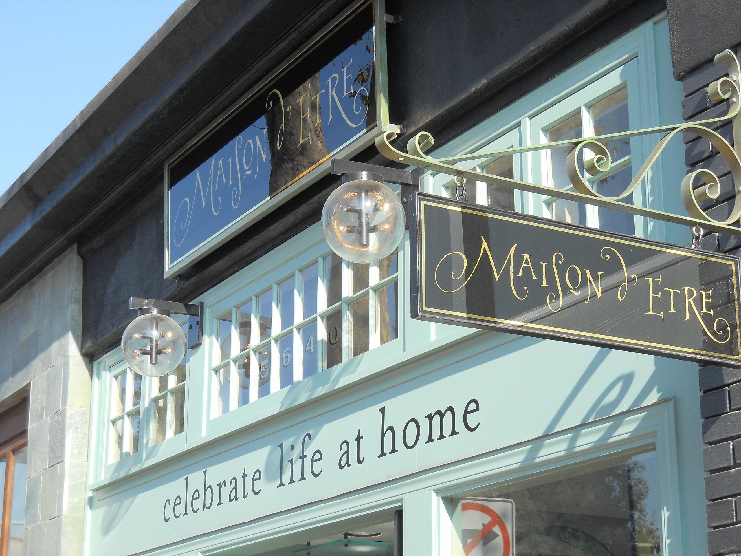
If a client has amazing taste and wants something great, then push yourself to match their level and do something better than you’ve ever done. For the Maison d’Etre job, I suggested glass gilded signs because I was sure it would provide a deep vintage look with lots of eye appeal that would suit this client.
The entire Clary Sage design was completed when I arrived but contained no production specs at all. In this case, I let appropriate vintage techniques do the talking. Hand-made gilded letters with gilded and painted glass art are fully capable of saying “classic and quality” with limited text.
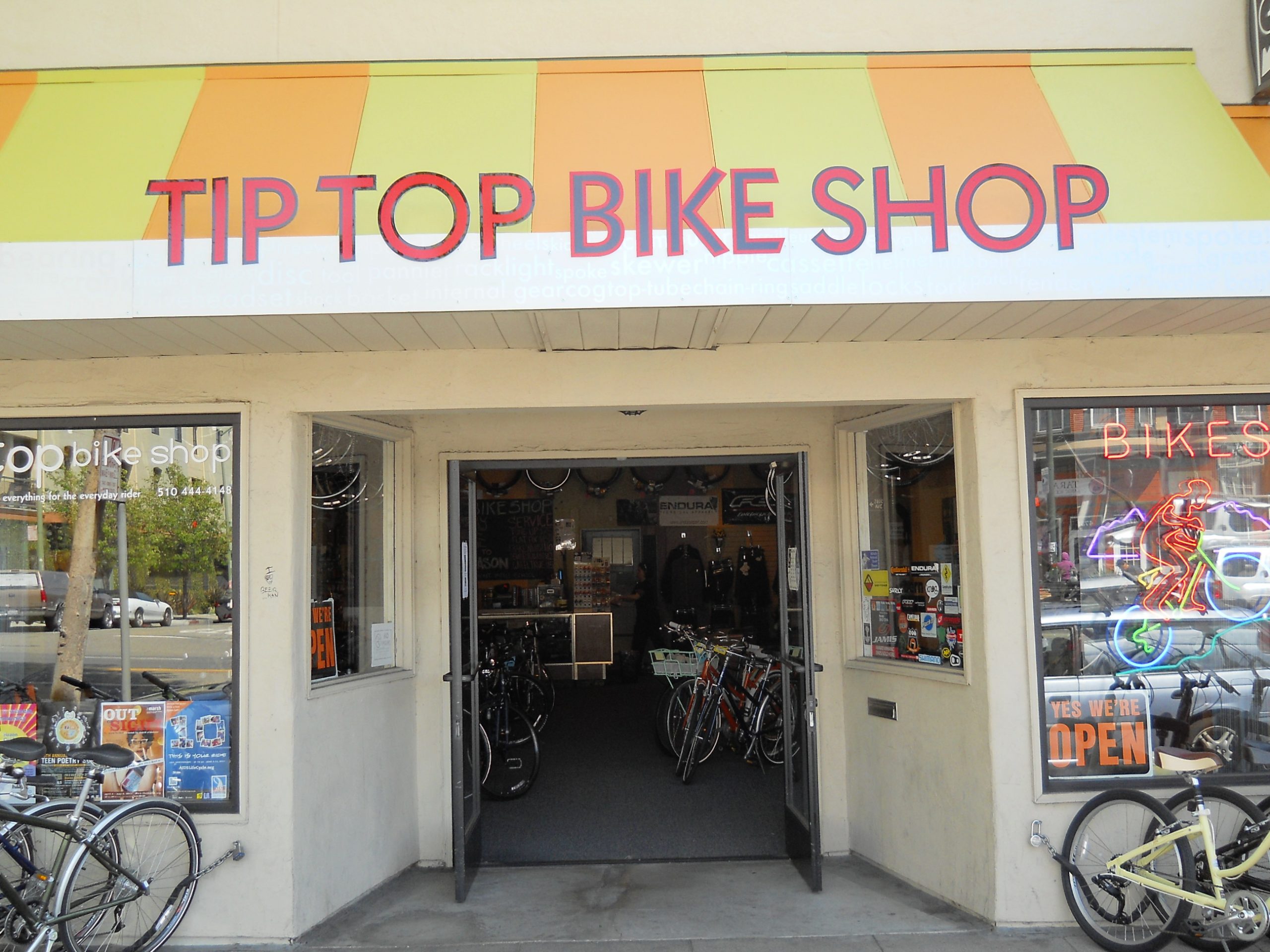
If someone designs something for themselves and wants to know if their slightly outrageous ideas are possible, then say yes, and endeavor to indulge their dreams. With the Tip Top Bike Shop project, they wanted awning stripes, letters that pop up, and the name of every bike part in existence written subtly along the white band. I painted the stripes myself and added reflective red to the lettering and kept pushing to make this ambitious design a reality.
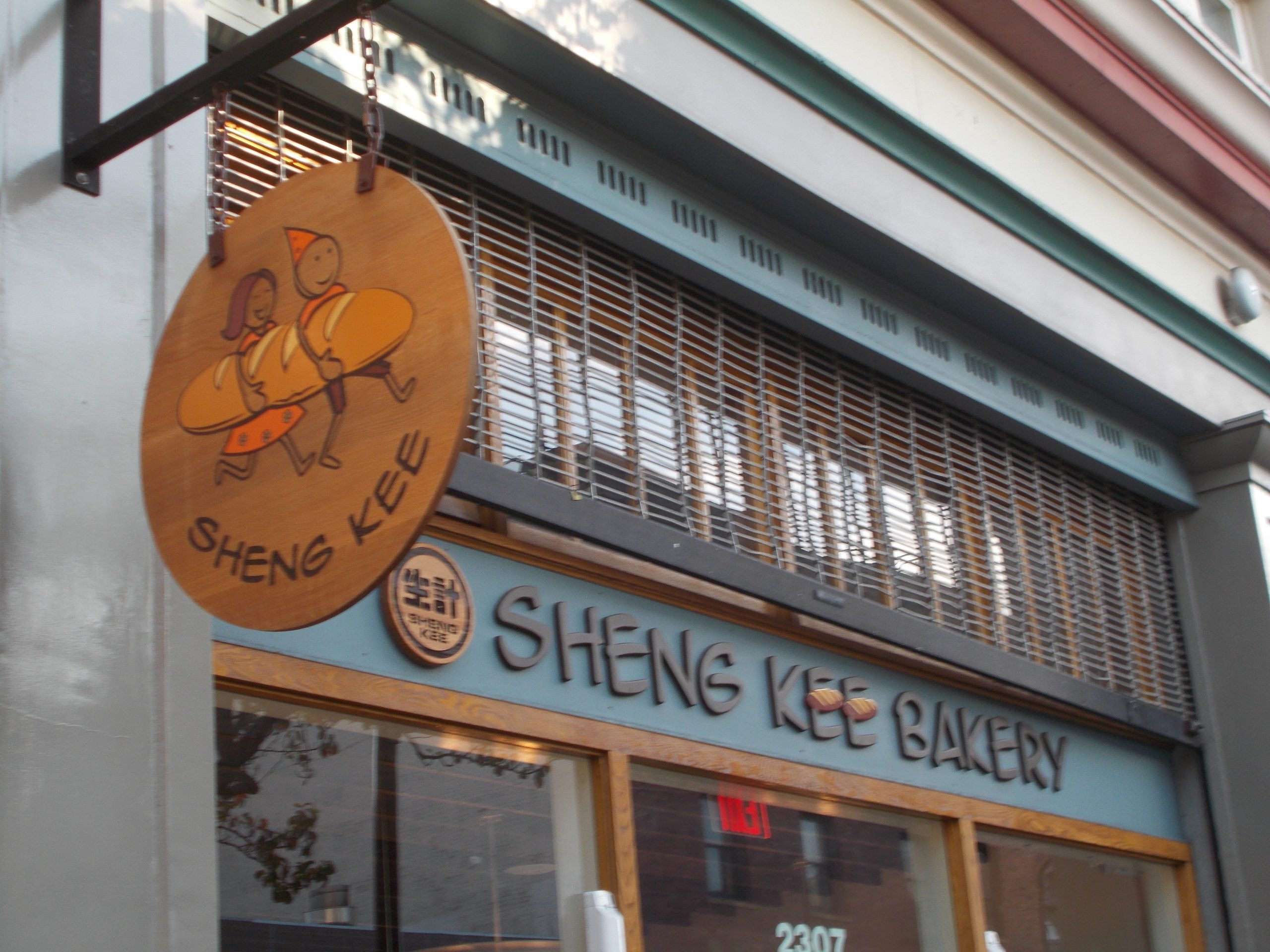
Sheng Kee could be the most popular Chinese franchise in California. They wanted something that worked for the college clientele in Berkeley. The branding manager liked the idea of working with the existing oak wood trim. I decided to take the client’s style suggestion to the limit. Even the letters are rough wood, which makes a unified statement about an earthy product.
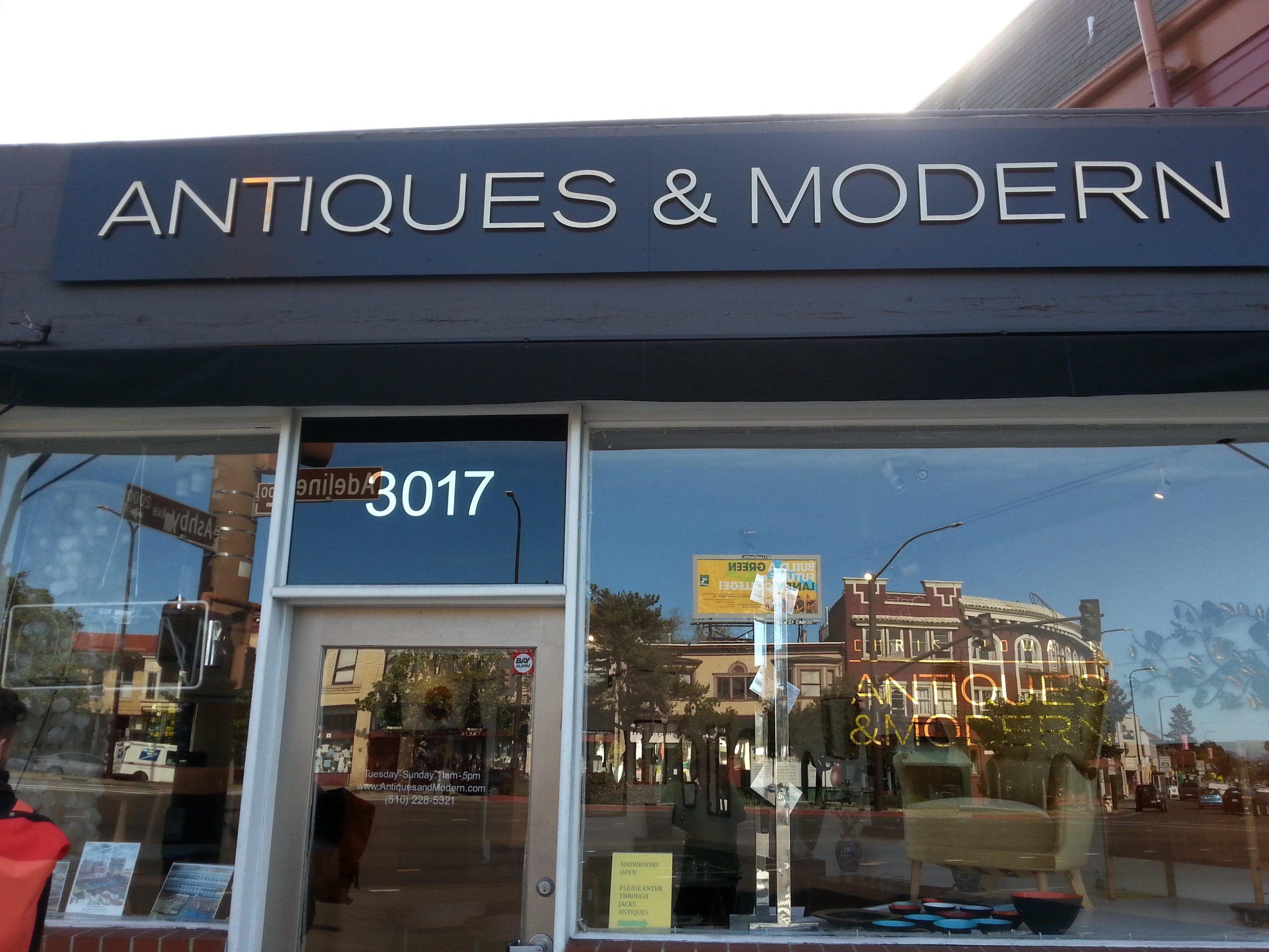
Bear in mind that some places want to look expensive. Every part of the Antiques and Modern design was chosen to illustrate the phenomenal quality and taste of the owner. The polished bronze letters, 12k gilded address, 23k mirror gilded name on the right window make an unequivocal statement about the uncompromising nature of the place. It says, “Hey you, preferred customer with money, this is your place! Come look in here for something you will adore!” And why not?
Let a good name and a good product jump off the wall as much as possible. At Berkeley Aikido, a master Aikido teacher had a dream of making a big splash by creating a landmark presentation with her new location. The task here was to tastefully maximize the possible sign viewpoints. Dimensional letters for the front with a metallic finish. A blade sign for catching viewers from side angles. Dynamic window signage with metallic leaf finishes. And finally, a crucial part of the storefront design process is to walk all around the nearby area to judge the best viewpoints for the possible sign placement locations. Look at all the sidewalls for possible secondary sign placements that might seem minor but prove to be crucial for getting seen by nearby street traffic.