Picture Perfect: Using a Phone as a Design Tool
In the February '20 issue of A&E, Shon Roti of 9th Street Designs details how to use your smartphone as a design tool.

Have you ever asked yourself what life would be like without smartphones? Most of us take them for granted. I know I do. Imagine packing for a family vacation with some of the things that the smartphone has replaced: an atlas, a flashlight, music player and entire music collection, a set of encyclopedias (an internet substitute), video camera, an alarm clock, movie player, and a camera. Now try to imagine packing all of that into a station wagon along with luggage, kids, and the family dog. Okay, maybe without a set of encyclopedias. And maybe the dog.
But for me, the instant access to a decent camera has been the game-changer in my life and the top feature of my smartphone for many reasons. I’ve used it to record my daughter’s first steps, I’ve photographed products I’ve created for marketing purposes, and I take photos of grocery lists that my wife Lura makes for me (I tend to misplace them).
Phone in For Designs
For the past few years, however, I’ve also used the smartphone camera as a design tool, taking pictures of just about anything that I think I can use for future design projects. For instance, I recently finished a design (Figure A) for a client in need of a label for his small batch of beer he brewed in his garage.

Figure A (All images courtesy Shon Roti)
There’s a number of design elements in this label, but the yellow art deco element resembling the outline shape of South Dakota can be attributed to the phone camera and Lura’s old sewing machine that is displayed in our living room (Figure B). A closer look reveals a fantastic example of this art deco feature on the base and face of the machine (Figure C).
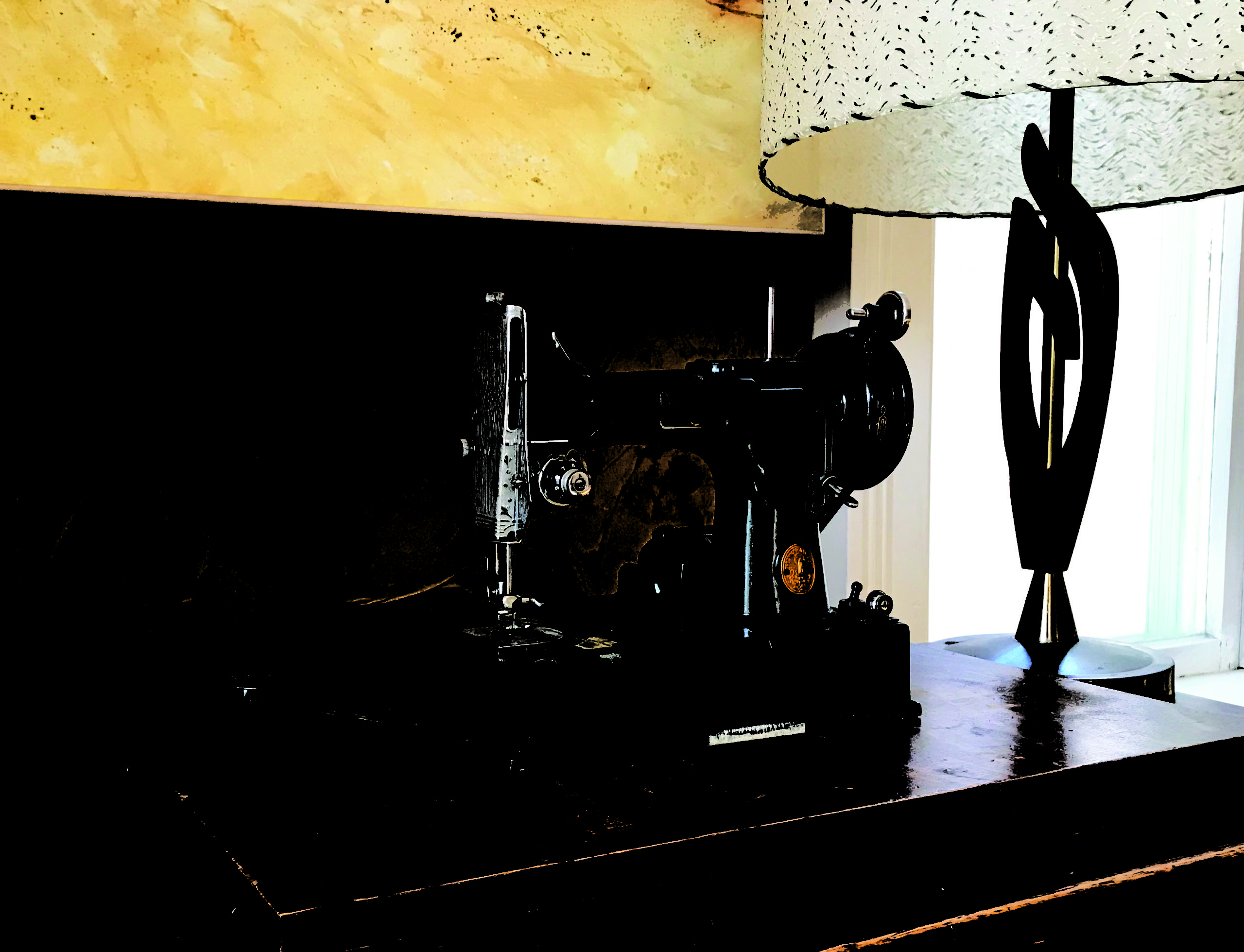
Figure B
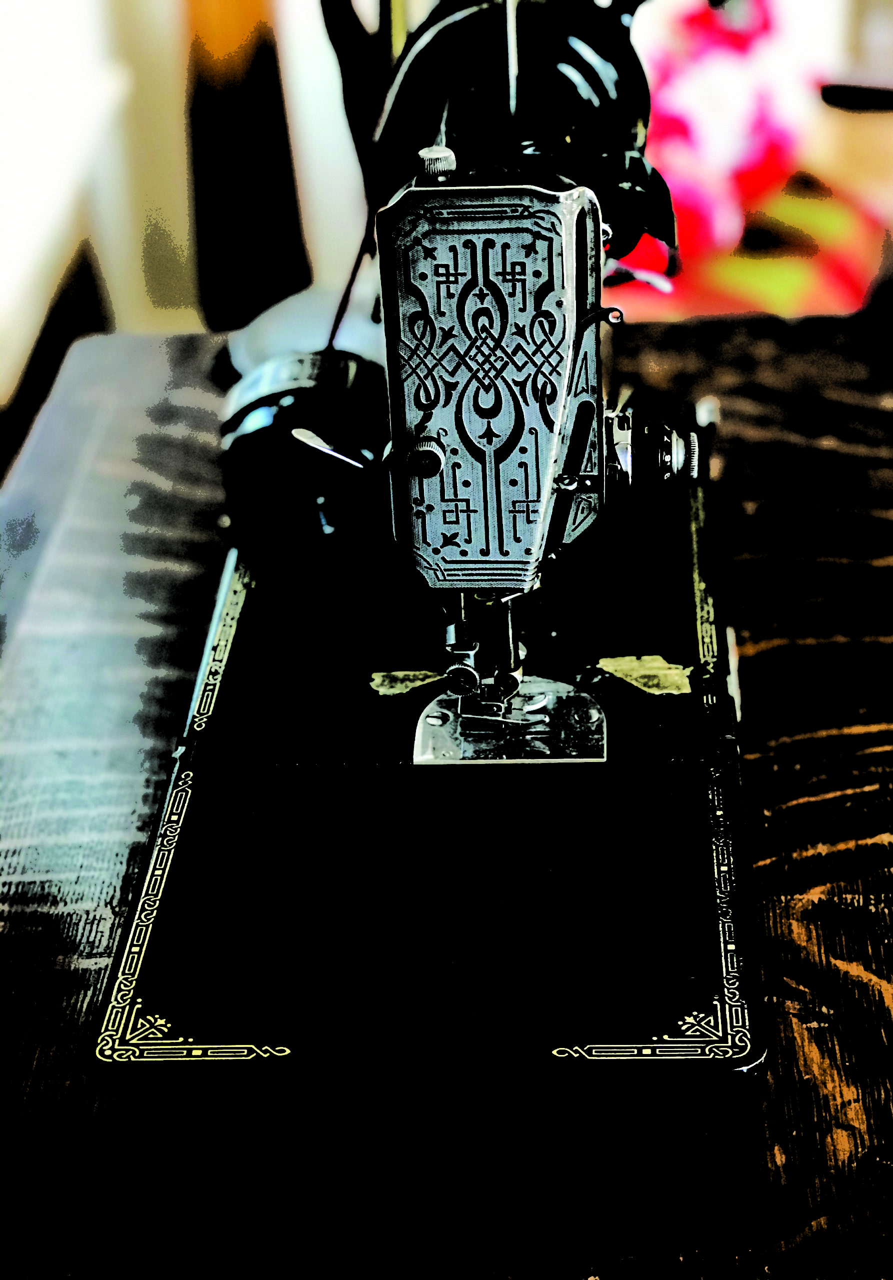
Figure C
After capturing the image digitally, I opened it into Corel PHOTO-PAINT, converted it to a black-and-white bitmap (Figure D), and then used the Trace tool in CorelDRAW to convert that bitmap to vector art (Figure E). From there, I was able to manipulate the individual graphic pieces of this design into the shape I needed for the label.
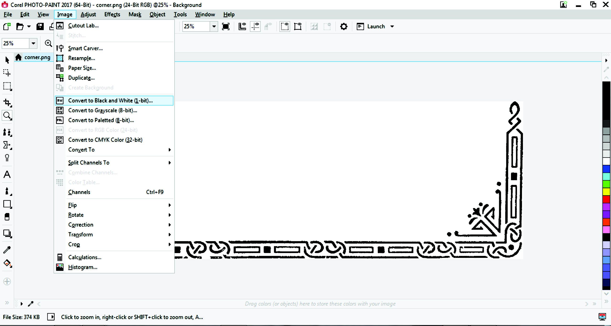
Figure D
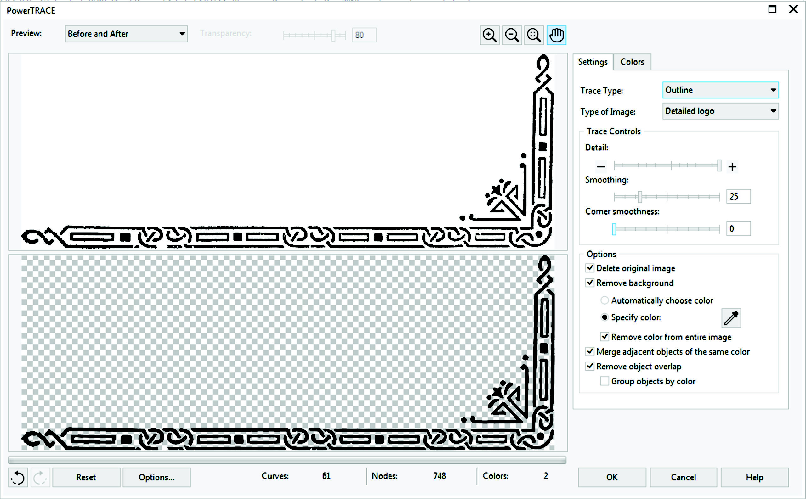
Figure E
I often take photos of architectural elements like Victorian door handles, furniture, decorative wrought-iron gates, and wallpaper in old buildings. All these images can be converted into design elements if the right project calls for it.
Side note: The photos/images are only useful if you can find them again quickly. An important part of taking photos to be used for design purposes is to download and archive the photos into some sort of organization that makes sense. I separate all images by category.
Hundreds of labeled folders contain thousands of my images that I have taken over several years. And, like all files you create, it’s a good idea to backup your images onto an external hard drive or upload to a cloud storage.
“Vector Clutter”
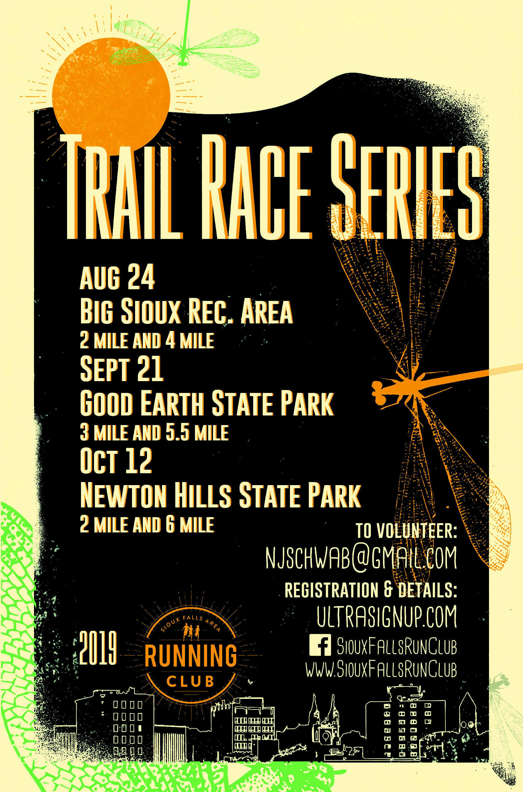
Figure F
Another way I use the camera is for creating what I like to call “vector clutter.” This is used to create a vintage or a distressed look in a design. Figure F is an example of a running schedule handout that I created for a local running club. Notice the rough edges and textured surface. These have their origins from my photos of random surfaces like concrete walls, an oxidized copper panel, or an ink splatter on a concrete floor (Figure G). Any random surface has the potential to become a design feature.
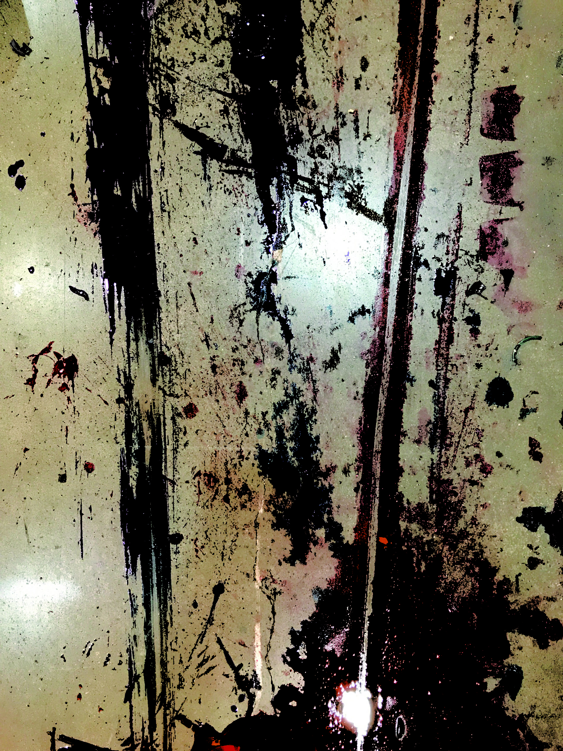
Figure G
Again, to create this vector clutter from an image, open the image in PHOTO-PAINT or Photoshop and convert it to a bitmap, import that into CorelDRAW or Illustrator, and use a Trace tool to convert the image into thousands of tiny vector pieces. These pieces can be duplicated, rotated, resized, and compiled into any number of different configurations. They can then be applied to existing artwork to create a grungier version of a graphic or text.
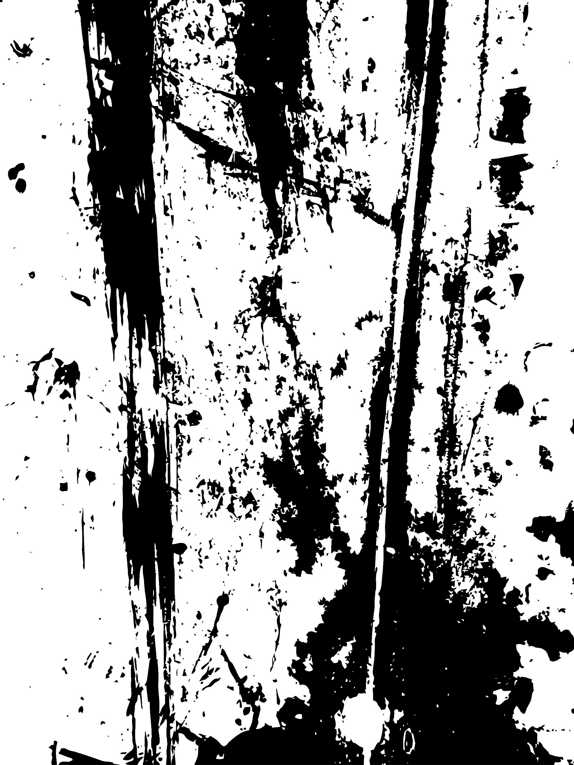
Figure H
Figure H shows the final vector form gleaned from the ink splatter. Normal text takes on a different feel once this clutter has been used to distress it (Figure I).

Figure I
Images of random surfaces can also be used to make interesting textures using Merge Modes in CorelDRAW. For example, the textured look that was used in a running club poster I created was combined with an image of a copper panel (Figure J).

Figure J
I placed the copper panel image on top of the finished poster design, then added a uniform transparency to the image and changed the Merge Mode to Soft Light (Figure K).
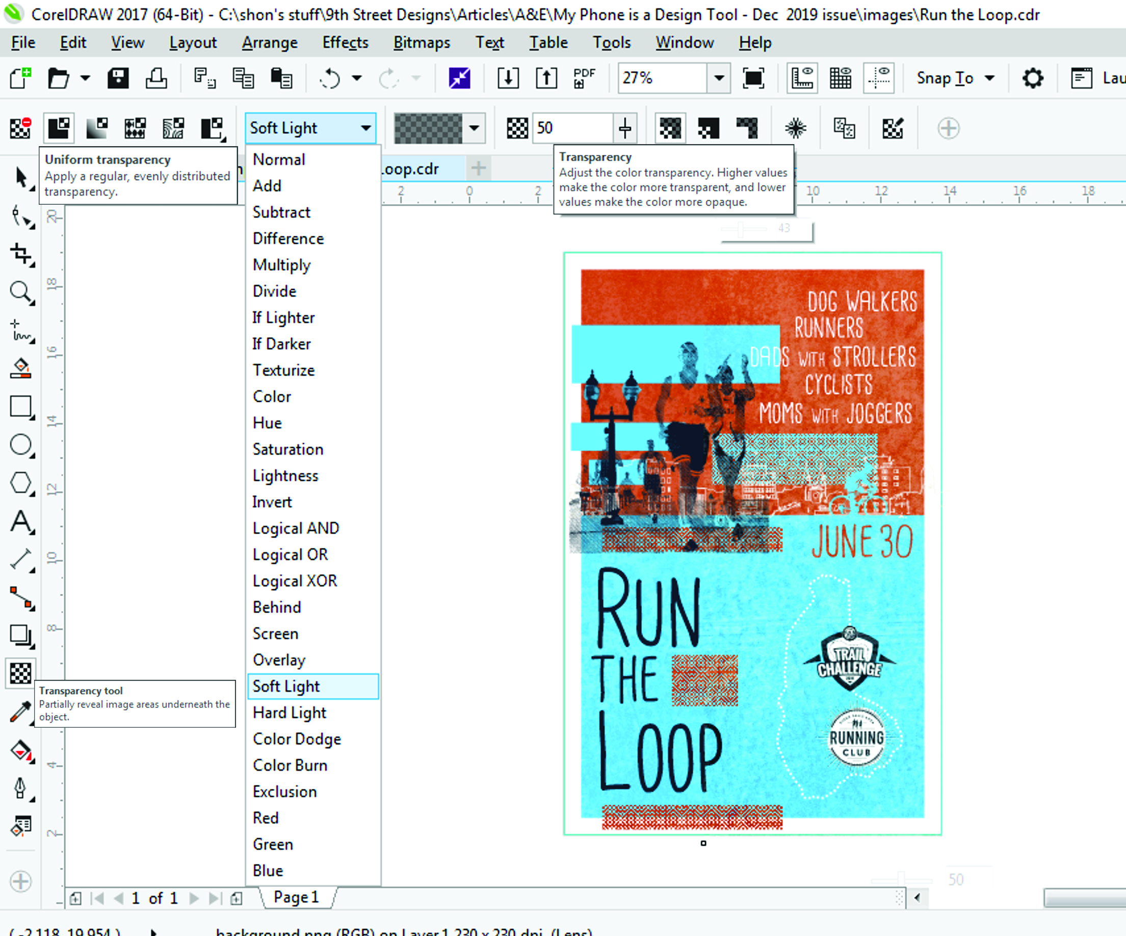
Figure K
A close-up/side-by-side comparison of a portion of the poster with and without the added texture is shown in Figure L. It was a simple addition to the design, but it captured the distressed look I was going for with this design.

Figure L
I also use my camera in more traditional ways. The poster (Figure M) that was created for a local museum gift shop in 2019 started as a photograph I took of the St. Joseph Cathedral that summer with my iPhone 7. And like many other photos that I have used for graphic design, it was opened and edited in PHOTO-PAINT, imported into CorelDRAW, then digitized into a vector graphic using the Trace tool. Though I’m far from a professional photographer, I prefer to rely on my own skills to have control over my photos rather than worry about infringing on somebody else’s copyrighted photos.
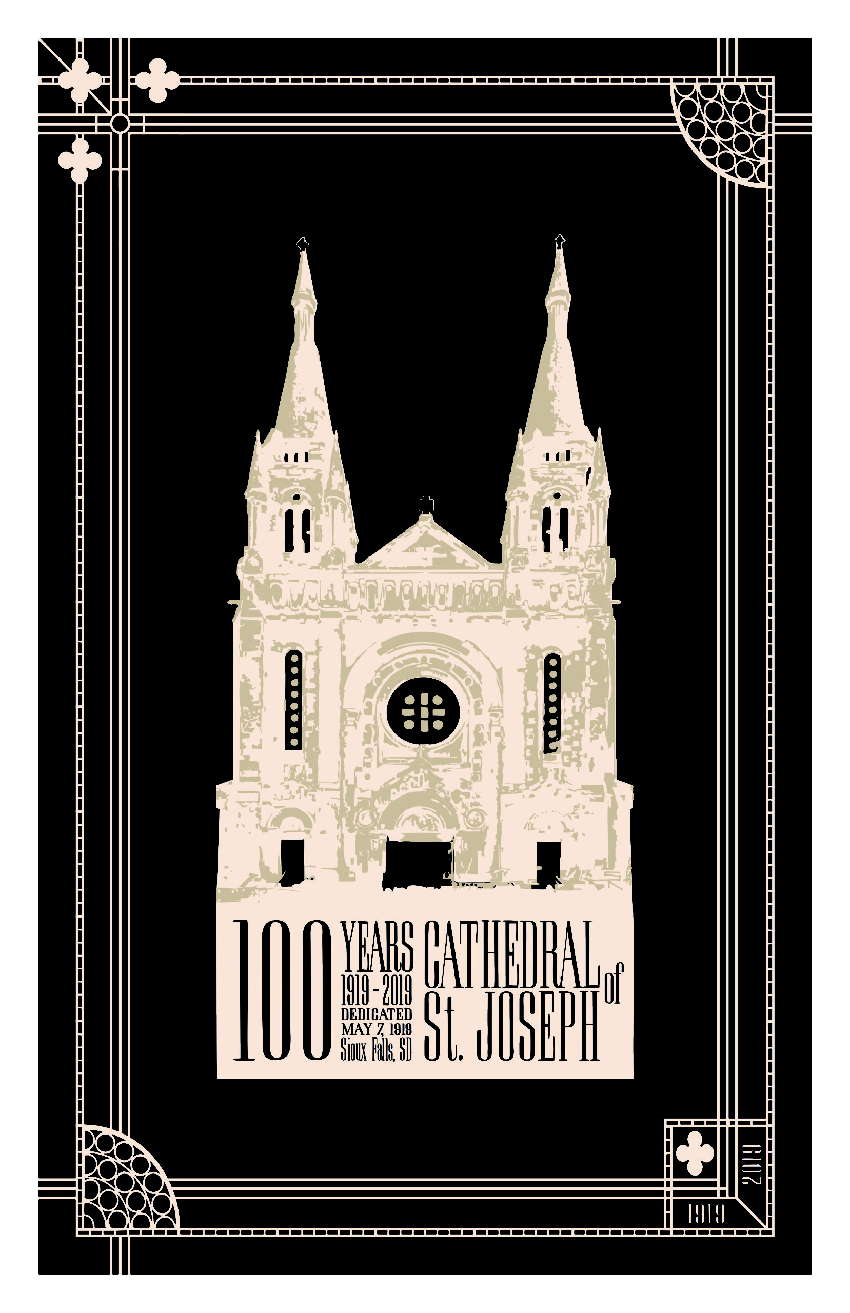
Figure M
It’s easy to see how the smartphone has revolutionized so many aspects our lives and is difficult to image our lives without them. Our job as retailers is to identify how to harness the power of the technology and apply it in new and creative ways to help elevate the clients’ products and in turn, help promote our own retail businesses.