Perspective Abilities of CorelDRAW
Learn how to create more realistic sign mockups
In this article, I hope to help folks grasp some of the basic concepts of drawing images using the Perspective abilities that are an inherent part of the CorelDRAW suite. We will look only at basic and simple concepts of Perspective. More advanced information is available online and in various written texts that give greater and more detailed information about the concepts involved.
Prior to the Renaissance period of history, perspective was not used in art nor understood at all, but was only depicted as a profile image or a straight-on view (known as an orthographic view). However, a vast number of well-known Renaissance artists like Michelangelo, Leonardo DaVinci, Botticelli, and others saw the visual advantages of perspective to depict more realistic images. As design artists, we have been privileged to share their age-old insights.
Vanishing Point
As we begin, it is likely best to explain a Vanishing Point (VP). A good way to understand this is to imagine standing on a straight railroad track. Looking into the distance, the two rails converge into one and eventually disappear from sight. The point of disappearance is the VP. All perspective endeavors will be related to a VP.
Perspective concepts include one-point, two-point, and three-point images. We will only look at the first two as three-point perspective is not a feature of the program and is used only in specific instances. It is possible in the program to render a three-point image, but it requires additional images to do that and is beyond our present discussion.
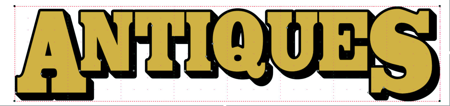
In Figure 1, I typed the word ANTIQUES and filled it with a gold color. I then added a black outline and shadow using the contour feature prior to adding perspective. (Note: If you use an outline, it will not follow the perspective properly. It is necessary to convert outlines to objects prior to adding perspective to get the desired results. This is often problematic with some fonts. Contour is most often a better choice).
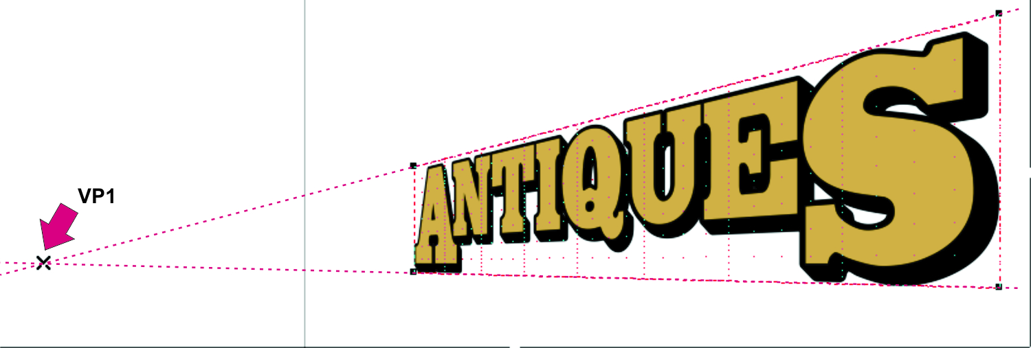
Next, I grouped the text and shadow. Then, with that group selected, I went to Effects>Add Perspective – a red grid appeared over my image with a black node at each corner. I chose the left top node and, holding my Ctrl key, moved it slightly down. I then selected the bottom left node and, again holding my Ctrl key, moved it slightly up. Figure 2 shows the result. (Holding the Ctrl key restrains it to a one-point perspective).
There appears an X at the line convergence or the VP. Selecting the X allows it to be moved up, down, right, or left to alter the perspective result. (Depending on the angle and intensity of perspective, the X, or VP, may exist far outside the drawing window, requiring one to zoom out to see it on screen.)
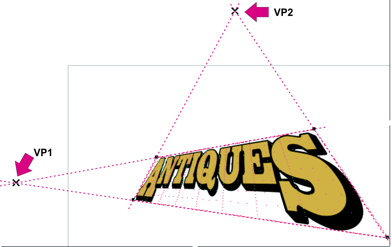
Going on, Figure 3 shows two-point perspective and the resulting VPs. Though greatly exaggerated, this view shows the VP for both one- and two-point perspective to get the VP into visibility on screen. Reality will likely be less intense. Before, I held down my Ctrl key; now, I just move the X to left, right, up, or down to get the desired result. The Ctrl key may also help here – user’s choice. (Note: If, for any reason, you need to remove the Perspective from an object, go to Effects>Clear Perspective.)
Real-Life Applications
At this point, we have only discussed theories of perspective. It’s good, now, to apply it to a real-life project to demonstrate the importance of this feature.

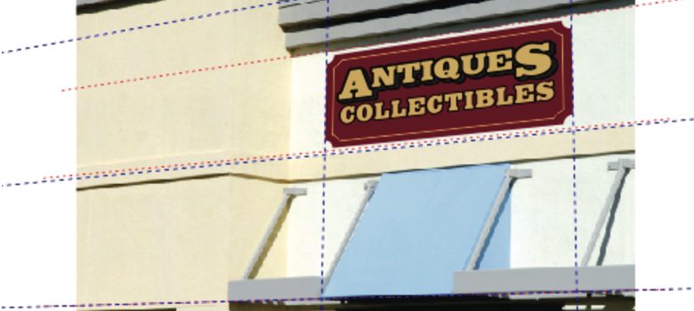
Figure 4 is a possible scenario (the building image was chosen from the stock photos in the X5 gallery). Suppose a prospective client brought this photo in for a proposed sign to be placed on his storefront but wanted to see how it would look when installed on his building. Let’s say you already have approval for the sign, an orthographic image with all objects grouped (Figure 5). Use the following steps.

On the building image, I first created several guidelines and rotated each of them to follow the angles of the various planes of the photo. I then brought my sign image in and added perspective to follow my guidelines with Snap to Guidelines enabled. See Figure 6.
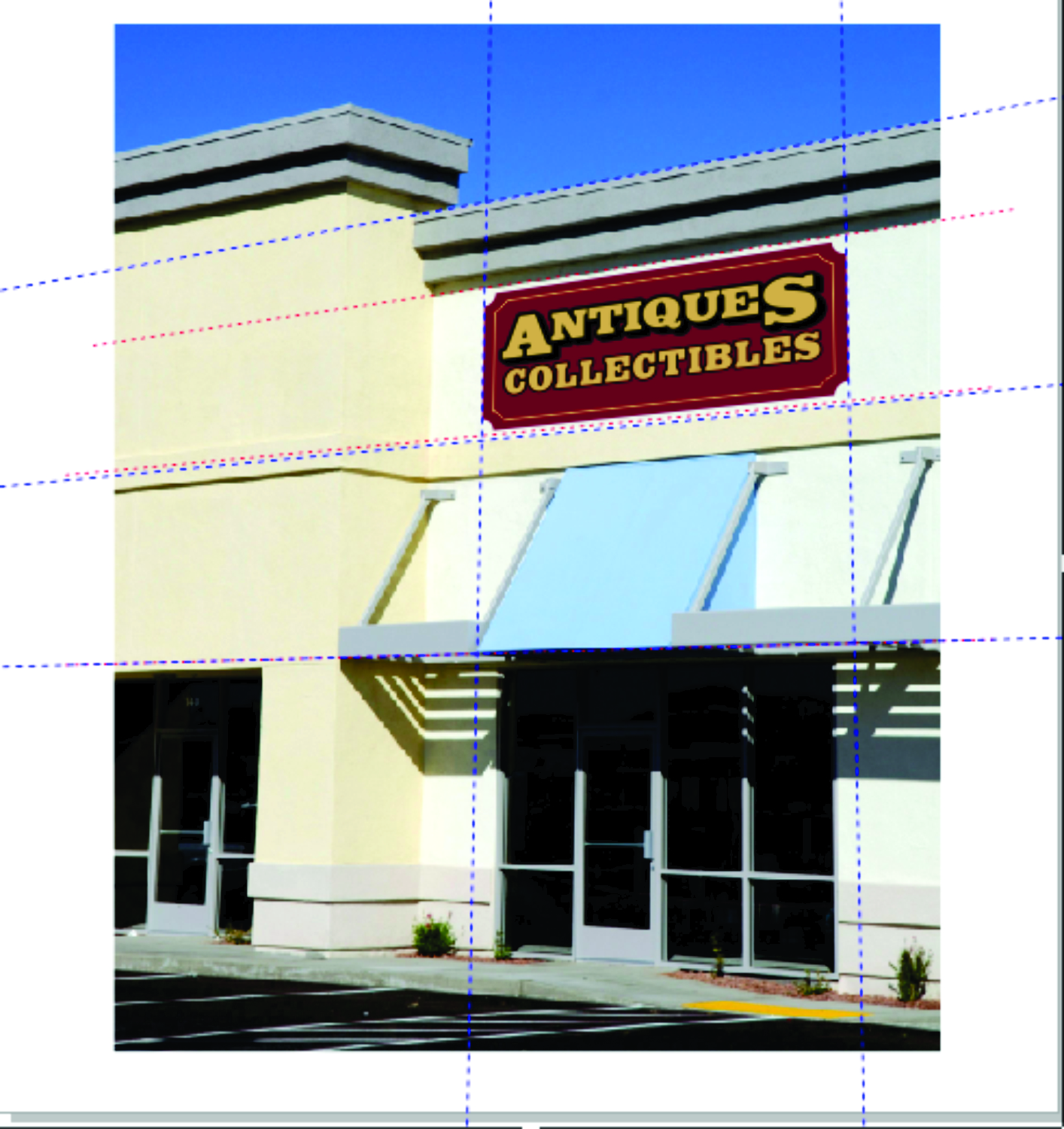
Since the vanishing points are so far out of the drawing window, my drawn lines must suffice for visual clarity. The point at which these lines converge is the VP. The final image may require a bit of adjustment to get it visually correct, but it is now presentable to show my customer.
Figure 7 shows a recent project in which I had to create assembly drawings for a customer. It is a depiction of an internally lit Pan Channel Letter and the main components, in an exploded view, of how they are to be assembled. The foremost image is the assembled letter with each of the major components equally staggered behind. Callouts were added to briefly describe each one. The electrical hookups and routing were drawn in a separate schematic so do not appear in this rendering.
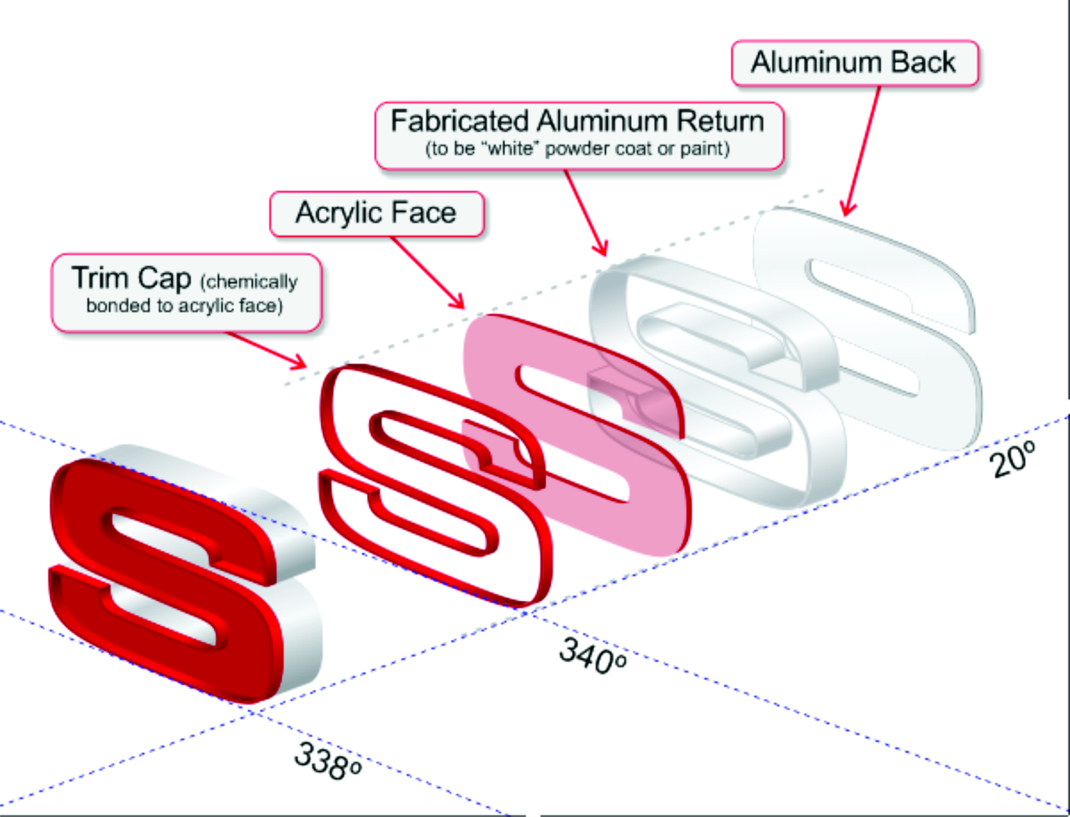
In beginning this project, I first typed the uppercase letter S using the Microgramma Bold font and filled it with a deep red color. I then drew three guidelines at differing angles: 340 degrees, 338 degrees, and 20 degrees. Since the S is mostly rounded shapes, I drew a rectangle around it and grouped them (see Figure 8).

I next located the S in an appropriate relation to my guidelines, then, adding perspective to it, I brought the left top corner to Snap to the 340-degree guideline and the bottom to Snap to the 338-degree guideline. This gave me the basic perspective needed to complete the drawing. I then ungrouped the S and deleted the rectangle.
My next step was to duplicate the S several times. One was then given a small inside contour, broken apart and combined. The Extrude tool was utilized to create the depth needed for each of the components. The extrudes were broken apart, ungrouped, and each colored with a fountain fill to simulate actual light reflection.
As each was completed, it was moved back and placed in order along the 20-degree guideline. This is a simplified description of the necessary processes needed to complete the project.
The use of Perspective is yet another way to add three-dimensional realism to our artistic creations using CorelDRAW. It will likely require some dedicated experimentation to get it just right, but it is an available useful tool. A similar tool is the Envelope tool. We will, next time, look at some of its features, abilities, and limitations.