Finnegan’s Beer is a Minneapolis-based, small batch brewery with a mission as refreshing as its brews. Founded on the idea of what they call “turning beer into food,” Finnegan’s donates profits to feeding the hungry. Beyond its social impact, the brewery has built a reputation for crafting delicious beers that reflect the character and creativity of the Midwest. From crisp lagers to bold ales, every Finnegan’s pint carries the spirit of giving back, making their brand not only beloved among beer enthusiasts but also respected in the world of philanthropy. Their commitment to community and quality made them an ideal partner for a project of decorated apparel celebrating a quarter century.
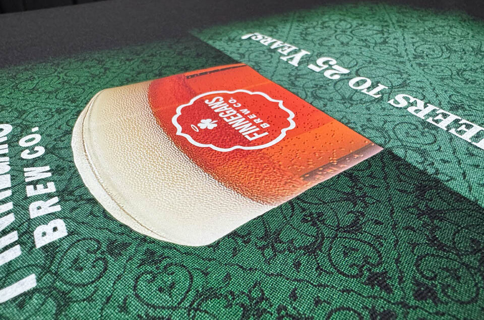
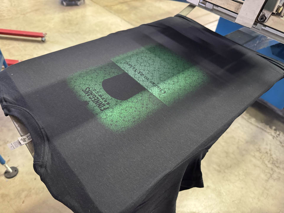
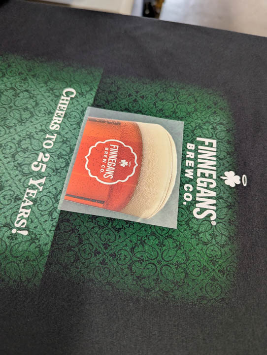
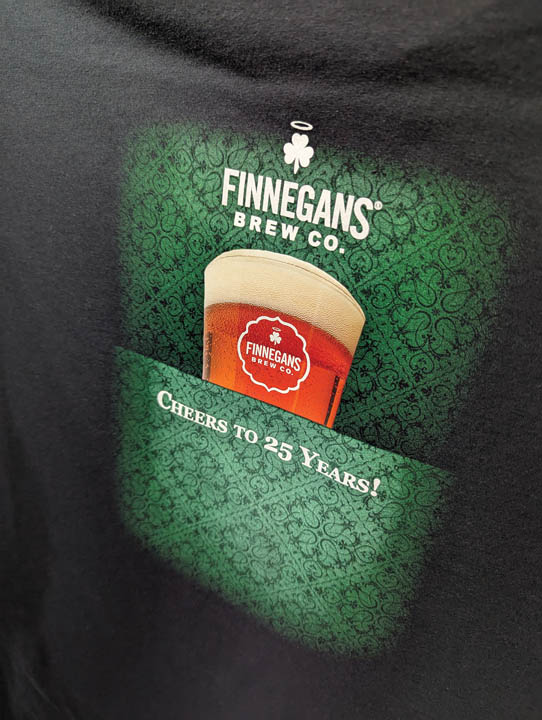
Sometimes the simple jobs often turn out to be the most complicated. Small quantity orders seem like a easy request with today’s DTG and DTF technologies. This seemingly straightforward design would require some finesse, however. In reality, this was a bit of a technical challenge that called for some tricks and creativity. Finnegan’s wanted to feature a photographic image, a pic of a perfectly poured pint, light refracting off the glass, tiny bubbles chasing their way to the surface in a rich, delicious amber beer. The photograph was somewhat complex, full of transitions and subtle tones. The kind of image that we would normally screen print using a simulated process method. Not this time.
The run was under 50 pieces, which meant too many screens and just not practical. The job also had another twist: the background was not part of the photo itself. It was a soft, fading gradient, almost more of a mood than an image along with the brewery’s logos and type. This background element needed to blend seamlessly into the shirt fabric itself. Part of the design needed to have the hand, texture, and feel of traditional water-based screen print while the photo could use the precision and clarity of digital output. One image, two processes, it would seem.
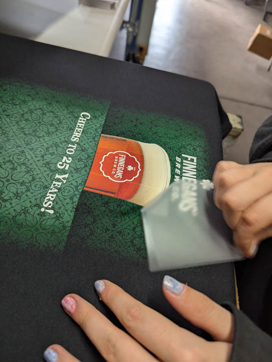
By screen-printing the gradient background first, we could manipulate the ink, opacity, and hand feel, creating the illusion that these elements were dyed into the shirt itself. The hybrid digital transfer of the photographic image would be dropped in later, locking the photo in place without disturbing the subtle feel and flow of the screen print beneath. But doing it this way comes with challenges, specifically, registration of the transfer to the screen print.
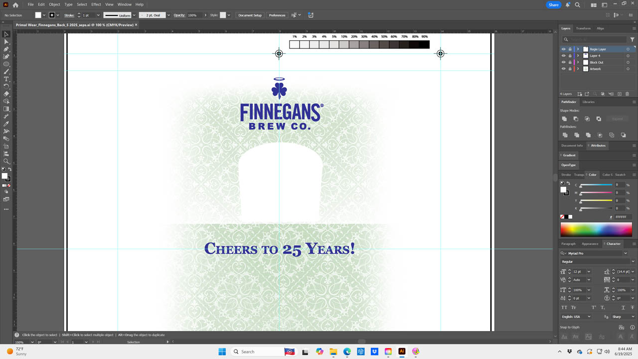
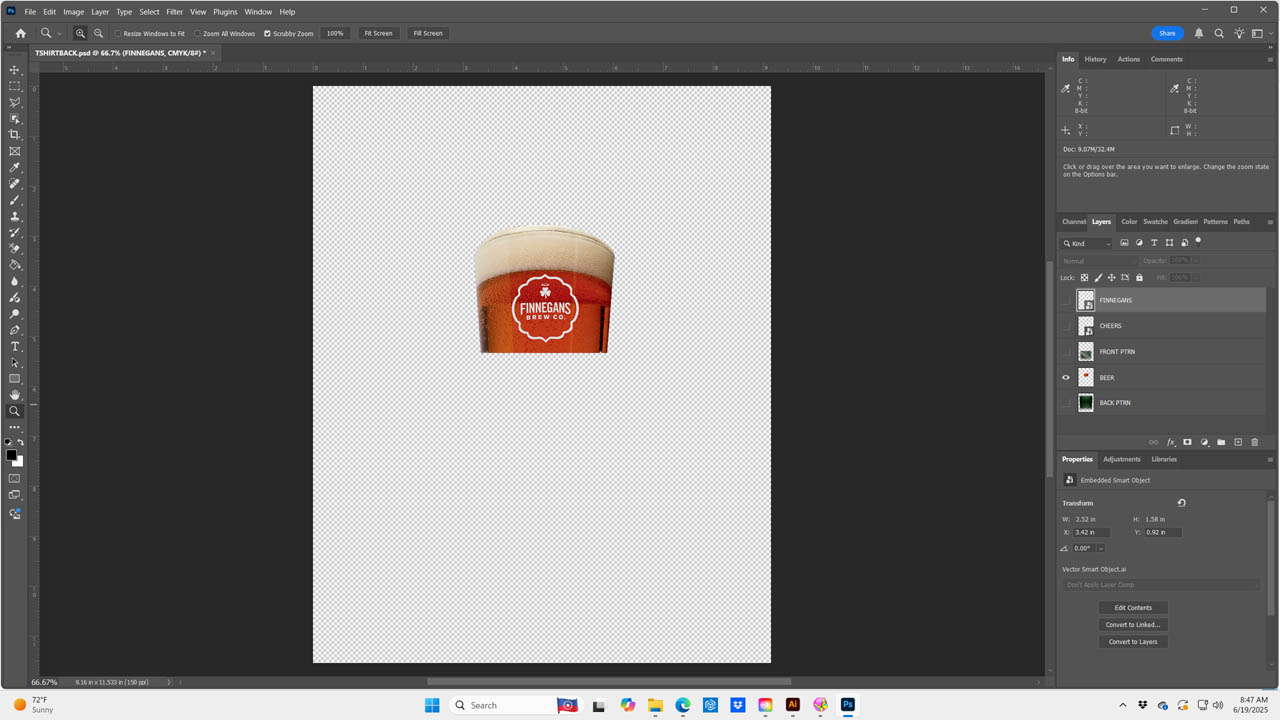
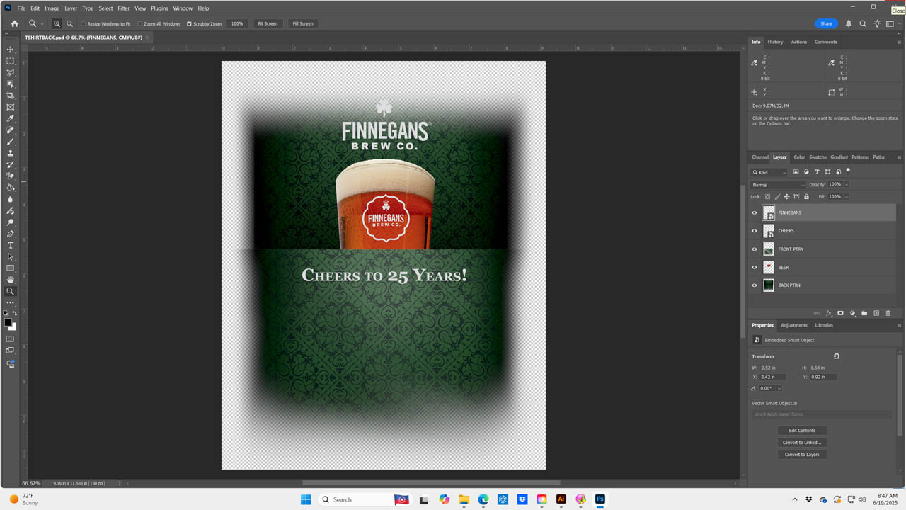
First, we separated the design into the two distinct components. The screen print layer of the soft background gradient, logos, and supporting type. These would all be printed using water-based inks to ensure a soft hand and subtle blend into the shirt. These elements formed the visual foundation and platform for the photographic transfer.
The hybrid digital transfer of a glass with all its crisp imagery, highlights, shadows, full color, and fine detail would be applied via heat press. We knocked out the area in the screen print, allowing the transfer to adhere directly to the garment without interference. The screen-printed background had to seamlessly fit to the photo. Since we were running low solids transparent water-based inks, we spread the screen print portion a couple points under the transfer. We tested this first to make sure the transfer would still stick in these areas.
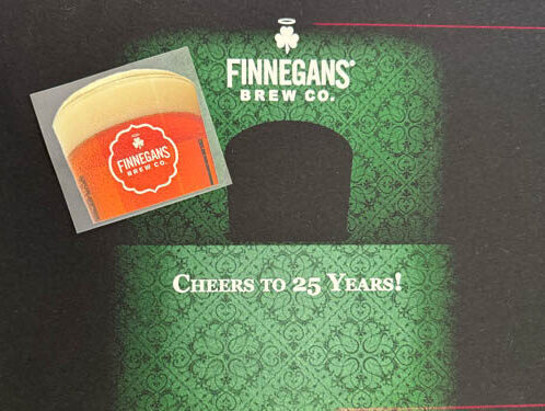
The low solids water-based ink gave us the soft, vintage feel Finnegan’s wanted. A high solid acrylic, high-opacity white water base was used for the logos and type. The gradient itself was built using halftones ranging from 5% to 85% and output at 55 LPI on CTS. This frequency was enough to hold detail in the transitions but open enough for the ink to clear cleanly through the mesh. We used 230 tpi mesh screens at 35 N/cm2 for the gradients and 156 for the white at the same tension minimizing off contact distance.
Because the hybrid digital transfer would arrive as a finished element and unalterable, the screen print beneath had to be precisely registered to accept that transfer without shift. Any distortion would be a problem. Before printing, we projected laser crosshairs onto the pallet to establish the exact location relative to where the transfer would later fall.
For the hybrid digital transfer application, on a transfer machine we set the heat to 295 degrees and pressed for eleven seconds with 40 pounds of medium pressure. Careful placement of the transfer was the order of the day. The photo dropped perfectly into the negative space left by the screen print, with no gaps. The gradient background wrapped around the edges of the photo like fog behind glass and the brewery logos floated just where they belonged.
When Finnegan’s received the final shirts, they were blown away. The depth of the photo was clean, rich and dimensional while contrasting beautifully with the soft background and logo elements. Even after all these years, jobs like this remind us of why the software to substrate journey is still the heart of this craft. Transfer technology is a tool that can work in harmony with traditional techniques, not replace them. We might call this a multimedia application and, when done right, it elevated the product far beyond what screen or digital alone could do. It demanded a bit of discipline, planning, and a willingness to break the rules. We love breaking rules!
For Finnegan’s, this small project proved we could deliver a complex solution at low volume without sacrificing hand, detail, or durability. For me, it’s another reminder that pushing boundaries, digital and/or analog, is what keeps this industry exciting. Every print from 10 pieces or 10,000 is a balance of technology and creativity. Math and art, baby. When they meet just right, you can taste the result. Like an ice-cold beer on a summer day.