Some users have expressed a bit of confusion as to how the Fit Text to Path works, and I hope to clarify some of that confusion. I will also try to explain the use of Fit Blend to Path in the following examples and steps to reach that goal for each of these concepts.
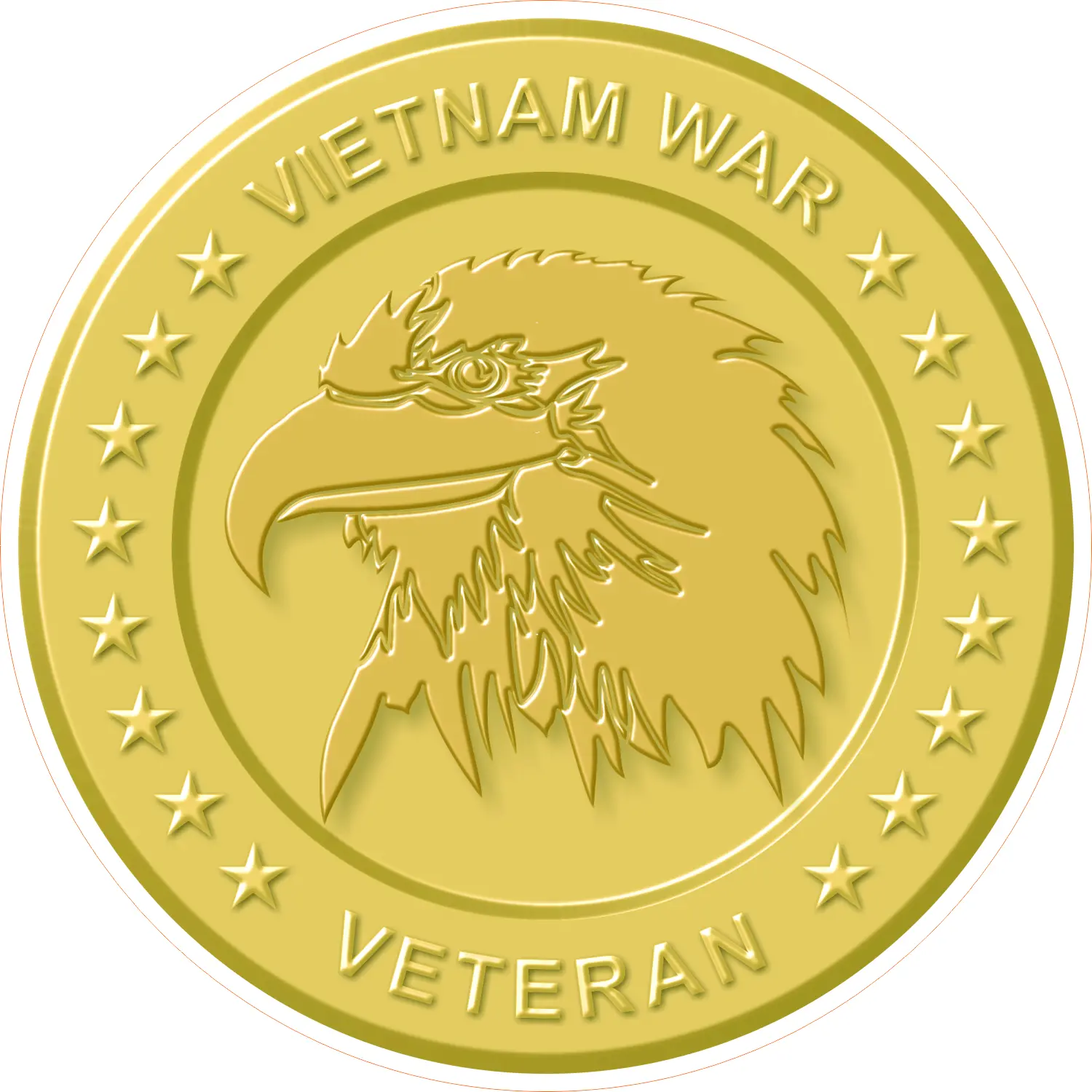
My first example (see Figure 1) was inspired by a lapel pin that I received from the Veterans Administration. The re-creation of this pin in CorelDRAW was straightforward using the tools available in the program. I first drew a circle using the ellipse tool with the control key held down to get a perfect circle. I then typed the words VIETNAM WAR in all uppercase letters.
There are a couple of ways to get the lettering to follow the arc of the circle. You can select both the text and the target object and choose Text > Fit Text to Path, and they are automatically linked.
The text appears at the top of the circle. To move it, you must select only the text. You may have to click on it a couple of times. Alternately, and a little quicker, select the text, choose Fit Text to Path, and drag it to the circle.
When the text is horizontally centered, a small red line appears. There are some settings and adjustments that we’ll look at a bit later. I want to add the word VETERAN to the bottom of the circle in the same manner as the top lettering.
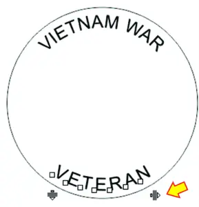
A couple of things to notice: the text appears upside down and backward, so on the taskbar are two icons to mirror the text vertically and horizontally, which will put it in the proper orientation. You’ll have to move it to the desired location. The text letters also look a bit crowded together, so extending the kerning will correct the appearance. This is done with shape tool by dragging the little herringbone arrow as seen in Figure 2.
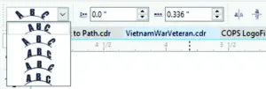
On the taskbar, when Fit Text to Path is selected, are several options to configure the appearance of the text. In Figure 3, there is first a dropdown menu with five choices. The first is the default and is most used. The next adds slight kerning to the text. The third one tips the letters inward, the fourth tips them outward, and the final choice restrains all letters to remain vertical.
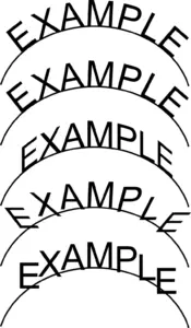
Figure 4 shows an example of each of these choices. Next to the dropdown menu is a Distance From Path indicator that allows one to enter a specific value. Following that is an Offset option that allows one to move the text relative to the beginning of the path by entering a positive or negative number. Then, there are the two horizontal and vertical mirror buttons.
When I had the text just the way I wanted it, I proceeded to add color fills and details using a clip-art eagle head image and several other effects that I have discussed in some previous articles. The row of stars was created using a blend that was then fit to the path. I’ll explain this a little further on. But first, another possibility,
seen in Figure 5. I drew a random line to use as a path. Select the text tool and Fit Text to Path, click on the path, begin typing your message, and the text follows the path.
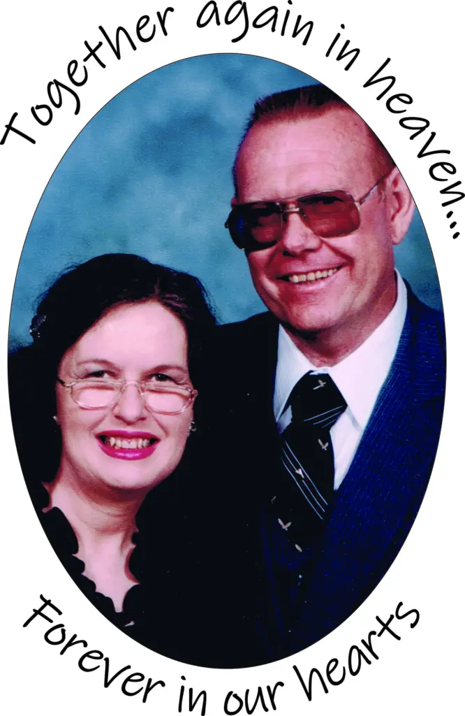
Figure 6 is another example of using Fit Text to Path. I received a Word file containing the photo and lines of text and was asked to create a memorial card for family members of the deceased couple. I copied the photo and text to the clipboard and pasted the photo into CorelDRAW, which I power-clipped into an ellipse. To get the text into CorelDRAW, I chose Edit > Paste Special > Rich Text. I then proceeded to complete the card design.

Figure 7 is a design I did some time ago for a law enforcement training facility. The text on the circle was created as described earlier. To get the look of rivet heads on the shield, I first drew the basic shield shape. I then drew a small circle and gave it a radial fountain fill, then duplicated it and moved the duplicate a distance to the right.
I selected both of these, and with the Blend tool, chose a 10-step preset direct blend. Since I didn’t know how many rivets would fit the shield shape, I added two circles to the blend for a total of 12.
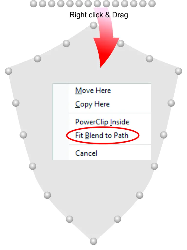
The next step is to right-click on the blend group and drag it to the path. In this case, the path is the shield shape created earlier (see Figure 8). At this point, a small dialog box appears with the option to Fit Blend to Path.
The blend group appears as a cluster; look for the icon More Blend Options on the taskbar and choose Blend Along Full Path. This will distribute the blend objects evenly along the perimeter of the shield shape, but in my case, they didn’t appear quite as expected, so I added objects one at a time until it all came out symmetrical. The final number of rivets ended up being 18.
(Note: I have found that different versions of CorelDRAW are more accurate than others with this operation. The original design was created using the X3 version without any problems, but when I tried to duplicate it in X7, it came out a bit different, not aligning objects evenly with the path. The 2022 version was largely different. Maybe using the Object-Color accelerator in the blend dialog would help correct it. Otherwise, objects may need to be moved manually to get it visually correct.)
Once I was content with the way the rivets displayed, I broke the blend apart and created an inside and outside contour of the shield and combined them. Then, I began adding details using some fountain fills, bitmap fills, and transparencies to reach the final image. To output the final image for print, I converted it all to a high-resolution bitmap to avoid any print spooler problems.
All of the above descriptions are fairly clear and obvious, but some users may have questions about a few of the details, so I am able to answer questions, hear insights, and hear some successes of CorelDRAW users at dezender1@gmail.com.