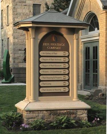
Featured Project: The Blending of Past and Present
Shane Durnford says he relishes the opportunity to make new signs that complement the architecture of the past.
Orange, California-based Coastal Enterprises, manufacturers of Precision Board HDU used in the signage and tooling industries, brings us this featured project.
In an email sent to Sign & Digital Graphics, Coastal highlights a project done by artisan and sign maker Shane Durnford of Shane Durnford Design, based in Creemore, Ontario, Canada, about 80 miles northwest of Toronto not far from Lake Huron.
Durnford founded his company in 1989 and has built up quite the resumé over the years. For this project, he was contacted by the Peel Heritage Complex-now called the Peel Art Gallery, Museum and Archives-in Brampton, Ontario. The organization that runs it wanted a handcrafted sign that would match the historical building’s architecture to create a seamless look. For his materials, Durnford chose Precision Board HDU; copper; stone from the community of Wiarton, Ontario; and used bronze and gilded lettering.
The owners of the complex wanted a directional sign on the side of the building that would stand 12′ high; a 15′-long sign for the lawn; and some modern touches added to the sign that’s on the building itself.
He says that previously, a reader board was used as signage and it looked totally out of place compared to the rest of the campus. So when they hired him, Durnford went to work researching the time period the building was built and the materials and architectural forms common to that era.
“I’m a sign specialist, as much as a sign maker,” Durnford says. “The visual fit and placement with surrounding environment greatly influence the effectiveness of the final product. I tell clients, they are hiring me for my expertise as well as supplying the product.
“I followed a design process that follows a criteria developed from research and discovery. I designed the bases and they were contracted out. The signs themselves were created in (my) studio and then assembled on location.”
Durnford says he sketched the designs, redrew them in Adobe Illustrator, then scaled them to full size and hand-crafted them out of PBLT-18 Precision Board HDU using traditional woodworking tools, including a wood lathe (for the corner pillars), a bandsaw, a table saw, and carving tools. There were no CNC machines used-everything was done by hand.
The Wiarton stone is limestone from the Niagara escarpment, a native stone traditionally used throughout Ontario in the 1800s.
The sign’s roof is copper that was patina’d. Durnford says copper was a natural choice for this. He then used pot lighting to light the sign up at night.
“The principal criteria was that the signs had to look like they had always been there,” he says. “We had to match the architecture, the building and historic vernacular.”
Durnford says he finds projects such as this especially rewarding because of the palpable sense of history involved.
“I look at everything. After all the research and information is gathered, I then tuck it away and go by feeling. It tends to design itself this way.
“I want to understand why they did what they did and then that gets infused into your design. It’s creating a story. How it’s going to be used. It’s a nice blending of all of it, combined with the quality of materials used.”
Durnford says too many signs these days are new interpretations of old pieces and they fall short-there’s no story. The very thing that gives it soul.
“Old buildings were intuitively designed using natural proportioning and patterns, You look at old buildings and you feel and connect on a visceral level,” he says. “You look at a new building and it’s usually void of these values, and connection.”
His initial signage was made about 15 years ago, and when the Peel Heritage Complex changed its name, he was asked a few years ago to come back and retrofit the signs. The photos are what the signs look like today.
“I feel signs are all about storytelling and intimate communication,” Durnford says. “They can bridge a strong connection not only to the subject they represent but to ourselves as well. A making for a very effective branding and marketing tool.”


