Featured Project: Showing the Way
The sprawling campus needed signage that would be clearly visible and easily readable to both pedestrians and vehicles alike, the company says.
This featured project comes from Toronto-based Forge Media + Design, providers of digital and static signage as well as branding and website development services, which did the wayfinding signage for the Downsview Complex, a government and medical center campus located in Toronto’s Downsview neighborhood.
The company says the complex started out as a group of isolated government offices and then grew into a bustling urban campus, which required signage to guide both visitors and emergency services workers to where they needed to go. Infrastructure Ontario and Urban Strategies asked Forge to develop a wayfinding plan and signage strategy that would give the campus a strong identity and help everyone find their way.
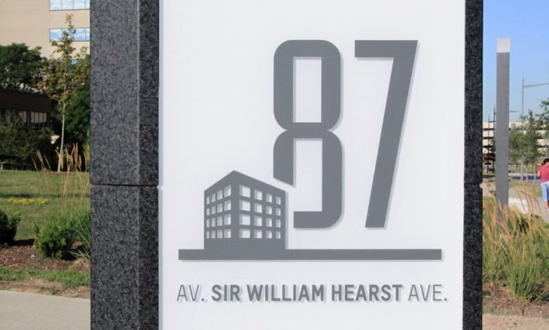
Forge says it started the project by analyzing traffic patterns for both vehicles and pedestrians. Its designers then developed a coordinated sign family adapted to the specific conditions at the site. The signage is constructed from durable materials with a unique wedge shape that stands out from other nearby signs. Eighteen-feet tall signs mark the campus gateways, while human-scaled signs identify the buildings and parking lots. Thin post signs complete the wayfinding experience by helping pedestrians to find their way around the campus.
The company’s goal, it said, was to develop signage that would create a sense of place, respond to users’ intuition and respect the attractive nature of the campus.


