Studio 618, my Charlotte, North Carolina-based consultancy focused on story-driven signage and wayfinding, was brought on to create custom murals for three parking garages in Washington, D.C., Charlotte, and Falls Church, Virginia. Each mural was thoughtfully designed for its specific location, taking cues from the surrounding neighborhood and property itself. Our goal was to create designs that felt unique to each building, complemented the architecture, and added to the warm, welcoming feel of the interior spaces.
A distinctive map always wins
Every time I present mural concepts that include a custom map designed specifically for the property, clients consistently choose the map over the other options. They’re drawn to how closely it connects to the location and tells a story that feels meaningful and intentional.
One of the biggest reasons the custom map approach stands out is that it creates a strong sense of place and clearly distinguishes the property from its neighbors. Using a color palette that aligns with the interior design or architectural features further reinforces that connection. Clients also appreciate the practical benefits, as larger shapes that typically make up the graphic make the murals easier to maintain and simpler to touch up if vandalism ever occurs.
The importance of placemaking
The concept behind all three map murals was grounded in the idea of placemaking. As described by experiential design consultancy RSMDesign, “Placemaking is a collaborative process of designing public spaces that are functional and reflective of the community’s culture and identity. Placemaking creates friendly communities by building environments that encourage interaction and engagement.”
The goal of placemaking is to create public spaces that truly enrich the community. This can include elements like signage and wayfinding, public artwork, unique landscaping, and lighting. Together, these features create a distinctive environment that tells a story unique to that space and encourages visitors to come back and share the experience with others.
What makes each map unique
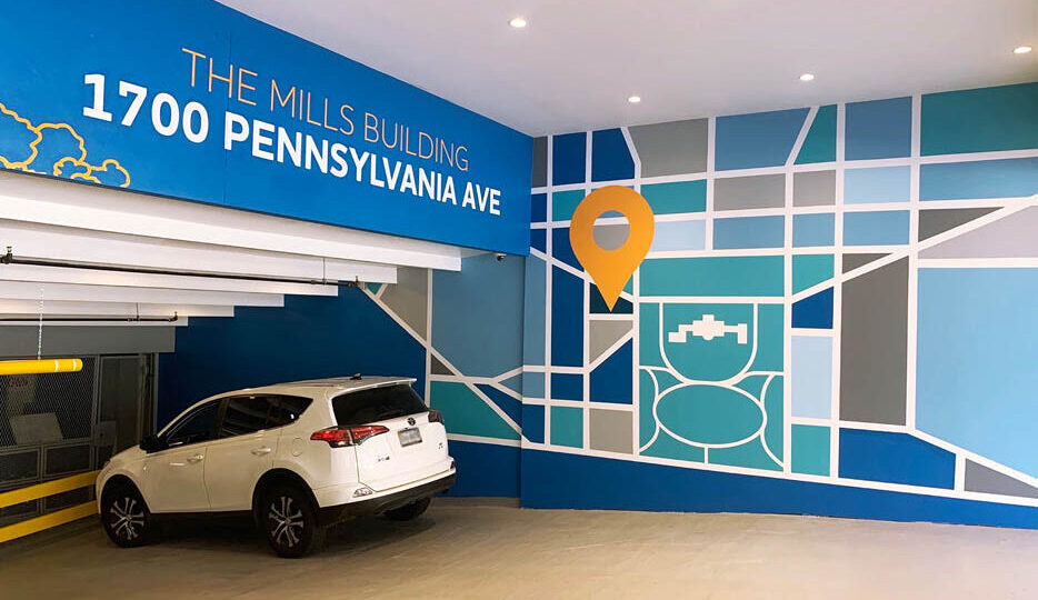
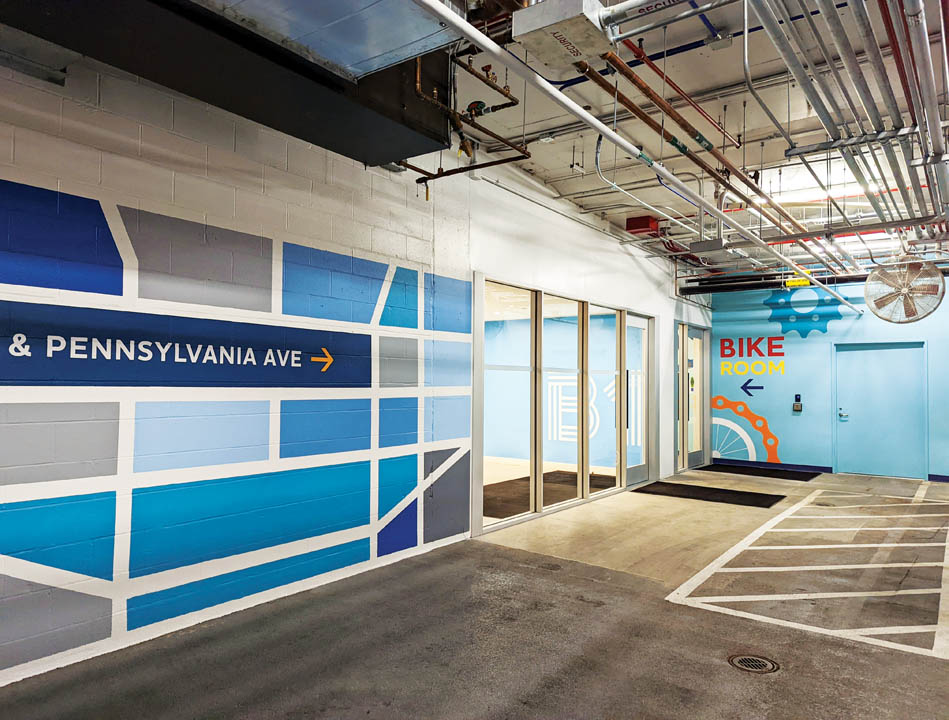
The first map mural, created for 1700 Pennsylvania Ave, a workplace building in Washington, D.C., owned by Akridge, emphasizes just how close the property is to some of the city’s most iconic landmarks. Unlike the other two murals, this one takes a more detailed, close-up approach, showing nearby roads, a bird’s-eye view of the surrounding blocks, and the White House itself. The intent was to highlight how connected the location really is to the heart of D.C. You are literally on Pennsylvania Avenue with views of the White House and nearby monuments, historic landmarks, and buildings tied to the city’s rich history, all visible from the penthouse terrace.
The color palette combines deep blues and grays with pops of orange, which carry through the rest of the garage graphics. To help the mural stand out, the property owner chose a more muted gray palette for the level identification, keeping the focus squarely on the artwork.

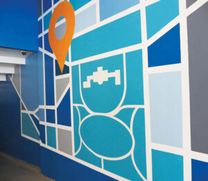
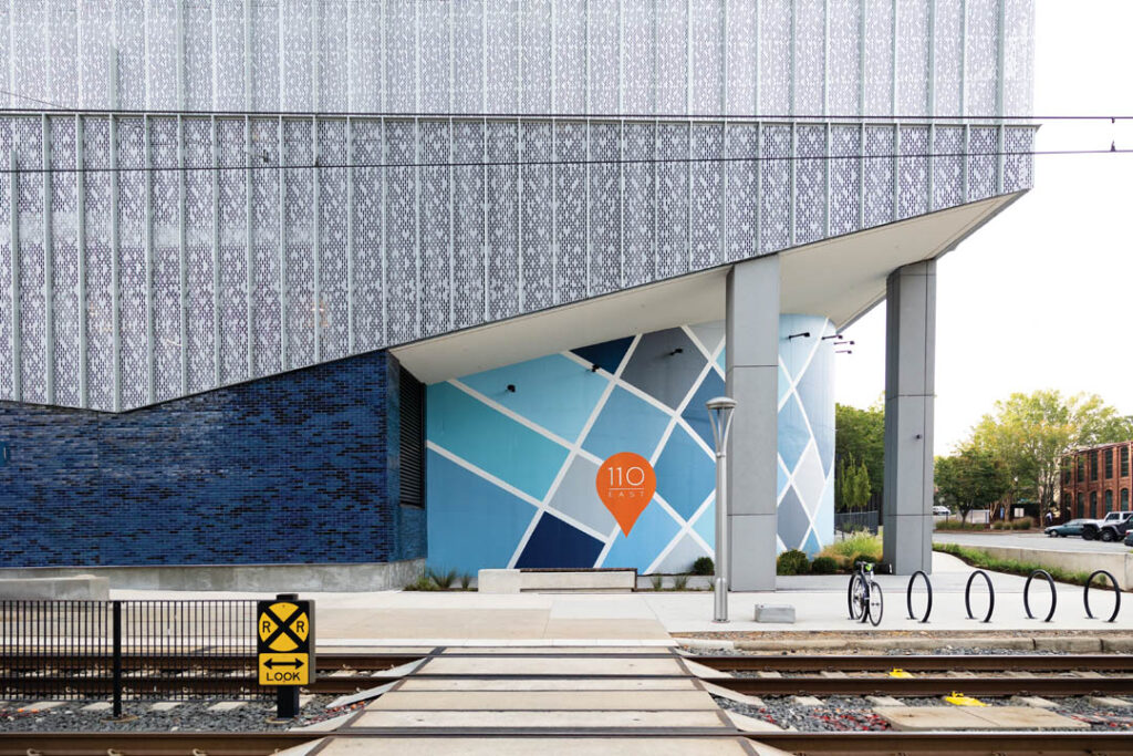
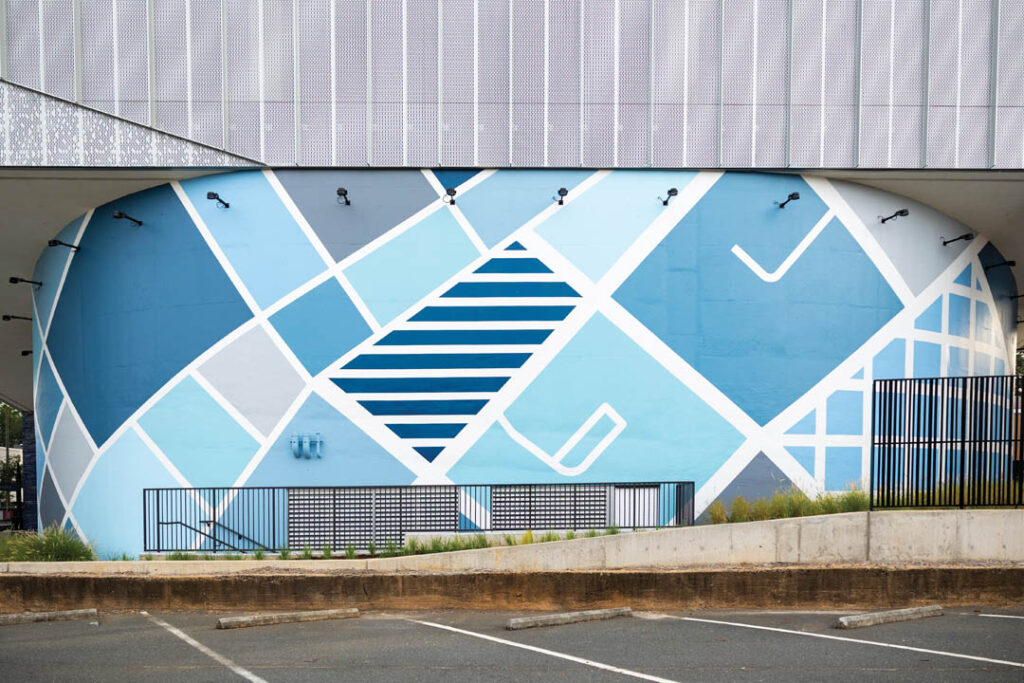
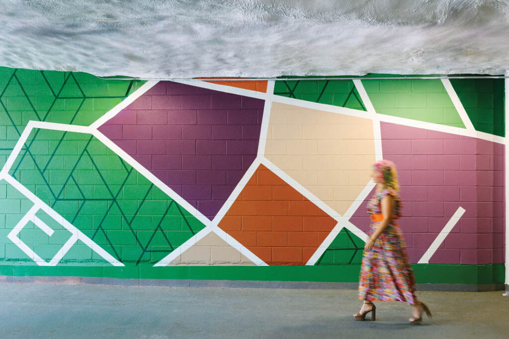
The second map mural is at 110 East, a workplace building in Charlotte owned by Stiles. It spans over 3,500 square feet and was inspired by the building’s facade and color palette. Part of the facade is covered in blue high-gloss tile right next to the mural, while the metal panels feature gray tones balanced by natural wood accents. The mural combines grays and blues with a touch of white, and the “You Are Here” icon stands out in vibrant orange. The orange complements the blues without taking away from the overall design or the architectural details of the angular metal facade.
The map offers an abstract take on 110 East’s location in Charlotte, showing both a macro and micro perspective. About three-quarters of the mural focuses on the macro view with roads, larger shapes, and grid and horizontal lines that add pattern and visual interest, inspired by the patterns and textile history of the property. The remaining quarter on the left side provides a micro view with smaller shapes and minimal linework for a more detailed focus. At the exact location of 110 East, a prominent “You Are Here” icon with the 110 East logo highlights the building’s spot on the map.
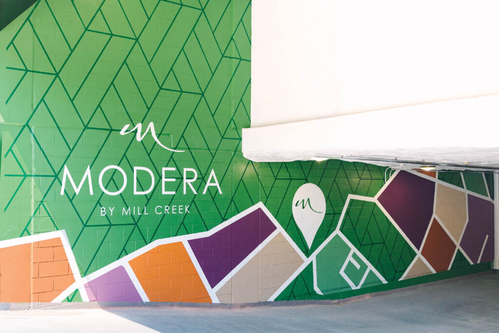
The third map mural is at Modera at Falls Church, a multifamily property in Falls Church owned by Mill Creek Residential. The patterning behind the map was inspired by the interior design, particularly the angular tilework found throughout the public spaces. The goal was to bring a playful texture into the garage graphics. You can see this pattern on the columns and retail murals that my consultancy also designed, and it appears as the background in the map mural where the map color blocks are absent. This adds visual interest and helps tie the mural to both the garage and the building’s interior design.
The color palette of rich greens, purples, tans, and rusts was also drawn from the interiors. By blending interior and exterior elements, the mural feels like a natural part of the space rather than an afterthought. The “You Are Here” icon features the Modera “M,” giving the map a subtle but meaningful connection to the building’s identity.
Why garage graphics & murals are a good investment
Whether you’re developing a new building or updating an existing one, investing in parking garage graphics is always a smart move. Adding custom graphics, like a dynamic mural, can help you achieve several important goals:
1. Graphics are a smart way to improve signage and wayfinding in your garage

To help visitors navigate easily, consider adding informational graphics that guide them clearly. Think about the key features you want to highlight. For example, if elevators are important, you could use colored walls around the elevator area to make them more visible. Eye-catching icons near electric vehicle charging stations, bike rooms, and other key areas can also make a big difference.
A custom mural can serve as both a wayfinding tool and a memorable piece of art. Two of the three murals we’ve discussed include the property’s name on the mural itself, while the third is highlighted on the adjacent entry bulkhead. This approach identifies entrances and incorporates branded elements in a subtle but meaningful way.
2. Enhance your space without breaking the bank
Parking garage graphics can range from five to six figures, but the cost really depends on the project’s complexity, including size, level of detail, color palette, and overall design.
Your garage is often one of the first things visitors notice when they arrive. Do you want to leave a great first impression? Do you want them to come back? I’ve been to plenty of garages that felt dark, confusing, or uninviting, and honestly, it made me hesitate about returning. People tend to remember negative experiences more than positive ones, so why not make your garage stand out in the right way? Even small design touches can have a big impact. Parking garage graphics are an easy and effective way to tell a unique story and make your building memorable.
Getting such positive feedback from clients is always incredibly rewarding, especially when they recognize how important this type of work is and the value it brings to their property. As Chris Grenier, senior vice president of development at Stiles, shared about the mural at 110 East, “This mural is a vibrant celebration of the neighborhood’s unique energy and culture. The mural is more than just art; it’s an investment in community engagement and placemaking. It transformed an otherwise ordinary wall into a creative backdrop for memorable social media posts, amplified visibility, and brand recognition for our office building.”
Final thoughts
Garage graphics and murals can have a big impact on creating a space that is both functional and visually engaging. As you plan your budgets for 2026, consider setting aside some funds to enhance your parking garage and make your property stand out from the competition. You’ll be glad you did.