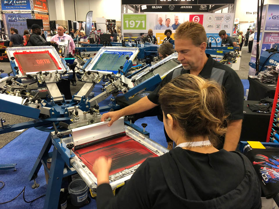
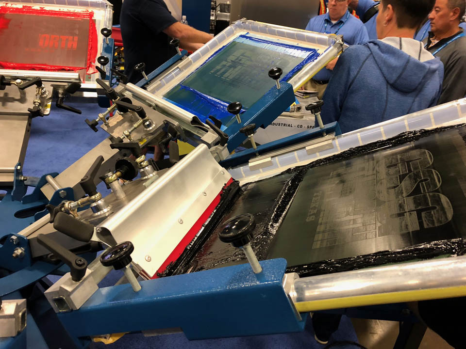
As you may know, our team here at Graphic Elephants frequently speaks, presents, and provides live screen print demonstrations at international, national, and regional trade shows including our very own GRAPHICS PRO EXPO (GPX). As we reflected on this project, it seems as though we have been here before. A little déjà vu, as it were. That’s because we have.
In fact, this might be the ninth or 10th version of this crowd-pleasing, show-stopping demo. The client’s needs remain simple and straight forward. This demo would be on a six-color manual press. They wanted vintage, classic, and distressed for black shirts and as much bang as possible. It would need to be for Texas! It always does.
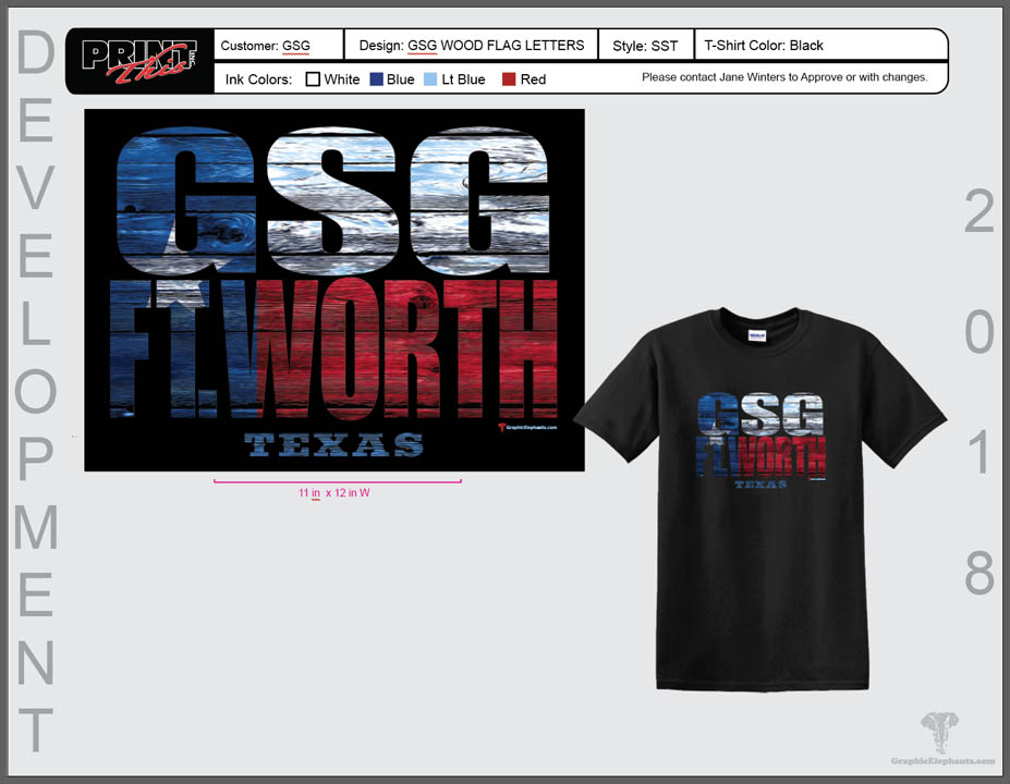
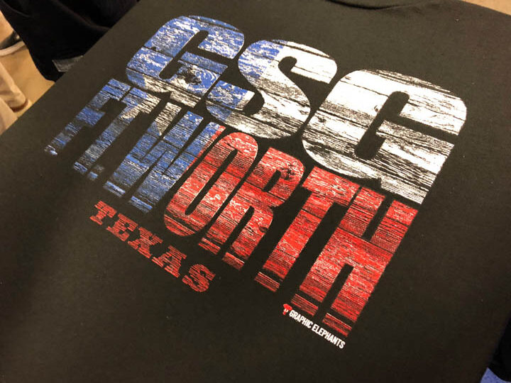
Where to begin? The Texas state flag. This was our subject matter. Been there, done that — a dozen times, at least. We would jazz things up a bit and turn this subject into another legacy and a consistent print. Let’s face it, what says Texas better than the Texas state flag? Residents sometimes think Texas is it’s own country. This show would be in Fort Worth, so we would spell that out into a wooden version of the flag.
The wooden texture would be perfect for the fill of the letters. Though filling text with imagery is nothing new, it was important to pick an appropriate font with a wide-open space and no serifs for this application. We were careful not to have the letters too close to each other or overlap for readability.
We started with a new document in Photoshop and set up our working layers. Since the finished print was on black, (you know how much we like black!), we made a new layer and filled it black to represent the shirt color. After picking Impact as our font, we set type with the Type Tool from the Tools Palette.
The font size and width were decidedly different for both words, so we typed them on separate layers and moved into position with the Character Palette open for proportion. Once the text was configured and active, we rendered the layers by selecting both and then clicking Layer, then Rasterize, making the type accessible. The two layers were then merged and essentially became one, therefore no longer active as type.
We found a clean version of the Texas flag and set it up on a separate layer after we cut and pasted it into our file. To place the flag in the text, we selected the text revealing the marching ants, as they call it, around the perimeter of the type. We turned off the type layer and had only the flag layer turned on with the marquee of the text still showing. To create the layer mask so that everything on the inside is filled, in the Layers palette we used Add Layer Mask and placed the flag within the confines of the letters.
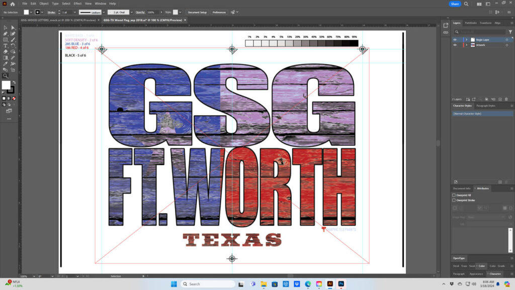
To add the vintage wood grain, we used the mask but placed the grain above the flag layer and removed areas outside the letters. We built the texture as a knockout to define the darker recesses of the wood and help create dimension. Secondly, we created a highlight for what would be the lightest areas in a wood grain, and lastly, a middle tone to add more dimension.
With all the elements working together and on individual layers, it made the separation process easy to manage. We kept the colors mostly separated and knocked out of each other from the get-go.
The black was completely knocked out of all the colors. With the black grain deleted in the shadow recesses, it broke up the colors cleanly. For the white printer, or baseplate, we built in variable halftone densities to give us pop where we wanted and subtle tones in other areas. Some of the halftones are at 10% and lower, while other areas are near 100%.
Finally, shadow areas required complete removal of the base to allow portions of the wood grain to look dark. For the mid-tones, we made a selection and reduced large portions of the white printer down to give us a relief by using the Levels and Adjustments Palette. We added an overall one-pixel choke to the base so there would not be any peaking out under the colors on press.
This being illustrative, output was at 45 lpi (lines per inch) and 22.5 degrees on CTS (computer to screen). The hi-density black was on N-102 with a 400u stencil. The white printer was base N-166, while red and blue were on N-272s, and finally the highlight white on an N-205 all at the same high tension of 45 N/cm2 and a more traditional EOM (emulsion over mesh) percentage. The squeegees were 65/95/65 triple ply dual durometer. We used a clever approach to print order. White printer, flash, HD black, flash, royal, red, and hiwhite all wet on wet.
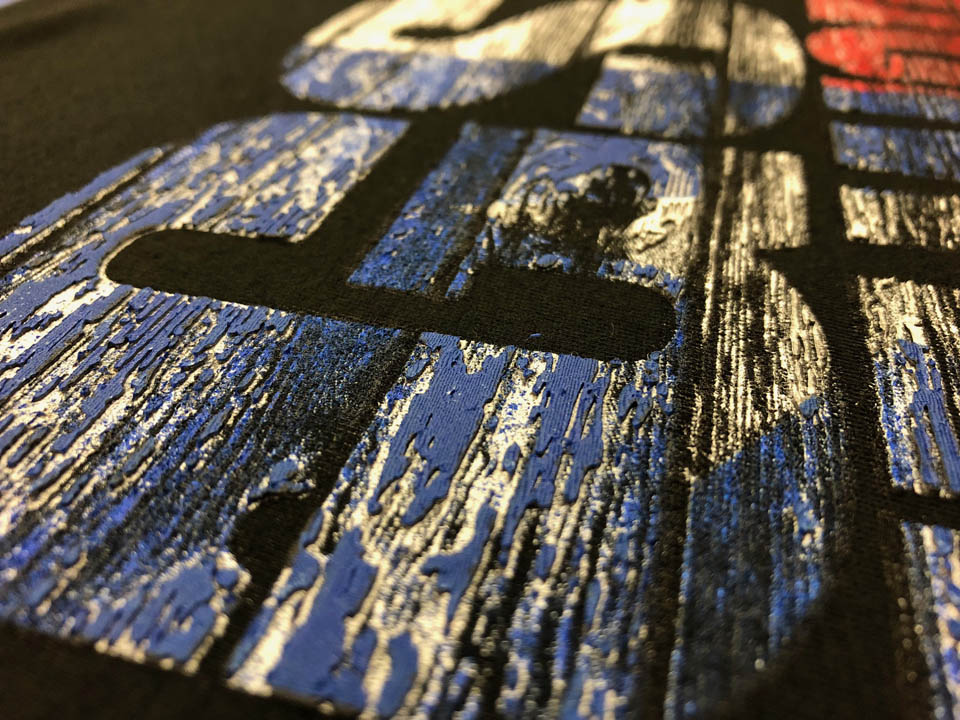
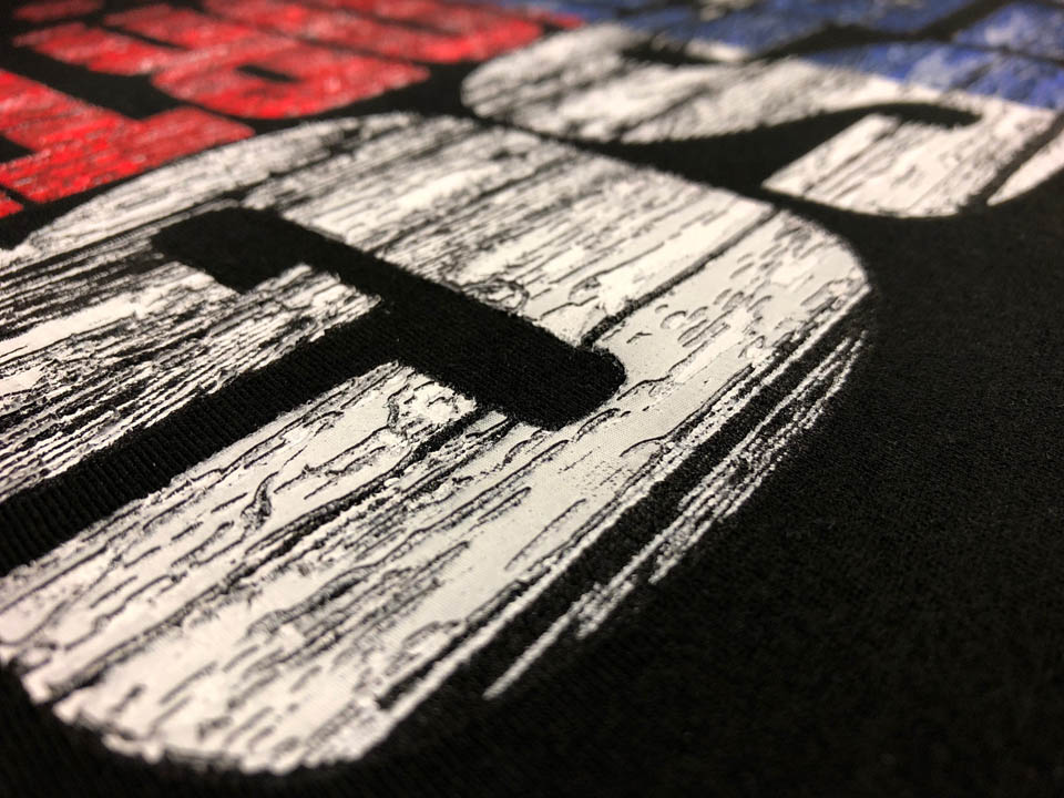
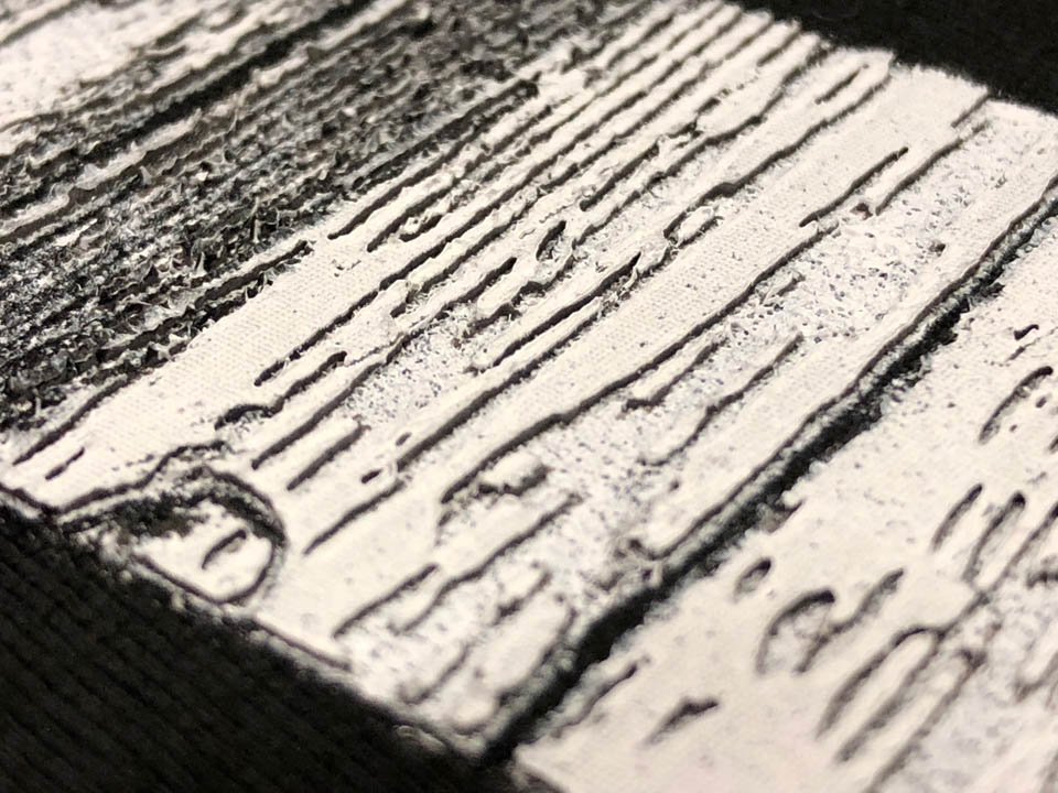
The printing technique yielded more of a “paint peeling” effect rather than wooden texture. We thought it was very convincing, both visual and tactile. We call that a “happy accident,” as Mark Coudray says. Hey, sometimes it’s better to be lucky and good! My one rule is this: “If you can make something look like something it ain’t, it always works!”
The client was thrilled with this version and subsequent versions of the Texas flag with flair. The attendees continue to wrestle over sizes at the end of the dryer belt during the shows, so we don’t think we will retire this one just yet.
