You receive a call from a local HOA who has a significant sized stone monument. They feel it’s time for a face lift. The HOA president proceeds to tell you that the sign was originally built in the early ’90s and that over the years the effects of wind, rain, and sun have stolen its original charm. They are looking for a sign company who can dress it up and make it look better, perhaps a bit more modern, so that is why he is calling you. Naturally you are very intrigued by the idea so you agree to meet him at the site to look at the sign to determine if it’s something that’s within your wheelhouse.
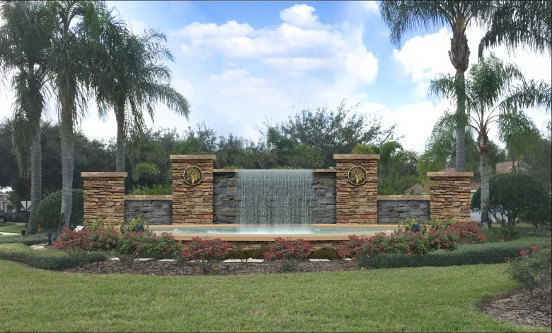
You arrive at the site and greet the HOA president. You have never seen this structure before because it’s located well within the entrance of the gated community and barely visible from the main thoroughfare. It’s really more than a sign, it’s a water feature. The HOA president explains the good and bad of the sign from his point of view and relays some ideas the board had for reviving this tired, worn-out giant of a structure. He asks you, “Is it possible to paint it or add some new capstone and perhaps completely remove the existing letters and replace them with something else, something more modern or visually interesting?”
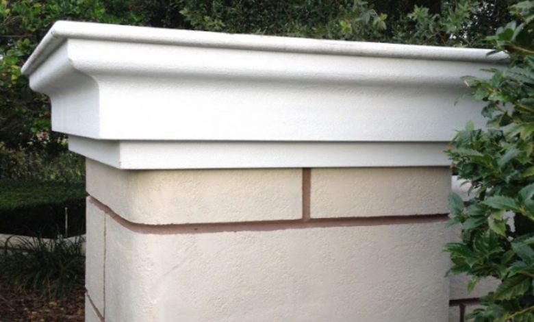
You fear that any attempts to work with the surface material that is currently there would be nothing more than throwing good money out the window. The structure looks secure, the tiles are still in place, the capstones are in okay shape, and all in all it simply needs a face-lift. You decide that this is something that you and your team can get behind.
Since you are there, you decide to enlist his help to hold the tape measure while you grab some measurements as part of your pre-sale sign survey.
You have been down this road a hundred times during your career in the sign business and you have disciplined yourself to take 10 minutes to get all of the details you will need for coming up with a viable plan. Doing this now, while you are there, will provide you the info you need to research how code may or may not affect the sign.
Your quick survey includes:
- Lots of photos and measurements of everything about the structure: You have no idea if the new city zoning plan that went into force last year will have any effect on this structure. After all, it is on private property, but it also has the name of the development on it. You may not be allowed to alter it, so research of the new code will be step one and knowing how big the existing structure is, and the signage area it contains, will provide you the details necessary for a discussion with the sign code department. For your designer, a clear, straight-on photo will be beneficial for creating the presentation drawing.
- Try to determine what the structure is made of. If it was a stucco finish, it would be easy. You would simply drill a small hole somewhere in the back to determine what the core is made from. CMU block? Steel Frame? Wood? In the case of this structure, a few small drill holes may not tell you anything and or could cause an issue. The tiles appear to be solid, so you can only assume the core is made of CMU block, or a solid chunk of poured concrete. If it had a stucco finish, this info would affect whether or not you can build onto what is there, or whether you should demo some of it away.
- Is there any illumination present? Is there power to the sign now and how far is the nearest possible power source? In this case it’s obvious that the lighting fixtures are old and outdated. This makes your job even easier as you do not have to reinvent any wheels on the illumination of the structure. If there was an internally illuminated sign attached, bringing all of it up to code would be required.
- Take photos of the houses within the neighborhood. You note the architectural style of the newer or renovated homes for some possible design reference. Stone, brick, stucco; where is the building style trend headed in this community, or are the houses all stuck in the ’60s?
- Obtain a copy of the HOA’s guidelines. Knowing how the board looks at style, color and architectural elements is critical information for you and your designer. In order to create a favorable design, it’s important to know how the HOA looks at style and building materials.
Once you are satisfied that you have what you need, you make a quick call to your buddy at the city sign permitting desk and within 20 minutes you find out that you are free and clear to move forward with just about anything you want to do because the sign is not visible from any main thoroughfare, it is within the confines of the neighborhood, and it’s considered a decorative structure, not a sign. Your buddy does suggest keeping its overall height about the same so that it doesn’t grab too much attention from the street. One complaint from a neighboring HOA and you may find your new sign suddenly up for review. This is great news, so you sit down with your artist and start to brainstorm.
Because budget is important to everyone no matter what they may say up front, you brainstorm to figure out a way to use what is there without starting from scratch. Fortunately, it’s a CMU block core and stone tile structure. This is great news because you know from experience that removing old stucco is a pain. You can easily build right over this stone giant without too much concern. To be on the safe side, you consult with your long-time friend in the masonry business. No doubt he will most likely be doing most of the work on this project. You explain to him your idea and after his quick site survey, he gives you the thumbs up to proceed.
The HOA guidelines specifically require a specific stone veneer be used on all new and or remodeled homes, along with a decorative ledge stone. This is great news because it eliminates the guess work on which stone veneer to use.
You and your artist settle on an idea to remove the existing top caps and add stone ledges in their place. Then you will add stone veneer to an expanded framework that will attach directly over the existing structure.
Following a detailed survey of the structure, including determining if the structure is still level and has not settled or listed over the years, you can confidently put together a plan for the big beauty makeover. Your artist suggests that since the water pool is already in place, and because they do not want to include the name of the development; maybe a waterfall over the top of the structure’s main wall might look great. Because you have taken measurements of the round-about where the sign is located, and there is currently power to the sign via several old broken spot lights, you decide to move that idea along and make the wall’s waterfall the new focal point of the sign.
After a couple of days, your designer proudly knocks on your office door and tells you to check your email. There it is, the design you had hoped to present, along with a stunning night view that will provide the residents of this community a significant upgrade in the neighborhood’s curb appeal. This sign has now become a focal point of visual interest.
Naturally for the sake of this exercise, the HOA unanimously votes to approve your design and they hand you a hefty 50% deposit on the job. The project runs smoothly because your estimate was spot-on. Your artist was able to create a nearly-exact-scale shop drawing, with all of the details spelled out so there was no guessing and no surprises for anyone involved. Your intent was clearly defined, and everyone was able to provide their bid without guesswork.
We all know that even with the best up-front planning by highly seasoned professionals of their trade, unforeseen obstacles can sometimes rear their ugly heads and throw a monkey wrench into the construction process. Yes, sometimes this happens. However, by taking the time to accurately obtain the details of a project like this up front, and by insisting that your sub-contractors follow the same survey protocols, and by discussing these potential hidden speedbumps with your customer, in writing, you significantly increase the likelihood of a smooth-running job that actually puts a profit in your pocket and a smile on everyone’s face.


