Making the Most of Lettering Opportunities
If you're in the sign business, then you had better work on becoming a sign expert


What is a sign, and what is lettering? Is a sign the collection of different letterings? Can letters alone be called a sign? When does a lettering job become a sign project? Are we in the sign business or lettering business?
In 1985 I started “Charboneau Sign & Lettering Company,” which I later shortened to Charboneau Signs, only after hand-lettering those 15 extra wasted letters on numerous truck doors and sign panels. One thing that sign painting taught me was to design simplistically-because I then had to hand-letter that design onto the truck doors, stroke by stroke, outline by outline; and on the back, too. If the customer wanted something fancy, I had to prepare them for some serious sticker shock before I got started. Usually they hoped to have something that looks like Dom Perignon, but were only hoping to pay for something like Korbel; a natural expectation by a customer who doesn’t understand the hand-lettering process.
So, for me the term “lettering” was part of what I offered back then. Customers would call my shop and ask, “Do you do truck lettering” or walls or windows … but it always involved the word lettering when asking or talking about the sign on their store or on their door. Today the word “graphics” and “digital” have gotten stirred into so many areas of the sign industry that the term “lettering” is almost getting lost in the translation.
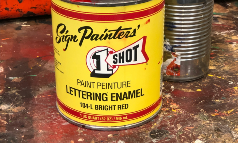
The term “lettering” was used by sign painters like me, and pretty much the entire sign industry. Even the company who made the paint we typically used; 1-Shot Lettering Enamel, had no problems calling it what it was … it wasn’t paint for signs, it was for lettering.
When vinyl cutting machines were in their infancy and required “X-Y” coordinate values and font style names had to be entered in on a DOS ticker-tape looking display, I for one knew that we were not in Kansas anymore and things were changing for the hand-lettering industry. The vinyl options available for lettering that could be produced by someone with very little sign experience was disheartening. It changed everyone’s perception of what it meant to be in the sign business; to produce signage, and lettering for businesses, and how fast it can be delivered.
One of the reasons why I felt it was important to review and outline the differences in our vernacular is because in today’s sign industry, in my honest opinion, there are a lot of new sign companies out there and to make things as clear as possible and understand that “lettering” is a stand-alone process. It’s kind of a verb, too. It speaks of the product that is being sold, or made, and it also is applied to the process of, or act of providing a set of letters for use on a wall, window, door, whatever. Lettering is not a sign; it is a description of a process, and it also describes the product used in the process of “lettering” … whether it is a vinyl letter, or a channel letter … it becomes a sign once “the set of letters” are installed, and a word(s) is formed that now identifies, points-to, describes or warns about something. Everyone has heard this before: “Look at those huge red letters; your sign is so much more readable now.”
What does the term lettering include?
Channel letters; flat, cut-out metal letters; plastic-formed letters; cut vinyl letters? The options seem pretty basic and they look like they would be easy to sell to a customer. However, old guys like me have learned over the years (the hard way) that you better know what you are selling before you firmly plant both feet in your mouth and sell a set of letters that can’t be built at that size, or installed where the customer wants them. Or even worse, elements of the letter fail and your client is faced with these examples.
Every lettering type has a different application, a different installation method, and certainly can complement, or take away from, the brand, identity or style that the business is trying to portray. This is basic design 101, however telling a client that you can get X, Y or Z to match their custom font in their logo could put your butt in a sling when you realize that when dealing with outdoor, there are a host of considerations that will affect which lettering option you should recommend.
Before I go any further, let me set the stage and define the market of which this article is referring, and that is the outdoor sign market where lettering options are being considered and compared for use in outdoor applications, not the inside of a store. Also, it is assumed that we are dealing with scenarios where the client wants a long-term solution, not just a quick temporary sign. So the subject of longevity, readability, wind load, snow load, red iron and membrane-lined roofs become critical (and costly) details to recognize and workaround. Lettering created for use indoors follows a completely different rule book, with its own unique materials DNA that can be discussed in another article.
How do you know which lettering option to offer?
The client’s expectations must be groomed so that they understand the differences, advantages, and disadvantages of each so that the best option for them can be chosen. Ask yourself, are you an order taker or a solution provider? There are so many things to consider before you open your big mouth and say, “Oh yeah, we can do that.” Knowing the ins and outs of each of your lettering options is critical. Knowing when certain types of letters can be or can’t be used is the first step to avoiding costly do-overs. Just because your customer says they want X, Y or Z doesn’t mean you should agree. The customer is not the sign expert; that’s supposed to be your job!
Fire-Hot-Bad
Not understanding the very basics of UL and NEC 600 electrical code requirements for channel letters can get you into the tall weeds quickly. I was once asked by a sign company to join in on a phone call with an architect who was sold a set of channel letters by a well-meaning but uninformed salesperson. I had to break the news that the channel letters required an unsightly raceway or daisy-chained conduit, or they could not be installed where they wanted them to go. UL standards state that all connections must be accessible, and you need space behind the wall, or a raceway in most cases. Without the basic core of understanding of what UL is trying to prevent, the logic behind the rules of the UL standard unfortunately can easily be overlooked.

One easy way to look at it, in a very broad umbrella sort of way, is that UL is about fire prevention from short circuits that cause heat. It also mandates sealed, waterproof containment of, and access to, all connectors within the sign. (You must be able to access via a panel, every place where two wires connect). This idea sounds so simple, and it is, until you think it through as to where the connections need to be, and what is or isn’t behind that brick wall where they want the letters.
And for NEC (National Electrical Code), the website says that NEC 600 covers the installation of conductors and electrical equipment wiring in the field. (Along with a host of other electrical-related grounding issues).
Switching gears and being forced to order and pay for a second set of letters because you didn’t do your homework is never any fun, especially for the person paying for them.
Be the solution provider
Aside from product knowledge, IMHO, knowing the client’s budget is probably the most critical aspect to being able to recommend the right end result. Understanding their advertising/visibility/informational/safety needs is critical to providing the right solution, for their intended installation site, and for their intended end result.
Don’t fall into that cheap trap
With tongue in cheek, I say this: Don’t let the cheap-skate restaurant owner tell you he thinks that the $600 vinyl lettering option would work just fine on his building when you know darn well that the high-end image of his place, and cool mood-setting ambiance and higher-priced entrees, demands a nicer set of channel letters, or at least a set of brass letters to properly address the issue.
Do your homework
Know your products and conduct a quick survey to better understand the conditions of the installation site, the sign code, the landlord’s restrictions (if any), and do this before you meet with the owner to discuss options. In this way, you can begin to build rapport with your client, and hopefully trust when they see that you have done your homework.
Only in this way can you recommend the right type of letters for the business’ advertising or brand enforcement. Be the hero … not the zero.