The lucky horseshoe has been a symbol of good fortune for centuries. Hung in barns or stables, horseshoes are thought to bring good luck and protection. Why do people believe in the luck of the humble horseshoe? In Irish legend, a blacksmith was forging horseshoes and the devil appeared demanding shoes of his own. The blacksmith nailed burning hot shoes deep into the devil’s hooves. Because of the excruciating pain, the devil ripped them off and swore he would never go near a horseshoe again. Thus, we hang a horseshoe over an entrance to ward off evil.
Europeans believed that iron had magical powers and drove away evil. Horseshoes, being made of iron, naturally became protective projectiles as well. Other legends said that witches are afraid of horseshoes and travel by broomstick instead of horseback. The crescent shape of the horseshoe protects against the evil eye, thus making it a good luck charm. The number of holes in a horseshoe isn’t random either. Horseshoes have seven holes to secure them.
The number seven is revered for its frequent appearances in nature. Seven continents, seven seas, seven colors in the rainbow, and seven days in a week. This only amplifies the horseshoe’s lucky aura. In Lincoln, Nebraska, where some of us here at Graphic Elephants went to school, a horseshoe hangs over the entrance to Tom Osborn Field from the locker room at Memorial Stadium, where our beloved Huskers play. Go Big Red!
We have a client who has several clothing lines in the western and country markets. Now being in Colorado for 35 years, we’ve found that this way of life also fits our rock ’n’ roll lifestyle. Tin Haul brand is a little bit country and a little bit rock ’n’ roll. It’s like a bridge between bull riding and skateboarding. The brand targets extreme sports with a western spin. While motocross and snowboarding may be mainstream, the Tin Haul wearer may also be into barrel racing, calf roping, and bull riding. Sports don’t get much more extreme than that.
The design we’ll talk about in this article was developed in a vintage style. Fortunately, in the spirit of a vintage feel, we were printing on cream tees and wouldn’t need a white printer or base plate to manage the colors, or so we thought. While for multiple seasons that was true, we recently had to adapt this design to work on black.
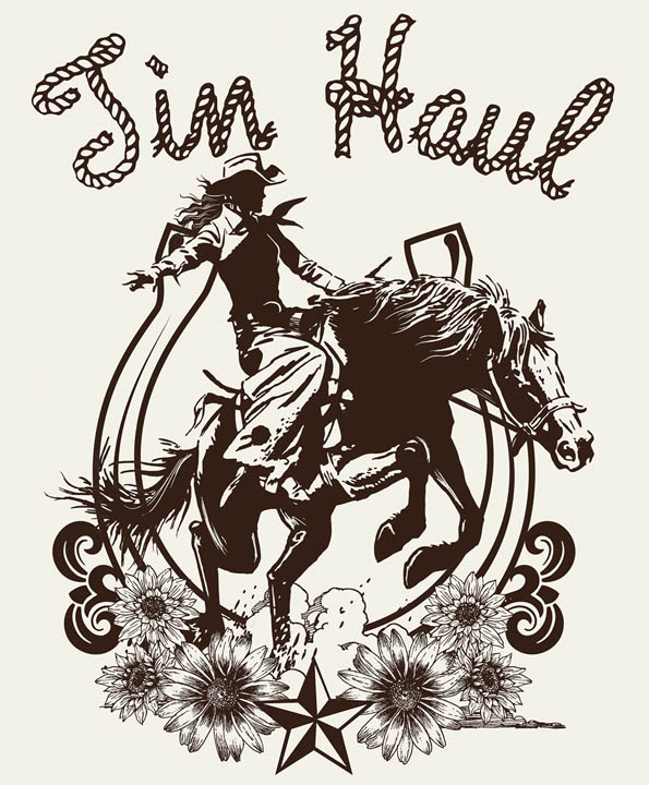
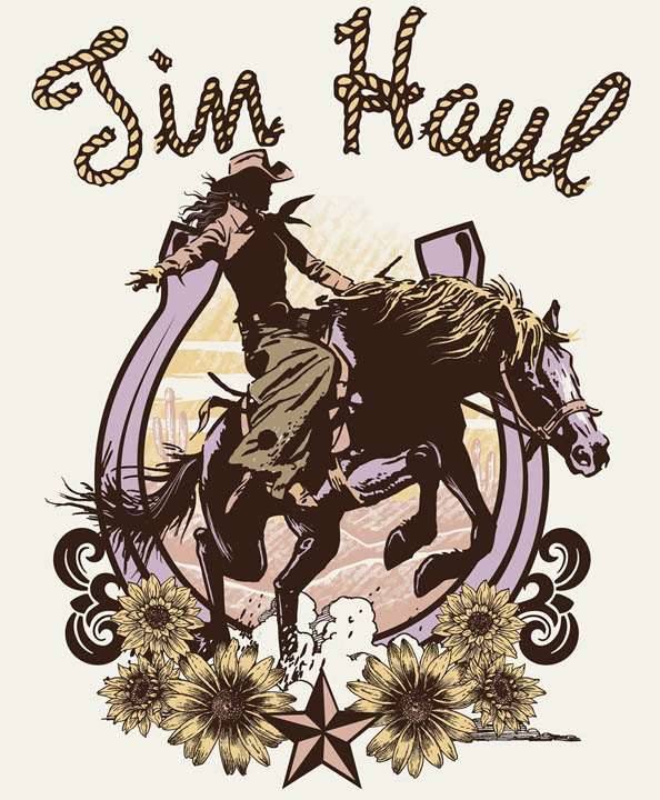
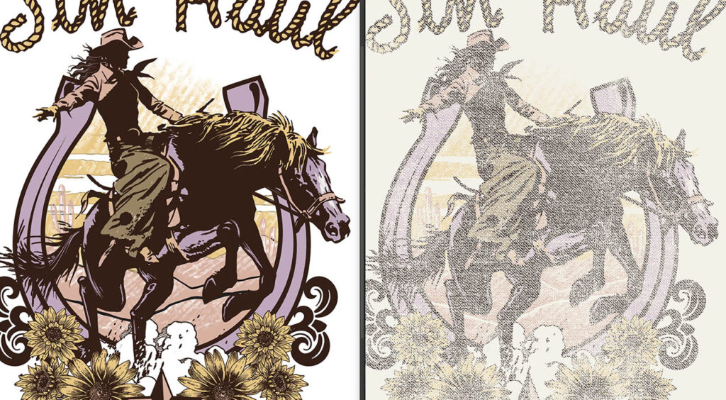
We constructed the image with larger dark elements like the bronc rider to be recognizable. Our type and outlines were fairly bold. The finer details were secondary elements. We used multiple pastel colors to fill the space between the key line, which provided the detail. The distressed texture worked well on the larger elements, but for the finer detail, we used a fade with only a percentage of density removed and didn’t completely knock out areas of information. We used Levels in the Adjustments options under the Image menu. We used this combination throughout.
Because we wanted this image super soft and subtle, we reduced the density of the entire thing, which helped keep the final print from filling in. We ultimately chose a burlap pattern with lots of openings. We increased the contrast of the photo of the burlap by overexposing the grayscale to help blow out the lighter values. For the overall design, the texture plays a major role. The bolder, darker elements kept this design from falling apart. We were careful not to let the loss of detail take away from the look of the overall print.
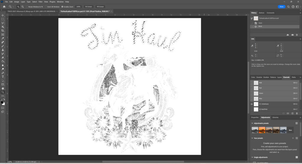
Now for the hard part. Several seasons down the line, the customer wanted to run the same image on black. This sounded simple enough to them. Not so much for us. Of course, we had to build our white printer or base plate. It would need to be fairly dense because of all the transparent colors on top. We decreased some densities for secondary tones. We would let the dark of the garment create the black outlined areas, shadows, and silhouettes. We did not base the horse and allowed it to become nearly black. We used the same burlap pattern to break up the base as well.
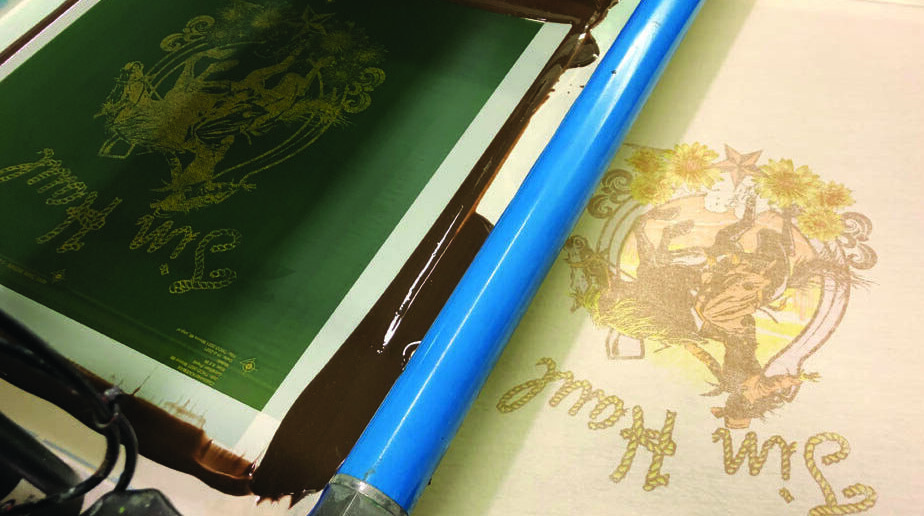
Once our channel seps were completed in Photoshop with the new white printer, we placed the file on our Illustrator artboard where our registration marks, grayscale, and job information live. We outputted on CTS (computer to screen) with a frequency of 55 lpi half-tone at a 22.5 degree angle and a round shape. For a very thin ink deposit, all the screens, including the white printer, were work-hardened N-272 tpi (threads per inch) at a tension of 45 N/cm2.
For the cream garments, the inks were cut with a reducer from 75% up to 99% for a nearly transparent look. We ran everything wet-on-wet using all 75/90/75 triple ply, dual durometer squeegees with flood and print speeds wide open and minimal pressures. We had to play with some of the ink formulations once we saw the first strike off but got most of the opacities right on the second try.
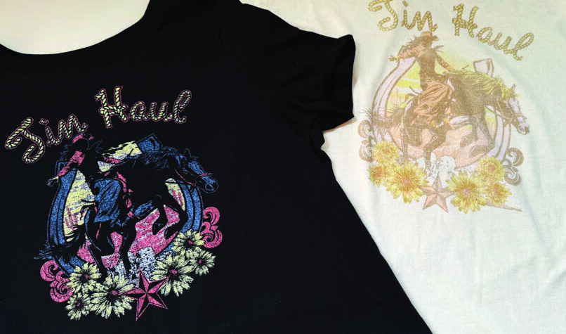
For the black shirts, all the inks were pulled and replaced with inks not cut. The white would be cut 25% and flashed and ironed, of course. The remaining colors ran again wet-on-wet in the same order. We were still aiming for a semi-transparent finish. Registration of all that burlap texture was a bit painful and we chased it around a bit. Once completed, though, they looked like completely different designs; the cream and black merchandised well together. To this day, we run both and treat them like two completely different set ups.
How should you hang a lucky horseshoe? The heels up position, resembling a U, is said to prevent good luck from spilling out. In the heels down orientation, legend says the horseshoe showers blessings on those who pass beneath. Well, we’re convinced. We’re going to hang two horseshoes, one in each orientation, ensuring a double dose of good fortune!
